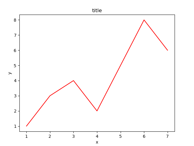
1、数据
# 导入pyplot模块
import matplotlib.pyplot as plt

# 初始化figure
fig = plt.figure()

# 创建数据
x = [1, 2, 3, 4, 5, 6, 7]
y = [1, 3, 4, 2, 5, 8, 6]
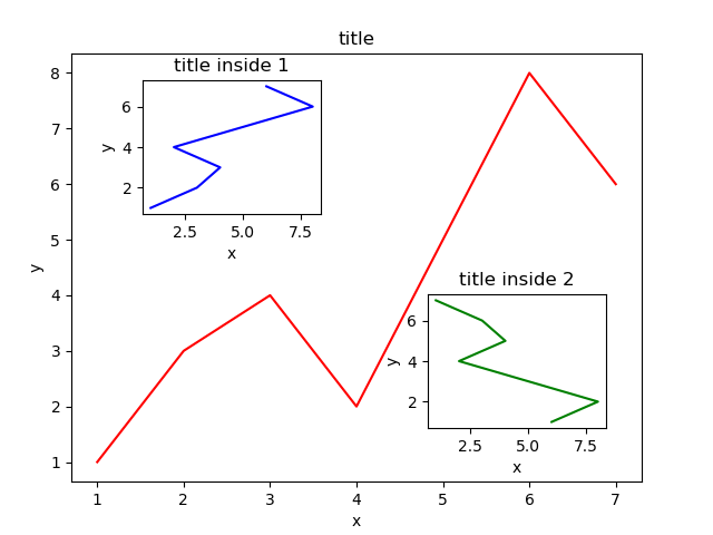
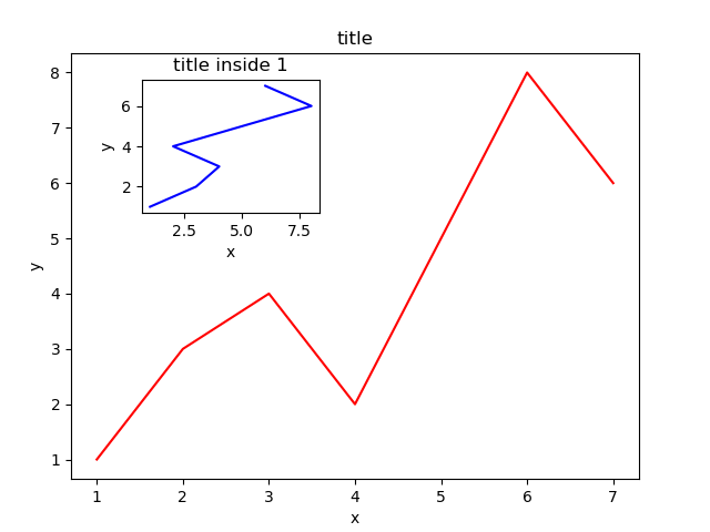
2、大图
接着,绘制大图。首先确定大图左下角的位置以及宽高:
left, bottom, width, height = 0.1, 0.1, 0.8, 0.8
注意,4个值都是占整个figure坐标系的百分比。在这里,假设figure的大小是10x10,那么大图就被包含在由(1, 1)开始,宽8,高8的坐标系内。
将大图坐标系添加到figure中,颜色为r(red),取名为title:
ax1 = fig.add_axes([left, bottom, width, height])
ax1.plot(x, y, 'r')
ax1.set_xlabel('x')
ax1.set_ylabel('y')
ax1.set_title('title')
3、小图
接着,绘制左上角的小图,步骤和绘制大图一样,注意坐标系位置和大小的改变:
left, bottom, width, height = 0.2, 0.6, 0.25, 0.25
ax2 = fig.add_axes([left, bottom, width, height])
ax2.plot(y, x, 'b')
ax2.set_xlabel('x')
ax2.set_ylabel('y')
ax2.set_title('title inside 1')
最后,我们来绘制右下角的小图。这里我们采用一种更简单方法,即直接往plt里添加新的坐标系:
plt.axes([0.6, 0.2, 0.25, 0.25])
plt.plot(y[::-1], x, 'g') # 注意对y进行了逆序处理
plt.xlabel('x')
plt.ylabel('y')
plt.title('title inside 2')