Layout management in Tkinter
原英文教程地址:zetcode.com
In this part of the Tkinter tutorial, we introduce layout managers.
在这一章,我们学习Tkinter布局管理器。
When we design the GUI of our application, we decide what widgets we will use and how we will organise those widgets in the application. To organise our widgets, we use specialised non-visible objects called layout managers.
There are two kinds of widgets: containers and their children. The containers group their children into suitable layouts.
Tkinter has three built-in layout managers: the pack, grid, and place managers. The place geometry manager positions widgets using absolute positioning. The pack geometry manager organises widgets in horizontal and vertical boxes. The grid geometry manager places widgets in a two dimensional grid.
在我们为程序设计图形界面的时候,我们需要决定使用哪些控件以及如何组织这些控件。为了组织这些控件,我们需要指定一个叫做布局管理器的不可见对象。
总的来说,只有两种控件:容器和他们的子控件。容器把他们的子控件放在一个合适的布局里。
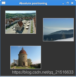
Absolute positioning
In most cases, programmers should use layout managers. There are a few situations where we could use absolute positioning. In absolute positioning, the programmer specifies the position and the size of each widget in pixels. The size and the position of a widget do not change if we resize a window. Applications look different on various platforms, and what looks OK on Linux, might not look OK on Mac OS. Changing fonts in our application might spoil the layout. If we translate our application into another language, we must redo our layout.
在很多情况下,程序应当使用布局管理器。毕竟适合使用绝对定位的很少。在绝对定位中,程序为每一个控件指定大小和精确到像素的位置。当我们重新设置窗口大小的时候,控件的大小和位置并不会改变。在不同的平台,程序看起来均不相同。可能你在Linux上看着比较OK,但是到了Mac上就不行了。在程序中改变字体还有可能会挤爆布局。当我们改变我们程序的语言时,我们必须重新调整我们的布局。
from PIL import Image, ImageTk
from tkinter import Tk, BOTH
from tkinter.ttk import Frame, Label, Style

class Example(Frame):

    def __init__(self):
        super().__init__()

        self.initUI()


    def initUI(self):

        self.master.title("Absolute positioning")
        self.pack(fill=BOTH, expand=1)

        Style().configure("TFrame", background="#333")

        bard = Image.open("bardejov.jpg")
        bardejov = ImageTk.PhotoImage(bard)
        label1 = Label(self, image=bardejov)
        label1.image = bardejov
        label1.place(x=20, y=20)

        rot = Image.open("rotunda.jpg")
        rotunda = ImageTk.PhotoImage(rot)
        label2 = Label(self, image=rotunda)
        label2.image = rotunda
        label2.place(x=40, y=160)

        minc = Image.open("mincol.jpg")
        mincol = ImageTk.PhotoImage(minc)
        label3 = Label(self, image=mincol)
        label3.image = mincol
        label3.place(x=170, y=50)


def main():

    root = Tk()
    root.geometry("300x280+300+300")
    app = Example()
    root.mainloop()


if __name__ == '__main__':
    main()
In this example, we place three images using absolute positioning. We use the place geometry manager.
在这个例子中,我们使用绝对定位放置了三个图片。我们使用了place布局管理器。
from PIL import Image, ImageTk
We use Image and ImageTk from the Python Imaging Library (PIL) module.
我们使用python中 PIL 模块的 Image 和 ImageTk。
如果 PIL 模块不存在,可使用 pip install pillow 来进行安装
style = Style()
style.configure("TFrame", background="#333")
We configure our frame to have a dark gray background using styles.
我们使用样式配置我们的框架为黑灰色背景。
bard = Image.open("bardejov.jpg")
bardejov = ImageTk.PhotoImage(bard)
We create an image object and a photo image object from an image in the current working directory.
我们从当前工作目录下的一个图像创建了一个 Image 对象和一个 ImageTk 对象
label1 = Label(self, image=bardejov)
We create a Label with an image. Labels can contain text or images.
我们创建了一个图像标签。标签可以包含文字或者图像。
label1.image = bardejov
We must keep the reference to the image to prevent image from being garbage collected.
我们必须保证持续引用该图像,以防止该图像被当作垃圾给处理。
label1.place(x=20, y=20)
The label is placed on the frame at x=20 and y=20 coordinates.
这个标签被放置在框架中坐标为20x20的位置。
Tkinter pack manager
The pack geometry manager organises widgets in horizontal and vertical boxes. The layout is controlled with the fill, expand, and side options.
pack布局管理器将控件组织成水平和垂直的框。布局控制器的属性有:fill、expand 和 side 选项。
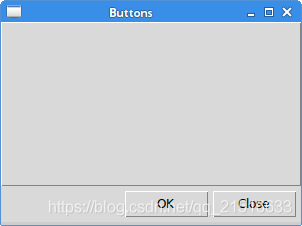
Buttons example
In the following example, we position two buttons in the bottom-right corner of the window. We use the pack manager.
在下面这个例子中,我们使用pack管理器放置了两个按钮在窗口的右下角。
from tkinter import Tk, RIGHT, BOTH, RAISED
from tkinter.ttk import Frame, Button, Style

class Example(Frame):

    def __init__(self):
        super().__init__()

        self.initUI()


    def initUI(self):

        self.master.title("Buttons")
        self.style = Style()
        self.style.theme_use("default")

        frame = Frame(self, relief=RAISED, borderwidth=1)
        frame.pack(fill=BOTH, expand=True)

        self.pack(fill=BOTH, expand=True)

        closeButton = Button(self, text="Close")
        closeButton.pack(side=RIGHT, padx=5, pady=5)
        okButton = Button(self, text="OK")
        okButton.pack(side=RIGHT)


def main():

    root = Tk()
    root.geometry("300x200+300+300")
    app = Example()
    root.mainloop()


if __name__ == '__main__':
    main()
We have two frames. There is the base frame and an additional frame, which expands in both directions and push the two buttons to the bottom of the base frame. The buttons are placed in a horizontal box and placed to the right of this box.
我们有两个框架,一个是基本的框架,另一个是附加的在两个方向上扩展的框架用来将两个按钮推向基本框架的底部。这个按钮放在一个水平框的右边。
frame = Frame(self, relief=RAISED, borderwidth=1)
frame.pack(fill=BOTH, expand=True)
We create another Frame widget. This widget takes the bulk of the area. We change the border of the frame so that the frame is visible; by default it is flat.
我们创建了另一个框架控件,它占据了大部分空间。我们改变框架的框线以让其可见,在默认情况下,它是平的。
closeButton = Button(self, text="Close")
closeButton.pack(side=RIGHT, padx=5, pady=5)
A closeButton is created. It is put into a horizontal box. The side parameter causes the button to be placed to the right of the horizontal. The padx and the pady parameters put some space between the widgets. The padx puts some space between the button widgets and between the closeButton and the right border of the root window. The pady puts some space between the button widgets and the borders of the frame and the borders of the root window.
这里创建了一个关闭按钮,它被放在水平框中。side参数将按钮放在框的右边。padx 和 pady 参数在两个控件之间放在一些空白。padx 参数在两个按钮控件和关闭按钮与根窗口的右框线之间放空白,pady 在两个按钮和框架的框线与根窗口的框线之间放空白。
okButton.pack(side=RIGHT)
The okButton is placed next to the closeButton with 5 px space between them.
ok按钮被放在close按钮旁边,并且他们之间有5像素空白。
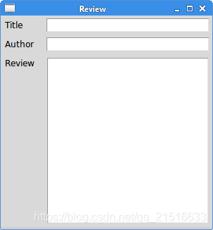
Review example
The pack manager is a simple layout manager. It can be used to do simple layout tasks. In order to create more complicated layouts, we need to utilise more frames, each having its own pack manager.
pack管理器是一个简单的管理器,它用来处理一些简单的布局任务。为了创建更复杂的布局,我们需要使用更多的框架,而且每一个框架都有独立的pack管理器来控制。
from tkinter import Tk, Text, TOP, BOTH, X, N, LEFT
from tkinter.ttk import Frame, Label, Entry


class Example(Frame):

    def __init__(self):
        super().__init__()

        self.initUI()


    def initUI(self):

        self.master.title("Review")
        self.pack(fill=BOTH, expand=True)

        frame1 = Frame(self)
        frame1.pack(fill=X)

        lbl1 = Label(frame1, text="Title", width=6)
        lbl1.pack(side=LEFT, padx=5, pady=5)

        entry1 = Entry(frame1)
        entry1.pack(fill=X, padx=5, expand=True)

        frame2 = Frame(self)
        frame2.pack(fill=X)

        lbl2 = Label(frame2, text="Author", width=6)
        lbl2.pack(side=LEFT, padx=5, pady=5)

        entry2 = Entry(frame2)
        entry2.pack(fill=X, padx=5, expand=True)

        frame3 = Frame(self)
        frame3.pack(fill=BOTH, expand=True)

        lbl3 = Label(frame3, text="Review", width=6)
        lbl3.pack(side=LEFT, anchor=N, padx=5, pady=5)

        txt = Text(frame3)
        txt.pack(fill=BOTH, pady=5, padx=5, expand=True)


def main():

    root = Tk()
    root.geometry("300x300+300+300")
    app = Example()
    root.mainloop()


if __name__ == '__main__':
    main()
The example shows how to create a more complex layout with multiple frames and pack managers.
这个例子展示的如何利用 fromes 和 pack 创建更加复杂的布局。
self.pack(fill=BOTH, expand=True)
The first frame is the base frame, on which other frames are placed. Note that in addition to organising children within frames, we also manage the frames on the base frame.
这里第一个框架是基本框架,用于承载其他框架。注意:基本框架不仅要组织其子控件,还需要管理框架中的框架。
frame1 = Frame(self)
frame1.pack(fill=X)

lbl1 = Label(frame1, text="Title", width=6)
lbl1.pack(side=LEFT, padx=5, pady=5)

entry1 = Entry(frame1)
entry1.pack(fill=X, padx=5, expand=True)
The first two widgets are placed on the first frame. The entry is horizontally streched with the fill and the expand parameters.
第一组两个控件被放在第一个框架中。表现为一个带有填充和扩展属性的条形框。
frame3 = Frame(self)
frame3.pack(fill=BOTH, expand=True)

lbl3 = Label(frame3, text="Review", width=6)
lbl3.pack(side=LEFT, anchor=N, padx=5, pady=5)

txt = Text(frame3)
txt.pack(fill=BOTH, pady=5, padx=5, expand=True)
Inside the third frame, we place a label and a text widget. The label is anchored to the north. The text widget takes the whole remaining area.
在第三个框架中,我们放置了一个标签和一个文本框。这个标签被固定在北方,而文本框则拥有剩下的所有空间。
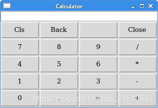
Tkinter grid manager
The Tkinter’s grid geometry manager is used to create a skeleton of a calculator.
使用Tkinter 几何管理器创建计算器的框架。
from tkinter import Tk, W, E
from tkinter.ttk import Frame, Button, Entry, Style

class Example(Frame):

    def __init__(self):
        super().__init__()

        self.initUI()


    def initUI(self):

        self.master.title("Calculator")

        Style().configure("TButton", padding=(0, 5, 0, 5),
            font='serif 10')

        self.columnconfigure(0, pad=3)
        self.columnconfigure(1, pad=3)
        self.columnconfigure(2, pad=3)
        self.columnconfigure(3, pad=3)

        self.rowconfigure(0, pad=3)
        self.rowconfigure(1, pad=3)
        self.rowconfigure(2, pad=3)
        self.rowconfigure(3, pad=3)
        self.rowconfigure(4, pad=3)

        entry = Entry(self)
        entry.grid(row=0, columnspan=4, sticky=W+E)
        cls = Button(self, text="Cls")
        cls.grid(row=1, column=0)
        bck = Button(self, text="Back")
        bck.grid(row=1, column=1)
        lbl = Button(self)
        lbl.grid(row=1, column=2)
        clo = Button(self, text="Close")
        clo.grid(row=1, column=3)
        sev = Button(self, text="7")
        sev.grid(row=2, column=0)
        eig = Button(self, text="8")
        eig.grid(row=2, column=1)
        nin = Button(self, text="9")
        nin.grid(row=2, column=2)
        div = Button(self, text="/")
        div.grid(row=2, column=3)

        fou = Button(self, text="4")
        fou.grid(row=3, column=0)
        fiv = Button(self, text="5")
        fiv.grid(row=3, column=1)
        six = Button(self, text="6")
        six.grid(row=3, column=2)
        mul = Button(self, text="*")
        mul.grid(row=3, column=3)

        one = Button(self, text="1")
        one.grid(row=4, column=0)
        two = Button(self, text="2")
        two.grid(row=4, column=1)
        thr = Button(self, text="3")
        thr.grid(row=4, column=2)
        mns = Button(self, text="-")
        mns.grid(row=4, column=3)

        zer = Button(self, text="0")
        zer.grid(row=5, column=0)
        dot = Button(self, text=".")
        dot.grid(row=5, column=1)
        equ = Button(self, text="=")
        equ.grid(row=5, column=2)
        pls = Button(self, text="+")
        pls.grid(row=5, column=3)

        self.pack()


def main():

    root = Tk()
    app = Example()
    root.mainloop()


if __name__ == '__main__':
    main()
The grid manager is used to organize buttons in the frame container.
grid管理器用于组织在框架容器中的按钮。
Style().configure("TButton", padding=(0, 5, 0, 5),font='serif 10')
We configure the Button widget to have a specific font and to have some internal padding.
我们给按钮设定一个指定的字体和一些内边距。
self.columnconfigure(0, pad=3)
...
self.rowconfigure(0, pad=3)
We use the columnconfigure() and the rowconfigure() methods to define some space in grid columns and rows. This way we achieve that the buttons are separated by some space.
我们使用 columnconfigure() 和 rowconfigure() 方法来定义一些 grid 行和列中的空白。这种方法可以让按钮被被空白分隔开。
entry = Entry(self)
entry.grid(row=0, columnspan=4, sticky=W+E)
The Entry widget is where the digits are displayed. The widget is placed in the first row and it spans all four columns. Widgets may not occupy all the space allotted by cells in the grid. The sticky parameter expands the widget in a given direction. In our case we ensure that the entry widget is expanded from left to right.
输入框用于显示数字。这个控件被放在第一行并且跨越所有列。在 grid 中,控件可能并不占据单元格分配的所有空白。而 sticky 参数将在给定的方向上扩展控件。在我们这个例子中,我们需要确保输入框从左扩展到右。
cls = Button(self, text="Cls")
cls.grid(row=1, column=0)
The cls button is placed in the second row and first column. Note that the rows and columns start at zero.
这个 cls 按钮被放置在第二行第一列。需要注意的是行和列是从0开始数的。
self.pack()
The pack() method shows the frame widget and gives it initial size. If no other parameters are given, the size will be just enough to show all children. This method packs the frame widget to the toplevel root window, which is also a container. The grid geometry manager is used to organize buttons in the frame widget.
pack() 方法显示框架并且给定一个初始大小。如果没有其他参数,框架的大小将仅仅能容纳所有子控件而已。这个方法将框架放在了也算是一个容器的根窗口的最上方。grid 几何管理器经常被用来在框架控件中组织按钮。
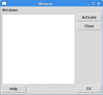
Windows example
The following example creates the windows dialog using the grid geometry manager.
下面这个例子将使用 grid 几何管理器创建一个对话框。
from tkinter import Tk, Text, BOTH, W, N, E, S
from tkinter.ttk import Frame, Button, Label, Style


class Example(Frame):

    def __init__(self):
        super().__init__()

        self.initUI()


    def initUI(self):

        self.master.title("Windows")
        self.pack(fill=BOTH, expand=True)

        self.columnconfigure(1, weight=1)
        self.columnconfigure(3, pad=7)
        self.rowconfigure(3, weight=1)
        self.rowconfigure(5, pad=7)

        lbl = Label(self, text="Windows")
        lbl.grid(sticky=W, pady=4, padx=5)

        area = Text(self)
        area.grid(row=1, column=0, columnspan=2, rowspan=4,
            padx=5, sticky=E+W+S+N)

        abtn = Button(self, text="Activate")
        abtn.grid(row=1, column=3)

        cbtn = Button(self, text="Close")
        cbtn.grid(row=2, column=3, pady=4)

        hbtn = Button(self, text="Help")
        hbtn.grid(row=5, column=0, padx=5)

        obtn = Button(self, text="OK")
        obtn.grid(row=5, column=3)


def main():

    root = Tk()
    root.geometry("350x300+300+300")
    app = Example()
    root.mainloop()


if __name__ == '__main__':
    main()
In this example, we use a Label widget, a Text widget, and four buttons.
在这个例子中,我们使用一个标签控件,一个文本框,和四个按钮。
self.columnconfigure(1, weight=1)
self.columnconfigure(3, pad=7)
self.rowconfigure(3, weight=1)
self.rowconfigure(5, pad=7)
We define some space among widgets in the grid. The weight parameter makes the second column and fourth row growable. This row and column is occupied by the text widget, so all the extra space is taken by it.
我们在 grid 的标签中定义了一些空白。weight参数让第二列和第四行大小可调。因为这一行和列都被文本框占据,所以额外的空白也被他占据了。
lbl = Label(self, text="Windows")
lbl.grid(sticky=W, pady=4, padx=5)
The label widget is created and put into the grid. If no column and row is specified, then the first column or row is assumed. The label sticks to the west and it has some padding around its borders.
标签控件也被创建并放在 grid 中。如果没有指定行和列,则默认是第一行第一列。标签将显示在西方向,而且在它的框线周围有一定的边距。
area = Text(self)
area.grid(row=1, column=0, columnspan=2, rowspan=4,
    padx=5, sticky=E+W+S+N)
The text widget is created and starts from the second row and first column. It spans two columns and four rows. There is a 4 px space between the widget and the left border of the root window. Finally, the widget sticks to all the four sides. So when the window is resized, the text widget grows in all directions.
文本框被创建并开始于第二行第一列。它跨越了两行四列。并且在这个控件的左边线和根窗口之间有4像素的空白。最后,控件的四个边都设置了操作杆,当窗口被重新设置大小时,文本框将在所有方向上扩展。
abtn = Button(self, text="Activate")
abtn.grid(row=1, column=3)

cbtn = Button(self, text="Close")
cbtn.grid(row=2, column=3, pady=4)
These two buttons go next to the text widget.
这两个按钮显示在文本框的旁边。
hbtn = Button(self, text="Help")
hbtn.grid(row=5, column=0, padx=5)

obtn = Button(self, text="OK")
obtn.grid(row=5, column=3)
These two buttons go below the text widget; the Help button takes the first column, the Ok Button takes the last column.
这两个按钮将显示在文本框的下方。其中 Help 按钮显示在第一列,Ok 按钮显示在最后一列。
In this part of the Tkinter tutorial, we have covered layout management of widgets.
Tkinter 教程的本部分,我们学习了控件的布局管理器。