转行学开发,代码100天——2018-04-15
(今天是代码开发的第30天,但是代码记录有些滞后,尽快补上。日后要严格执行,避免学习进度和内容相对滞后。)
今天,记录“前端大全”里分享的一篇关于利用Flexbox和CSS Grid实现高效布局的案例。
原文来源:葡萄城控件
www.cnblogs.com/powertoolsteam/p/combine-flexbox-and-css-grids-for-layouts.html
关于Flexbox前期学习笔记已经介绍过其基本用法。再添加一篇介绍文章:
flexbox-CSS3弹性盒模型flexbox布局完整版教程
一方面,使用Flexbox可以使元素对齐排列变得更加容易,另一方面,浏览器逐渐增加对CSS Grid的布局支持,使其为网页设计带来一定的便利。通过使用Flexbox 和CSS Grid均能实现网页布局设计,本次实践是组合两者工具,实现较复杂页面的布局设计。
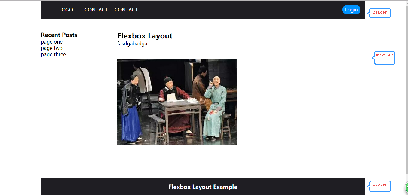
对于下图的页面布局
一.用Flexbox 实现的布局
HTML:cotainer(header+wraper+footer)
<div class="container"> <!--header start--> <header> <nav> <ul> <li><a href="#">LOGO</a></li> <li><a href="#">CONTACT</a></li> <li><a href="#">CONTACT</a></li> </ul> </nav> <span class="login"> <a href="#">Login</a> </span> </header> <!--header end --> <!--wrapper start--> <div class="wrapper"> <side class="sidebar"> <h3>Recent Posts</h3> <ul> <li><a href="#">page one</a></li> <li><a href="#">page two</a></li> <li><a href="#">page three</a></li> </ul> </side> <section class="main"> <h2>Flexbox Layout</h2> <p>fasdgabadga<br/><br/><br/> <img src="img/8.jpg"> </p> <br/><br/><br/> </section> </div> <!--wrapper end--> <!--footer start--> <footer> <h3>Flexbox Layout Example</h3> <p>© xxxx</p> </footer> <!--footer end--> </div>
<style type="text/css">
    *{
        margin:0;
        padding:0;

    }
    ul li{
        list-style: none;
        color: #fff;
    }
    a{
        text-decoration: none;
        color: #fff;
    }
    .container{
        display: flex;
        flex-direction: column;
        width: 80%;
        height: 100%;
        margin-left: 10%;
    }
    header{
        padding:15px;
        margin-bottom: 40px;
        display: flex;
        justify-content: space-between;
        /*border:1px solid red;*/
        background: #1f1e23;
    }
    nav ul{
        display: flex;
        flex-direction: row;
        margin-left: 20px;
    }
    nav ul li{
        /*background: #ccc;*/
        width: 100px;
        height: 30px;
        line-height: 30px;
        text-align: center;

    }
    nav ul li:hover{
        background: #ccc;
        color: #000;
    }
    .login{
        width: 60px;
        height: 30px;
        background: #0093ff;
        text-align: center;
        line-height: 30px;
        border-radius: 14px;

    }
    .wrapper{
        display: flex;
        flex-direction: row;
        color: #000;
        border:1px solid green;
    }
    .main{
        flex: 3;
        margin-right: 60px;
    }
    .sidebar{
        flex:1;
        color: #000;
    }
    .sidebar ul {
        margin-left: 0px;

    }
    .sidebar a{
        color: #000;
    }

    footer{
        /*border:1px solid black;*/
        background: #1f1e23;
        text-align: center;
        bottom: 0;
        color: #fff;
        height: 60px;
        line-height: 60px;

    }

</style>
基本布局效果如下:
二.用CSS Grid方式实现
未完,待续。。。。