元素的定位属性主要包括定位模式和边偏移两部分。
1. 边偏移
| 边偏移属性 | 描述 |
|---|---|
| top | 顶端偏移量,定义元素相对于其父元素上边线的距离 |
| bottom | 底部偏移量,定义元素相对于其父元素下边线的距离 |
| left | 左侧偏移量,定义元素相对于其父元素左边线的距离 |
| right | 右侧偏移量,定义元素相对于其父元素右边线的距离 |
2. 定位模式(定位的分类)
选择器{position:属性值;}
| 值 | 描述 |
|---|---|
| static | 自动定位(默认定位方式) |
| relative | 相对定位,相对于其原文档流的位置进行定位 |
| absolute | 绝对定位,相对于其上一个已经定位的父元素进行定位 |
| fixed | 固定定位,相对于浏览器窗口进行定位 |
3. 静态定位static
3.1 静态定位是所有元素的默认定位方式,当position属性的取值为static时,可以将元素定位于静态位置。 所谓静态位置就是各个元素在HTML文档流中默认的位置。(标准流特性)
3.2 静态定位状态下,无法通过边偏移属性(top、bottom、left或right)来改变元素的位置。
3.3 静态定位唯一的用处就是取消定位。 position: static;
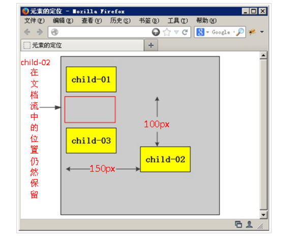
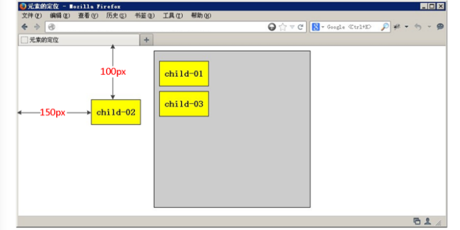
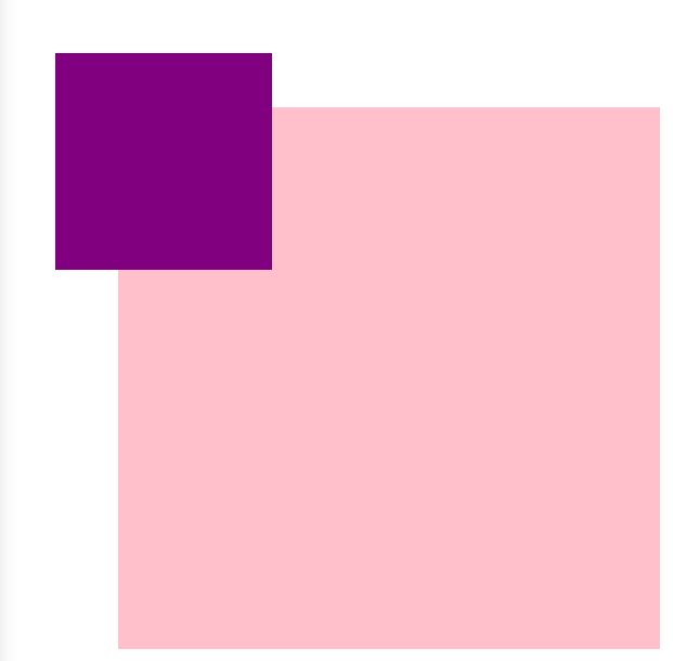
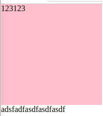
4. 相对定位relative(自恋)
4.1 相对定位是将元素相对于它在标准流中的位置进行定位
4.2 对元素设置相对定位后,可以通过边偏移属性改变元素的位置,但是它在文档流中的位置仍然保留。https://segmentfault.com/a/1190000011395218,https://stackoverflow.com/questions/26560303/does-setting-position-to-relative-on-a-div-takes-it-out-of-document-flow。
4.3 相对定位的盒子仍在标准流中,它后面的盒子仍以标准流方式对待它。(相对定位不脱标)
4.4 如果说浮动的主要目的是让多个块级元素一行显示,那么定位的主要价值就是移动位置,让盒子到我们想要的位置上去。
<!DOCTYPE html>
<html lang="en">
<head>
<meta charset="UTF-8">
<title>Document</title>
<style>
div {
200px;
height: 200px;
background-color: pink;
}
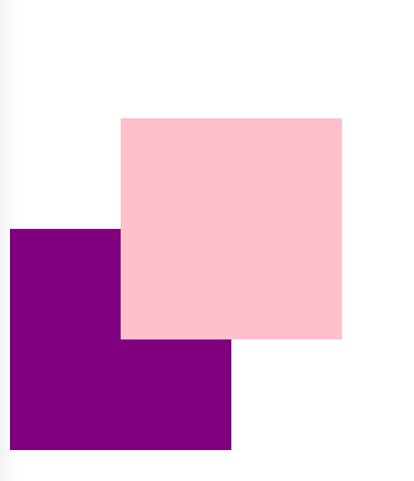
.top {
/* 注释这条看看*/
position: relative;
top: 100px;
left: 100px;
}
.bottom {
background-color: purple;
}
</style>
</head>
<body>
<div class="top"></div>
<div class="bottom"></div>
</body>
</html>
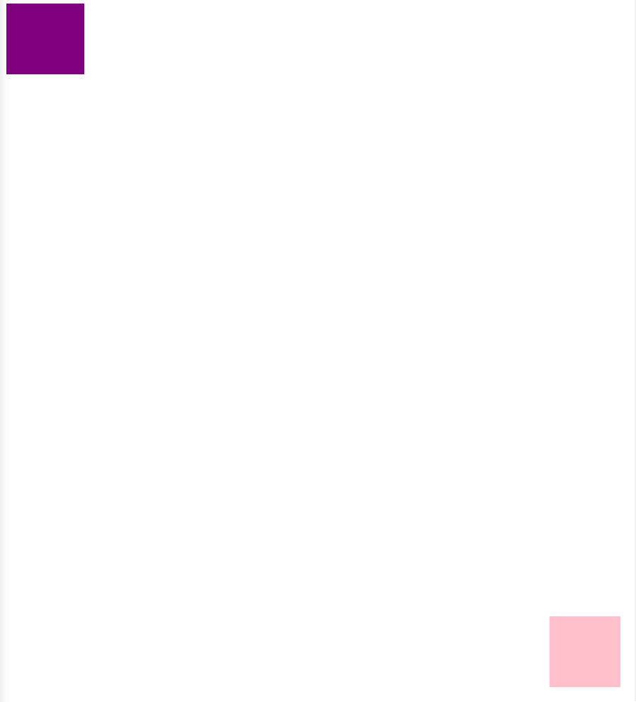
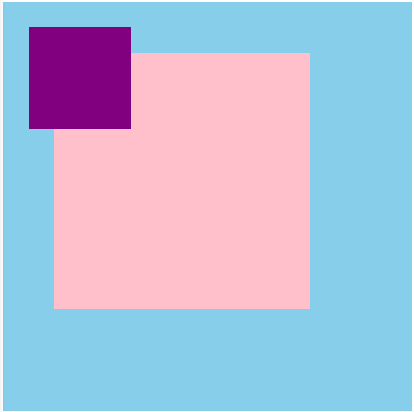
5. 绝对定位absolute(拼爹)
5.1 相对于其上一个已经定位的父元素进行定位
5.2 可以通过边偏移移动位置,但是它完全脱标,完全不占位置。
5.3 若所有父元素都没有定位,以浏览器当前屏幕为准对齐(document文档)。
<!DOCTYPE html>
<html lang="en">
<head>
	<meta charset="UTF-8">
	<title>Document</title>
	<style>
	body {
		height: 2000px;
	}
	div {
		 100px;
		height: 100px;
		background-color: pink;
		/*position: absolute;
		top: 10px;
		left: 10px;*/
	}
	.top {
/*        注释看看*/
		position: absolute;
/*        脱标,不占位置 跟浮动一样*/
		right: 20px;
		bottom: 20px;

	}
	.bottom {
		background-color: purple;
		 110px;
	}
	</style>
</head>
<body>
	<div class="top"></div>
	<div class="bottom"></div>
</body>
</html>
<!DOCTYPE html>
<html lang="en">
<head>
	<meta charset="UTF-8">
	<title>Document</title>
	<style>
	.father {
		 500px;
		height: 500px;
		background-color: pink;
		margin: 100px;
/*        position: relative;*/
	}
	.son {
		 200px;
		height: 200px;
		background-color: purple;
/*        注释看看*/
		position: absolute;
		top: 50px;
		left: 50px;
		/*若所有父元素都没有定位,以浏览器当前屏幕为准对齐(document文档)。*/
	}
	</style>
</head>
<body>
	<div class="father">
		<div class="son"></div>
	</div>
</body>
</html>
5.4 若父元素都有定位,绝对定位是将元素依据最近的已经定位(绝对、固定或相对定位)的父元素(祖先)进行定位。
<!DOCTYPE html>
<html lang="en">
<head>
	<meta charset="UTF-8">
	<title>Document</title>
	<style>
	.grandfather {
		 800px;
		height: 800px;
		background-color: skyblue;
		position: absolute;
	}
	.father {
		 500px;
		height: 500px;
		background-color: pink;
		margin: 100px;
/*		position: absolute;*/
	}
	.son {
		 200px;
		height: 200px;
		background-color: purple;
		position: absolute;
		top: 50px;
		left: 50px;
		/*若所有父元素都没有定位,以浏览器当前屏幕为准对齐(document文档)。*/
	}
	</style>
</head>
<body>
<div class="grandfather">
	<div class="father">
		<div class="son"></div>
	</div>
</div>

</body>
</html>
6. 子绝父相,最合适的搭配(相对定位不脱标,绝对定位脱标)
6.1 子级是绝对定位的话, 父级要用相对定位。
6.2 看上面的5.4,子级是绝对定位,父亲只要是定位即可(不管父亲是绝对定位还是相对定位,甚至是固定定位都可以),就是说, 子绝父绝,子绝父相都是正确的。
6.3 因为子级是绝对定位,不会占有位置,可以放到父盒子里面的任何一个地方。父盒子布局时,需要占有位置,因此父亲只能是相对定位(不脱标)。这就是子绝父相的由来。
这两个箭头(左移动,右移动)是子绝。
可以实现,小黄色块可以在图片上移动
左右箭头压住图片
hot 在盒子外面多出一块


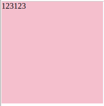
7. 绝对定位是完全脱标,浮动是半脱标
<!DOCTYPE html>
<html lang="en">
<head>
    <meta charset="UTF-8">
    <title>Document</title>
    <style>
        * {
            margin: 0;
            padding: 0;
        }

        div {
             200px;
            height: 200px;
            background-color: pink;
        }

        .top {
            /*            float不是完全脱标,文字,图片还可以看*/
            float: left;
            /*        position: absolute;*/
            /*绝对定位是完全脱标,看不到文字,图片*/
        }

        .bottom {
            background-color: purple;
        }
    </style>
</head>

<body>
    <div class="top">123123</div>
    <div class="bottom">adsfadfasdfasdfasdf</div>
</body>
</html>
浮动,能看到文字
绝对定位,看不到文字
8. 绝对定位水平居中
8.1 普通的盒子是左右margin 改为 auto就可, 但是对于绝对定位就无效了
8.2 定位的盒子也可以水平或者垂直居中,算法如下
8.3 首先left 50% 父盒子的一半大小
8.4 外边距margin设置为自己盒子大小的负一半 margin-left
<!DOCTYPE html>
<html lang="en">
<head>
	<meta charset="UTF-8">
	<title>Document</title>
	<style>
	div {
		 200px;
		height: 200px;
		background-color: pink;
/*		margin: 100px auto;*/
/*		float: left;*/
		position: absolute;
		/*加了定位 浮动的的盒子  margin 0 auto 失效了*/
		left: 50%;
		margin-left: -100px;
		top: 50%;
		margin-top: -100px;
	}
	</style>
</head>
<body>
	<div></div>
</body>
</html>
9. 固定定位fixed
9.1 固定定位的元素跟父亲没有任何关系,只认浏览器。
9.2 固定定位完全脱标,不占有位置,不随着滚动条滚动。
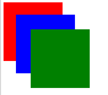
10. 叠放次序(z-index)
10.1 要想调整重叠定位元素的堆叠顺序,可以对定位元素应用z-index层叠等级属性,其取值可为正整数、负整数和0。例如 z-index: 3; font-weight: 700
10.2 z-index的默认属性值是0,取值越大,定位元素在层叠元素中越居上。
10.3 如果取值相同,则根据书写顺序,后来居上。
10.4 后面数字一定不能加单位。
10.5 只有相对定位,绝对定位,固定定位有此属性,其余标准流,浮动,静态定位都无此属性,亦不可指定此属性。
例子1.
<!DOCTYPE html>
<html lang="en">
<head>
	<meta charset="UTF-8">
	<title>Document</title>
	<style>
	div {
		 200px;
		height: 200px;
		background-color: red;
		position: absolute;
/*		z-index: 0;  只有定位的盒子才有*/
	}
	.red {
		z-index: 1;
	}
	.blue {
		background-color: blue;
		left: 50px;
		top: 50px;
		z-index: 2;
	}
	.green {
		background-color: green;
		left: 100px;
		top: 100px;
		z-index: 999;
	}
	</style>
</head>
<body>
	<div class="red"></div>
	<div class="blue"></div>
	<div class="green"></div>
</body>
</html>
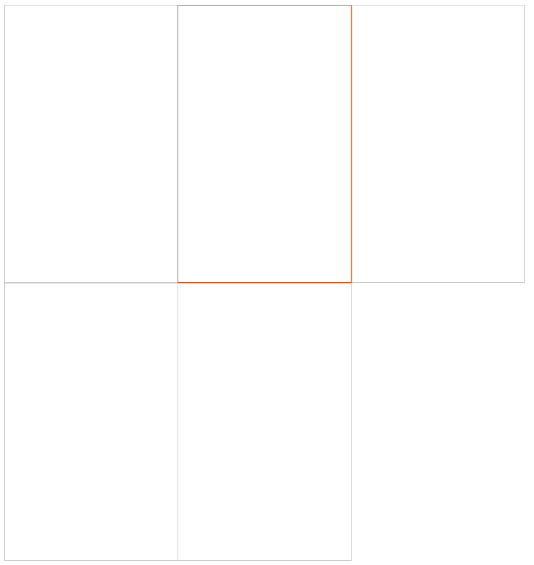
例子2. 因为先float(使多个元素显示在同一行),然后margin-left左移1,右边div的左边压着左边的div的右边,所以hover左边的div时显示不出左边div的右边。
<!DOCTYPE html>
<html lang="en">
<head>
	<meta charset="UTF-8">
	<title>Document</title>
	<style>
	div {
		 250px;
		height: 400px;
		border: 1px solid #ccc;
		float: left;
/*        margin-left: -1px消除边框重叠*/
		margin-left: -1px;
/*		position: relative;*/
		/*z-index: 0;*/
	}
	div:hover {
		border: 1px solid #f40;
		/*position: relative; 相对定位比标准流高一级 浮在上面的*/
/*		z-index: 1;*/
	}
	</style>
</head>
<body>
	<div></div>
	<div></div>
	<div></div>
	<div></div>
	<div></div>
</body>
</html>
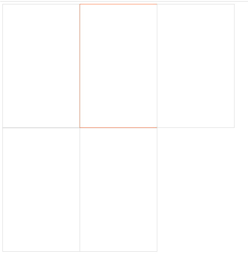
解决方法为设置z-index,使用z-index的前提先设置position
<!DOCTYPE html>
<html lang="en">
<head>
	<meta charset="UTF-8">
	<title>Document</title>
	<style>
	div {
		 250px;
		height: 400px;
		border: 1px solid #ccc;
		float: left;
/*        margin-left: -1px消除边框重叠*/
		margin-left: -1px;
/*		position: relative;*/
		/*z-index: 0;*/
	}
	div:hover {
		border: 1px solid #f40;
		position: relative; 相对定位比标准流高一级 浮在上面的
		z-index: 1;
	}
	</style>
</head>
<body>
	<div></div>
	<div></div>
	<div></div>
	<div></div>
	<div></div>
</body>
</html>
11. 定位模式转换
跟浮动一样,元素添加了绝对定位和固定定位之后, 元素模式也会发生转换,都转换为行内块(inline-block)模式
因此,行内元素如果添加了绝对定位或者固定定位后(或者浮动后),可以不用转换模式,直接设置width和height
12. 四种定位总结
| 定位模式 | 是否脱标占有位置 | 是否可以使用边偏移 | 移动位置基准 |
|---|---|---|---|
| 静态static | 不脱标,正常模式 | 不可以 | 正常模式 |
| 相对定位relative | 不脱标,占有位置 | 可以 | 相对自身位置移动(自恋型) |
| 绝对定位absolute | 完全脱标,不占有位置 | 可以 | 相对于定位父级移动位置(拼爹型) |
| 固定定位fixed | 完全脱标,不占有位置 | 可以 | 相对于浏览器移动位置(认死型) |