先看效果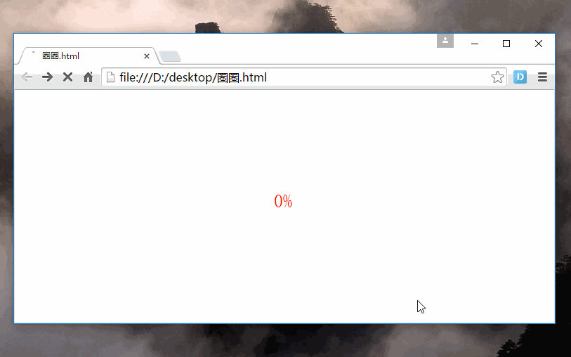
<!DOCTYPE html>
<html>
<head>
    <title></title>
    <meta charset="utf-8">
    <style type="text/css">
        @-webkit-keyframes up{
            0%{top: 0%;}
            100%{top:-80%;}
        }
        @-webkit-keyframes down{
            0%{top: 0%;}
            100%{top: 100%;}
        }
        /*父元素设置溢出隐藏,设置宽高度,居中,相对定位*/
        .father{width: 300px;height: 300px;margin:0 auto;overflow: hidden;position: relative;}
        /*遮罩层给父元素一半的宽度*/
        .zhe{position: absolute;width: 50%;height:100%;background: #fff;z-index: 100;}
        /*分别给两个遮罩层添加向上向下走的动画,通过等待时间,实现衔接*/
        .square_left{left: 0%;top:0px;-webkit-animation:up 1s linear 1s;
            animation-fill-mode: forwards;}
        .square_right{left: 50%;top:0px;-webkit-animation:down 1s linear;
            animation-fill-mode: forwards;}
        /*设置圈圈的样式*/
        .cricle{border:2px solid red;width:296px;height: 296px;border-radius: 50%;z-index: -1}
        #num{font-size: 26px;color:red;margin:0 auto;z-index: 300;
            position: absolute;top: 45%;left:45%;}
    </style>

</head>
<body >
<div class="father">
    <div class="cricle"></div>
    <div class="square_left zhe"></div>
    <div class="square_right zhe"></div>
    <div id="num" ></div>
    <script type="text/javascript">
        var c=0;
        var t;
        timedCount();
    function timedCount()
    {
        if (c==81) {clearTimeout(t);return;}

    document.getElementById('num').innerHTML=c+"%";
    c=c+1;
    console.log(t);
    //开始计时,不断重复这个函数,时间间隔25毫秒;动画是2s,这里2000/80=25ms
    t=setTimeout("timedCount()",25)
    }
    </script>
</div>
</body>
</html>