介绍:
styled-components 样式化组件,主要作用是它可以编写实际的CSS代码来设计组件样式,也不需要组件和样式之间的映射,即创建后就是一个正常的React 组件,并且可以附加样式给当前组件。下面通过两种平台的样式书写来比较说明:
a.react-native 下写样式的方式:
var styles = StyleSheet.create({
  container: {
    borderRadius: 4,
    borderWidth: 0.5,
    borderColor: '#d6d7da',
  },
  title: {
    fontSize: 19,
    fontWeight: 'bold',
  },
  activeTitle: {
    color: 'red',
  },
});
<View style={styles.container}>
  <Text style={[styles.title, this.props.isActive && styles.activeTitle]} />
</View>
通过 StyleSheet 库创建一个样式表,再到元素标签上引用创建的样式 styles.container
b.Html + Css的写法:
<style type="text/css">
  .container{
      borderRadius: '5px',
      borderWidth: '5px',
      borderColor: '#d6d7da',
  }
  .title{
      fontSize: '19px',
      fontWeight: 'bold',
  }
  .activeTitle{
      color: 'red',
  }
</style>
<div class="container"><span class="title"></span></div>
根据上面两种例子可以看出当元素需要某类样式时,都需要与之对应,才能有具体的显示效果。
接下来看 styled-components 样式化组件是如何做到组件与样式之间不需要映射的
如:创建一个 <h1>标签 的样式化组件,在React中直接使用创建好的Title组件就可以了
//在h1后添加附加的样式
const Title = styled.h1`
  font-size: 1.5em;
  text-align: center;
  color: palevioletred;
`;
render(
    <Title>
      Hello styled-component
    </Title>
);
那么问题来了,通过styled-component创建的样式化组件在页面上最终渲染成什么呢了?
先看效果:
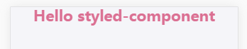
再看页面代码:实际上就是通过 <h1>元素标签渲染的

几种常用的样式化组件方法
# injectGlobal # 编写全局CSS的辅助方法。它不返回组件,而是直接将样式添加到样式表中
这个跟我们平时在写html页面,会先把一些需要重置浏览器的样式加到页面上的做法类似,主要作用是:重置样式及书写全局可共用的样式
import { injectGlobal } from 'styled-components';

injectGlobal`
  @font-face {
    font-family: 'Operator Mono';
    src: url('../fonts/Operator-Mono.ttf');
  }

  body {
    margin: 0;
  }
`;
# StyledComponent # 样式化组件声明方式:styled.tagname、styled(Component) 两种方式
第一种直接通过styled点一个元素标签,将button元素转化成样式化组件
第二种是重写样式化组件的部分样式,比如TomatoButton
还有一种是将一个非样式化组件转换成样式化组件并附加样式,如使用的蚂蚁金服的UI:Flex
import styled from 'styled-components';
import { Flex, List} from 'antd-mobile';
const Button = styled.button`
  background: palevioletred;
  border-radius: 3px;
  border: none;
  color: white;
`;

const TomatoButton = styled(Button)`
  background: tomato;
`;
const MoneyDetail = styled(Flex).attrs({
    direction: 'row',
    justify: 'between',
})`
  padding: 0.26rem;
`
另外介绍两种方法
.extend:创建一个新的StyledComponent并且继承它的规则
如:TomatoButton继承了Button的样式规则,并使用一些与颜色相关的样式进行扩展(其实就是覆盖了被继承组件的某些样式)。
const TomatoButton = Button.extend`
  color: tomato;
  border-color: tomato;
`;
.withComponent 创建一个新的StyledComponent,并应用于其他的标签或组件,且使用相同的样式
如:用<a>标签替换<button>标签,但还是使用相同的样式,相当于<button>有的样式<a>标签一样都有
const Link = Button.withComponent('a')
# Supported CSS # 样式化组件它支持所有的CSS及嵌套,如伪元素使用、选择器使用、媒体查询、css及css3的各类声明样式
const Example = styled.div`
  padding: 2em 1em;
  background: papayawhip;

  /* 伪元素使用:当鼠标悬浮在div块上时显示背景色palevioletred */
  &:hover {
    background: palevioletred;
  }

  /* 媒体查询:在屏幕小余600px的宽度下显示以下样式 */
  @media (max- 600px) {
    background: tomato;

    &:hover {
      background: yellow;
    }
  }

  /*css选择器使用:给当前div元素下的子元素p添加下划线的样式*/
  > p {
    text-decoration: underline;
  }
`;

render(
  <Example>
    <p>Hello World!</p>
  </Example>
);
# Attaching additional props # 附加额外的 props,可以使用.attrs构造函数,将props(或“attributes”)附加到当前组件
比如:声明一个input输入框,用html方式写就是:<input type="text" length="20" padding="10px"/>
而通过样式化组件声明input输入框就可以按下面的写法:
import styled from 'styled-components';

const Input = styled.input.attrs({
  type: 'text',
  length: props => props.length || 10
})`
  background: palevioletred;
  border-radius: 3px;
  border: none;
  color: white;
  padding: ${props => props.padding}
`;
<Input length="20" padding="10px">
实际上 attrs 方法就是一种添加属性的方式,也可以接收组件传过来的prop,如上面<Input>组件传的padding、length属性。
.attrs对象还可以接收函数:比如我们声明一个按钮,并给它添加一个点击事件
const Button = styled.button.attrs({
    onClick: props => props.onClick || null
})`
   background-color: '#e1e1e1';
   color: ${props => props.color || '#FFFFFF'};
    ${props => props.width || '1.92rem'};
   height: ${props => props.height || '0.64rem'};
   font-size: ${props => props.fontSize || '0.24rem'};
   border-radius: ${props => props.borderRadius || '0.02rem'};
   padding: 0.08rem 0.12rem 0.08rem 0.12rem;
   ${props => props.style || ''}
`
<Button onClick={() => {alert('点击我啊!')}}>
另外列举一个通过prop传递值优化样式的方式
精灵图片通过传递的prop值裁剪相应图片:
声明一个 <i>元素的样式化组件,并附一张背景图片,引用时分别给定不同图片的裁剪位置,如:
position={{backgroundPosition:'center -0.52rem'}},在样式声明中通过 ${props => props.position} 获取当前需要裁剪显示的位置
const WayImage = styled.i`
    background-image:url('${require('./resources/provided.png')}');
    background-size: 0.38rem 2.1rem;
    background-repeat: no-repeat;
    ${props => props.position};
     0.4rem;
    height: 0.42rem;
    display: inline-block;
    vertical-align: middle;
`
<WayImage position={{backgroundPosition:'center -0.52rem'}}/>
<WayImage position={{backgroundPosition:'center -1.1rem'}}/>