1、CSV文件是什么,以及与.XLS文件的区别?
csv是文本文件,用记事本就能打开,XLS是二进制的文件只有用EXCEL才能打
csv文件是以逗号为分隔符号,将各字段列分离出的一种ASCII文件。
csv(*.csv) 文件格式只能保存活动工作表中的单元格所显示的文本和数值。工作表中所有的数据行和字符都将保存。
数据列以逗号分隔,每一行数据都以回车符结束。如果单元格中包含逗号,则该单元格中的内容以双引号引起。
2、CSV文件常用的处理方法
1)通过调用csv.reader(),可以创建1个阅读器对象
2)enumerate(),可以获取每个元素的索引及其值
3)可以通过for循环遍历阅读器的各行
filename = 'death_valley_2018_simple.csv'
with open(filename) as f:
    reader = csv.reader(f)
    header_row = next(reader)

    for index, column_header in enumerate(header_row):
        print (index, column_header)

    dates, lows, highs = [], [], []
    for row in reader:
3、strptime解读日期
2018-02-18可以通过如下函数解读
datetime.strptime('2018-02-18', '%Y-%m-%d')
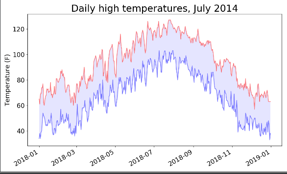
4、折线图绘制
1)首先绘制画布
2)其次绘制折线以及描绘中间区域
3)再次设置坐标轴等格式
4)最后展示
notes:需要注意的是两个函数
1)plt.fill_between()描绘两个函数之间的中间区域
2)fig.autofmt_xdate()设置X轴坐标的样式
    fig = plt.figure(dpi=128, figsize=(10, 6))
    plt.plot(dates, highs, c='red', alpha=0.5)
    plt.plot(dates, lows, c='blue', alpha=0.5)
    plt.fill_between(dates, highs, lows, facecolor='blue', alpha=0.1)

    plt.title('Daily high temperatures, July 2014', fontsize=24)
    plt.xlabel('', fontsize=16)
    plt.ylabel('Temperature (F)', fontsize=16)
    fig.autofmt_xdate()
    plt.tick_params(axis='both', which='major', labelsize=16)

    plt.show()
5、最后附上整段代码
 1 from matplotlib import pyplot as plt
 2 from datetime import datetime
 3 import csv
 4
 5
 6 filename = 'death_valley_2018_simple.csv'
 7 with open(filename) as f:
 8     reader = csv.reader(f)
 9     header_row = next(reader)
10
11     for index, column_header in enumerate(header_row):
12         print (index, column_header)
13
14     dates, lows, highs = [], [], []
15     for row in reader:
16         try:
17             current_date = datetime.strptime(row[2], '%Y-%m-%d')
18             high = int(row[4])
19             low = int(row[5])
20         except ValueError:
21             print(row[2])
22             print(current_date, 'missing date')
23         else:
24             dates.append(current_date)
25             highs.append(high)
26             lows.append(low)
27
28     fig = plt.figure(dpi=128, figsize=(10, 6))
29     plt.plot(dates, highs, c='red', alpha=0.5)
30     plt.plot(dates, lows, c='blue', alpha=0.5)
31     plt.fill_between(dates, highs, lows, facecolor='blue', alpha=0.1)
32
33     plt.title('Daily high temperatures, July 2014', fontsize=24)
34     plt.xlabel('', fontsize=16)
35     plt.ylabel('Temperature (F)', fontsize=16)
36     fig.autofmt_xdate()
37     plt.tick_params(axis='both', which='major', labelsize=16)
38
39     plt.show()