学了几天Html和CSS,做了个百度主页当练习(因为最简单)。由于还没看到Javascript,所以只是尽量把布局做得相似一些。
百度的主页比较简单,大概分为三个部分:右上角的标签、Logo和表单、下面的版权信息。
首先是top部分代码:
1 <div class="top"> 2 <div class="title"> 3 <span> 4 <a class="bold" href="#">新闻</a> 5 <a class="bold" href="#">hao123</a> 6 <a class="bold" href="#">地图</a> 7 <a class="bold" href="#">视频</a> 8 <a class="bold" href="#">贴吧</a> 9 <a href="#">登陆</a> 10 <a href="#">设置</a> 11 <input class="list" type="submit" value="更多产品" name="submit" /> 12 </span> 13 </div> 14 </div>
这部分的样式表:
.top{
    width:100%;
    height:64px;}
.top>.title{
    height:64px;
    float:right;}
.top>.title>span{
    line-height:64px;
    float:right;}
.top>.title>span>a{
    font-size:13px;
    font-family:"宋体";
    text-decoration:underline;
    color:#333}
.top>.title>span>.bold{
    font-weight:bold;}
.list{
    border:0;
    height:25px;
    width:60px;
    background:#36F;
    color:#fff;}
这里用了很多层嵌套。首先top设置width使得横向可以填满整个页面。
top里面的title这一层使用float:right;让内容向右对齐。
title里的span这一层是多加的,用line-height做一个垂直居中。
title和span的宽度都自适应。
几个标签的字体样式都比较好定义,只是最后一个“更多产品”,这里使用表单里面的button,定义一下宽和高,背景颜色和字体颜色。如果要做一个纯色的按钮还要记得把border改成0。
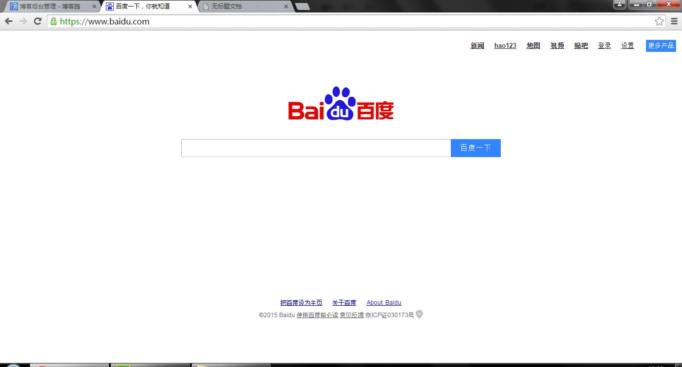
做出来的效果大概是这样的(Chrome):

对比一下百度的页面:

效果基本一样(好像有个错别字)
不过,“更多产品”这部分的文字和左边对齐了,可是按钮的上下边框并没有和什么对齐,不知道算不算设计上的误差哈(个人觉得仔细看的时候稍微有点不适)。
下面是body部分,先贴代码:
<div class="body">
    <div class="pic">
        <img class="logo" src="logo.png" />
    </div>
    <div class="search">
        <form>
            <label for="search"></label>
            <input class="input" type="text" name="search" id="search" value="" /><input class="btn" type="submit" value="百度一下" name="submit" />
        </form>
    </div>
</div>
样式表:
.pic{
    text-align:center;
    margin-bottom:30px;}
.logo{
    height:130px;
    width:270px;}
.search{
    text-align:center;}
.input{
    width:540px;
    height:36px;}
.btn{
    border:0;
    width:100px;
    height:40px;
    background:#36F;
    font-size:15px;
    color:#fff;}
Body又分两个块:图片和搜索框。
其中图片用一个div包裹,是为了让图片水平居中,并且和top层拉开一些距离。图片本身也需要调整尺寸。
搜索框部分用form,并且给search这一层调整水平居中。
这里表单和按钮的样式表里要写的比较多:
表单只要调整好宽和高就可以,按钮像之前一样,除了宽高还有字体和背景,另外要将border设定成0才会是扁平化的按钮。
做出来的页面只有一个细节和原网页不同:


原网页的表单和按钮是严格对齐的,而自己做的有一点偏移。
(解决方法待更新)
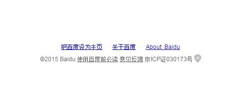
最后是底部的版权部分:
<div class="foot"> <div class="link"> <a href="#">把百度设为主页</a> <a href="#">关于百度</a> <a href="#">About Baidu</a> </div> <div class="copyright"> <p> ©2015 Baidu <a href="#">使用百度前必读</a> <a href="#">意见反馈</a> 京ICP证030173号 </p> </div> </div>
CSS:
.foot{width:100%;
    position:absolute;
    bottom:100px;}
.foot>.link{
    text-align:center;
    margin-bottom:10px;}
.foot>.link>a{
    font-size:12px;
    font-family:"宋体";
    text-decoration:underline;}
.copyright{
    text-align:center;}
p,p>a{
    font-size:12px;
    font-family:"宋体";
    color:#666;}
这里要说明一下,我觉得foot的部分应该要参照页面的底部来定位才更符合语义,所以这里使用了absolute并且和底部拉开一些距离(和百度差不多的距离)。
两行信息分了两个块分别定义,都设置水平居中。效果如下:

原网页:
效果还是很接近的,再看一下整体效果图(Chrome):

除了不能点以外感觉都还不错,
下次试着写复杂一点的网页。
(PS:IE的没放是因为实在有点惨)