以前写毛玻璃用的都是图层覆盖,看了 LEA VEROU 的《CSS揭秘》后才发现还有更优雅的毛玻璃:
<!DOCTYPE html>
<html>
<head>
<title>原来你是这样的毛玻璃</title>
<meta charset="utf-8">
</head>
<style>
@keyframes ants {
to {
background-position: 100%;
}
}
body, main:before {
background: url("demoImages/1.jpg") 0 /cover fixed;
}
main {
position: relative;
background: hsla(0, 0%, 100%, .3);
overflow: hidden;
display: block;
margin: 200px auto;
1000px;
height: 500px;
}
main:before {
content: '';
position: absolute;
top: 0%;
right: 0%;
left: 0%;
bottom: 0%;
filter: blur(10px);
margin: -30px;
}
.demoBox {
border: .5em solid transparent;
background: linear-gradient(white, white) padding-box,
repeating-linear-gradient(-45deg, red 0, red 12.5%, transparent 0, transparent 25%, #58a 0, #58a 37.5%, transparent 0, transparent 50%) 0/5em 5em;
animation: ants 12s linear infinite;
}
.demo {
position: relative;
z-index: 999;
font-size: 5em;
text-align: center;
line-height: 5;
font-weight: 100;
}
</style>
<body>
<main class="demoBox">
<div class="demo">原来你是这样的毛玻璃</div>
</main>
</body>
</html>
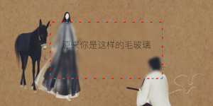
效果图: