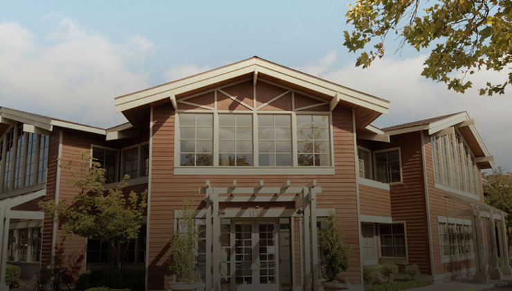
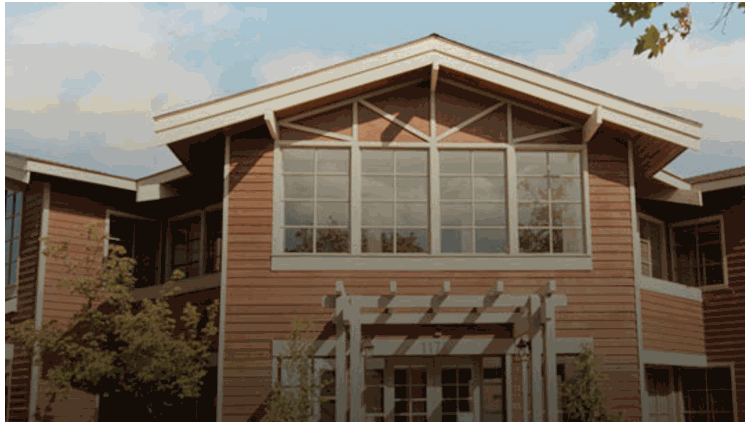
效果
源码
<!doctype html>

<html class="outline color">

<head>

    <meta charset="utf-8">
    <title>图片scale动画</title>

    <style>
        .img-box {
            position: relative;
            width: 740px;
            height: 420px;
            overflow: hidden;
        }
        /* 彩色图片缩放动画 */

        .img-box>.image-scale {
            position: absolute;
            width: 900px;
            height: 580px;
            top: -80px;
            left: -80px;
            background-size: cover;
            transition: all 0.5s ease-in-out;
        }

        .img-box:hover>.image-scale {
            transform: scale(0.822);
        }
    </style>

</head>

<body>

    <div class="img-box">
        <div class="image-scale" style="background-image: url(./images/1.jpg);"></div>
    </div>

</body>

</html>

img-box: 装图片的盒子,确保子元素超出部分隐藏起来.
image-scale: 绝对定位,并手动设置图片居中.
素材