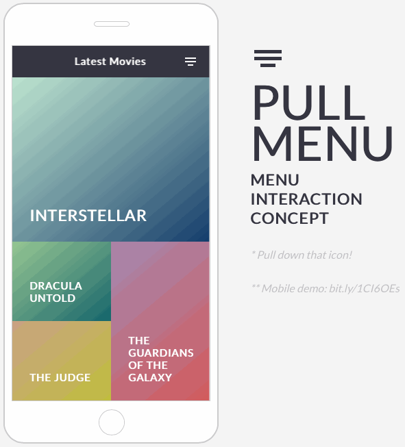
Pull menu interaction concept - 下拉菜单交互
http://freebiesbug.com/code-stuff/pull-menu-interaction-concept/
效果图:
源码:
-html-
<div id="phone">
  <div id="screen">
    <div id="header">
      <ul id="menu">
        <li>Latest Movies</uli>
        <li>Best Movies</uli>
        <li>Archive</uli>
        <li>About</li>
        <li class="reload"><i class="loader-icon"></i></li>
      </ul>
      <div class="pullmenu-icon"></div>
    </div>
    <div id="loader"><i class="loader-icon anim"></i></div>
<div class="pages">
    <div class="page back2" id="about">
      <div>
        <span>Pullmenu</span><br/>Menu interaction concept<br/>by @_fbrz
      </div>
    </div>
    <div class="page" id="latest">
      <div class="box hero back11">
        <span>Interstellar</span>
      </div>
      <div class="box back2">
        <span>Dracula untold</span>
      </div>
      <div class="box back9 right tall">
        <span>The guardians of the galaxy</span>
      </div>
      <div class="box back4">
        <span>The judge</span>
      </div>
      <div class="box back3">
        <span>Frank</span>
      </div>
      <div class="box back6 right">
        <span>Big Hero 6</span>
      </div>
      <div class="box back8 wide">
        <span>Hunger Games</span>
      </div>
    </div>
    <div class="page" id="best">
      <div class="box wide back11">
        <span>Boyhood</span>
      </div>
      <div class="box wide back2">
        <span>The lego movie</span>
      </div>
      <div class="box wide back9">
        <span>The Grand Budapest Hotel</span>
      </div>
      <div class="box wide back4">
        <span>Dawn Of The Planet Of The Apes</span>
      </div>
      <div class="box wide back3">
        <span>Nightcrawler</span>
      </div>
      <div class="box wide back6">
        <span>Big Hero 6</span>
      </div>
      <div class="box wide back8">
        <span>Hunger Games</span>
      </div>
    </div>
    <div class="page" id="archive">
      <div class="box small back11">
        <span>The Wizard of Oz</span>
      </div>
      <div class="box small back2">
        <span>Citizen Kane</span>
      </div>
      <div class="box small back9">
        <span>The Godfather</span>
      </div>
      <div class="box small back4">
        <span>The Third Man</span>
      </div>
      <div class="box small back3">
        <span>A Hard Day's Night</span>
      </div>
      <div class="box small back6">
        <span>Modern Times</span>
      </div>
      <div class="box small back8">
        <span>All About Eve</span>
      </div>
      <div class="box small back7">
        <span>Metropolis</span>
      </div>
      <div class="box small back5">
        <span>Singin' in the Rain</span>
      </div>
      <div class="box small back10">
        <span>King Kong</span>
      </div>
      <div class="box small back1">
        <span>Sunset Boulevard</span>
      </div>
    </div>
</div>
  </div>
  <div id="home"></div>
  <div id="speaker"></div>
</div>

<div id="text">
  <div id="pullmenu-icon"></div>
  <h1>pull<br/>menu</h1>
  <h2>Menu<br/>interaction<br/>concept</h2>
  <h3>* Pull down that icon!</h3>
  <h3>** Mobile demo: bit.ly/1CI6OEs</h3>
</div>

<a href="http://coolors.co" target="_blank" id="coolors">Coolors ></a>
-CSS-
@import url(http://fonts.googleapis.com/css?family=Lato);
body {
  font-family: Lato;
  -webkit-font-smoothing: antialiased;
  margin: 0;
  background: #f5f5f5;
}

/* phone */
#phone {
  width: 310px;
  height: 640px;
  border: 2px solid #ccc;
  border-radius: 30px;
  position: absolute;
  left: 50%;
  top: 50px;
  margin: 0 -285px;
  background: #fff;
}
#screen {
  width: 290px;
  height: 520px;
  border: 1px solid #ccc;
  position: absolute;
  left: 50%;
  top: 50%;
  margin: -260px -145px;
  box-sizing: border-box;
  overflow: hidden;
}
#home {
  width: 36px;
  height: 36px;
  border: 1px solid #ccc;
  position: absolute;
  bottom: 10px;
  left: 50%;
  margin: 0 -18px;
  border-radius: 50%;
}
#speaker {
  width: 50px;
  height: 6px;
  border: 1px solid #ccc;
  border-radius: 6px;
  position: absolute;
  left: 50%;
  top: 25px;
  margin: 0 -25px;
}

#header {
  height: 46px;
  background: #353541;
  position: relative;
  z-index: 30;
  cursor: grab;
  &:active {
    cursor: grabbing;
  }
}

.pullmenu-icon {
  width: 16px;
  height: 2px;
  background: #FFF;
  position: absolute;
  right: 20px;
  bottom: 27px;
  transition: opacity .2s ease-in-out;

  &:after {
    content: '';
    width: 8px;
    height: 2px;
    background: #FFF;
    position: absolute;
    top: 10px;
    left: 4px;
  }

  &:before {
    content: '';
    width: 16px;
    height: 2px;
    background: #FFF;
    position: absolute;
    top: 5px;
    left: 0;
  }

  &.hide {
    opacity: 0;
  }
}

#title {
  height: 46px;
}

#menu {
  list-style: none;
  margin: 0;
  padding: 0;
  width: 3000px;
  position: absolute;
  top: 50%;
  margin: -15px 0px;
  transition: transform .2s ease-out;

  li {
    color: #FFF;
    font-size: 15px;
    font-weight: 600;
    display: inline-block;
    padding: 0 20px;
    opacity: 0;
    transition: opacity .2s ease-out;

    &.show {
      opacity: 1!important;
    }

    &.reload {
      margin-left: 200px;
      position: relative;
      top: 6px;
      transition: opacity 0s ease-out;
    }
  }

  &.show li {
    opacity: .2;
  }

  &.notrans {
    transition: none;
  }
}

.loader-icon {
  box-sizing: border-box;
  width: 20px;
  height: 20px;
  border-radius: 10px;
  border: 2px solid #fff;
  border-bottom-color: transparent;
  display: block;
  &.anim {
    animation: loader 1s infinite linear;
  }
}


#loader .loader-icon {
  border: 2px solid #353541;
  border-bottom-color: transparent;
  position: absolute;
  top: 50%;
  left: 50%;
  z-index: 10;
  margin: -8px;
}
@keyframes loader {
  0% { transform: rotate(0); }
  100% { transform: rotate(359deg); }
}

.pages {
  transform: translate3d(0,0,0);
  transition: opacity .2s linear;
  z-index: 29;
  position: absolute;
  width: 318px;
  height: 100%;
  &.hide {
    transition: opacity .1s linear;
    opacity:0;
  }
}

.page {
  overflow-y: auto;
  overflow-x: hidden;
  height: 472px;
  display: none;
  padding-right: 15px;
}
#latest {
  display: block;
}

.back1 { background: -webkit-linear-gradient(-50deg, rgb(174, 147, 187), rgb(166, 61, 113)); }
.back2 { background: -webkit-linear-gradient(-50deg, rgb(151, 199, 148), rgb(18, 101, 108)); }
.back3 { background: -webkit-linear-gradient(-50deg, rgb(128, 143, 182), rgb(55, 63, 82)); }
.back4 { background: -webkit-linear-gradient(-50deg, rgb(202, 162, 133), rgb(192, 191, 60)); }
.back5 { background: -webkit-linear-gradient(-50deg, rgb(147, 176, 187), rgb(61, 122, 166)); }
.back6 { background: -webkit-linear-gradient(-50deg, rgb(187, 167, 147), rgb(166, 93, 61)); }
.back7 { background: -webkit-linear-gradient(-50deg, rgb(157, 147, 187), rgb(102, 89, 161)); }
.back8 { background: -webkit-linear-gradient(-50deg, rgb(175, 171, 178), rgb(105, 95, 100)); }
.back9 { background: -webkit-linear-gradient(-50deg, rgb(165, 137, 176), rgb(211, 92, 92)); }
.back10 { background: -webkit-linear-gradient(-50deg, rgb(147, 187, 149), rgb(90, 119, 78)); }
.back11 { background: -webkit-linear-gradient(-50deg, rgb(189, 229, 208), rgb(18, 60, 108)); }

.box {
  height: 116px;
  position: relative;
  width: 50%;
  float: left;

  &.right {
    float: right;
  }
  &.tall {
    height: 232px;
  }
  &.wide {
    width: 100%;
  }
  &.small {
    width: 100%;
    height: 70px;
  }
  &.hero {
    height: 240px;
    width: 100%;

    span {
      font-size: 23px;
    }
  }

  span {
    position: absolute;
    color: #fff;
    font-size: 15px;
    bottom: 0;
    left: 0;
    text-transform: uppercase;
    padding: 25px 25px;
    font-weight: 600;
  }
}

#about {
  color: #fff;
  text-transform: uppercase;
  text-align: center;
  font-weight: 600;
  font-size: 11px;

  div {
    position: relative;
    left: -6px;
    top: 50%;
    margin-top: -30px;
  }

  span {
    font-size: 20px;
  }
}

#text {
  position: absolute;
  height: 640px;
  left: 50%;
  top: 50px;
  margin: 0px 75px;
  color: #353541;

  h1 {
    margin: 0;
  font-size: 70px;
  line-height: 60px;
    text-transform: uppercase;
  }

  h2 {
    font-size: 23px;
    margin: 0;
    text-transform: uppercase;
    margin-top: 10px;
  }

  h3 {
    opacity: 0.3;
    font-style: italic;
    font-weight: 400;
    font-size: 16px;
    margin-top: 30px;
  }
}

#pullmenu-icon {
  width: 40px;
  height: 5px;
  background: #353541;
  margin-top: 69px;
  position: relative;
  margin-bottom: 40px;
  left: 6px;

  &:before {
     40px;
    height: 5px;
    background: #353541;
    content: '';
    position: absolute;
    top: 10px;
  }

  &:after {
    width: 22px;
    height: 5px;
    background: #353541;
    content: '';
    position: absolute;
    top: 20px;
    left: 9px;
  }
}


#coolors {
  position: fixed;
  bottom: 20px;
  right: 30px;
  text-decoration: none;
  color: #353541;
  font-size: 11px;
  text-transform: uppercase;
}
-JS-
//sorry for the mess
var current_index = 0,
    index,
    menu,
    menu_items_count,
    mouse_down,
    mouse_start_y,
    pull_step,
    total_pull = 80,
    release = 40,
    pull_release = total_pull + release;

$(document).on('selectstart', false);

$(document).ready(function(){
    $("#menu li").each(function(i,e){
       $(this).attr("data-index",i)
    });

    //
    menu = $("#menu").html();
    menu_items_count = $("#menu li").length;
    pull_step = total_pull/(menu_items_count-1);
    //


  $("#menu").css("transform","translate3d("+getItemX(0)+"px,0,0)");
  $("#menu li").removeClass("show");
  $("#menu li").eq(0).addClass("show");
});

$("#header").mousedown(function(e){

    //
    mouse_down = true;
    mouse_start_y = e.pageY;
    //

    if(index == menu_items_count-1) {
        index = 0;
    } else {
        var $item = $("#menu li").eq(index);
        $("#menu").html(menu);
        $("#menu li").eq($item.attr("data-index")).remove();
        $item.prependTo($("#menu"));
        $("#menu li").eq(0).addClass("show");
        $("#menu").addClass("notrans");
        $("#menu").css("transform","translate3d("+getItemX(0)+"px,0,0)");
    }
});

$(document).mouseup(function(e){
    if(mouse_down) {
    //
    mouse_down = false;
    $("#header").animate({height: 46},300);
    $("#menu").removeClass("show");
    $(".pullmenu-icon").removeClass("hide");
    //


    if(index>0) {

        if(index==menu_items_count-1) {

          $(".reload i").addClass("anim");

          setTimeout(function(){
                $("#menu li").removeClass("show");
                $("#menu").css("transform","translate3d("+getItemX(0)+"px,0,0)");
                $(".reload i").removeClass("anim");

                setTimeout(function(){

                    $("#menu li").eq(0).addClass("show");
                },500);
            },1000);

      } else {

        current_index = index;

        $(".pages").addClass("hide");

        setTimeout(function(){

          $(".pages").removeClass("hide");
          $(".page").hide();

          switch($("#menu li").eq(index).attr("data-index")) {
            case '0': $("#latest").show(); break;
            case '1': $("#best").show(); break;
            case '2': $("#archive").show(); break;
            case '3': $("#about").show(); break;
            }
        },1000);
        }
    }
  }
});

$(document).mousemove(function(e){

    $("#menu").removeClass("notrans");

    if(mouse_down) {

        var diff = Math.max(0, e.pageY - mouse_start_y);
        if(diff>pull_release) diff = pull_release + (diff-pull_release)/(diff*0.01);

        $("#header").height(46+diff);

        index = Math.max(0,Math.min(menu_items_count-2, Math.floor((diff-release)/pull_step)));
        if(diff>pull_release+pull_step*2) index = menu_items_count-1;

        if(diff>release) {
            $("#menu").addClass("show");
            $(".pullmenu-icon").addClass("hide");
        } else {
          $("#menu").removeClass("show");
            $(".pullmenu-icon").removeClass("hide");
        }

        $("#menu").css("transform","translate3d("+getItemX(index)+"px,0,0)");
        $("#menu li").removeClass("show");
        $("#menu li").eq(index).addClass("show");

        $(".loader-icon").css("transform", "rotate("+(diff*20)+"deg)");
    }
});

var getItemX = function(index){
    var $item = $("#menu li").eq(index);
    var item_offset = $item.offset().left;
    var item_width = $item.outerWidth();
    var menu_offset = $("#menu").offset().left;
    var screen_width = $("#screen").width();
    return (menu_offset-item_offset)+(screen_width-item_width)/2;
};