RDMBorderedButton
https://github.com/reesemclean/RDMBorderedButton
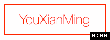
效果:
源码:
RDMBorderedButton.h + RDMBorderedButton.m
//
//  RDMBorderedButton.h
//  RDMBorderedButton
//
//  Created by Reese McLean on 6/12/14.
//  Copyright (c) 2014 Reese McLean. All rights reserved.
//

#import <UIKit/UIKit.h>

@interface RDMBorderedButton : UIButton

///Adjusting corner radius manually turns off automatic corner radius updating.
@property (nonatomic, assign) CGFloat cornerRadius;

///Determines whether the buttons corner radius is adjusting based on frame changes. Default = YES.
@property (nonatomic, assign) BOOL adjustsCornerRadiusBasedOnFrame;

///Approximate ratio of corner radius to smallest side of button frame. Default = 1.0/6.0.
@property (nonatomic, assign) CGFloat cornerRadiusRatioToSmallestSide;

@end
//
//  RDMBorderedButton.m
//  RDMBorderedButton
//
//  Created by Reese McLean on 6/12/14.
//  Copyright (c) 2014 Reese McLean. All rights reserved.
//

#import "RDMBorderedButton.h"

@implementation RDMBorderedButton

-(id) init {
    return [self initWithFrame:CGRectZero];
}

- (id)initWithFrame:(CGRect)frame {
    self = [super initWithFrame:frame];
    if (self) {
        // Initialization code
        [self commonSetup];
    }
    return self;
}

-(id) initWithCoder:(NSCoder *)aDecoder {
    self = [super initWithCoder:aDecoder];
    if (self) {

        NSAssert(self.buttonType == UIButtonTypeCustom, @"RDMBorderedButton's created in interface builder must be set to type custom.");

        [self commonSetup];
    }
    return self;
}

-(void) commonSetup {

    [self setTitleColor:self.tintColor forState:UIControlStateNormal];
    [self setTitleColor:[UIColor whiteColor] forState:UIControlStateHighlighted];
    [self setTitleColor:[UIColor grayColor] forState:UIControlStateDisabled];

    _adjustsCornerRadiusBasedOnFrame = YES;
    _cornerRadiusRatioToSmallestSide = 1.0/6.0;
    [self adjustCornerRadius];

    self.layer.cornerRadius = _cornerRadius;
    self.layer.borderWidth = 1.0;
    self.layer.borderColor = self.tintColor.CGColor;
}

-(void) layoutSubviews {
    [super layoutSubviews];
    if (self.adjustsCornerRadiusBasedOnFrame) {
        [self adjustCornerRadius];
    }
}

-(void) tintColorDidChange {
    [super tintColorDidChange];
    [self setTitleColor:self.tintColor forState:UIControlStateNormal];
    [self updateBorderAndFill];
}

-(void) adjustCornerRadius {
    _cornerRadius = roundf(MIN(CGRectGetHeight(self.frame), CGRectGetWidth(self.frame)) * self.cornerRadiusRatioToSmallestSide);
    self.layer.cornerRadius = _cornerRadius;
}

-(void) setTitleColor:(UIColor *)color forState:(UIControlState)state {

    if ([[self titleColorForState:state] isEqual:color]) {
        return;
    }

    [super setTitleColor:color forState:state];

    if (state == UIControlStateNormal) {
        self.tintColor = color;
    }

    [self updateBorderAndFill];
}

-(void) setTintColor:(UIColor *)tintColor {

    if ([[self tintColor] isEqual:tintColor]) {
        return;
    }

    [super setTintColor:tintColor];
    [self setTitleColor:self.tintColor forState:UIControlStateNormal];
    [self updateBorderAndFill];
}

-(void) setCornerRadius:(CGFloat)cornerRadius {
    self.adjustsCornerRadiusBasedOnFrame = NO;
    _cornerRadius = cornerRadius;
    self.layer.cornerRadius = _cornerRadius;
}

-(void) setEnabled:(BOOL)enabled {

    [super setEnabled:enabled];
    [self updateBorderAndFill];

}

-(void) updateBorderAndFill {
    self.layer.borderColor = self.enabled ? self.tintColor.CGColor : [self titleColorForState:UIControlStateDisabled].CGColor;
    self.backgroundColor = self.highlighted ? self.tintColor : [UIColor clearColor];
}

-(void) setHighlighted:(BOOL)highlighted {

    if (self.highlighted == highlighted) {
        return;
    }

    [super setHighlighted:highlighted];

    [UIView animateWithDuration:0.2f
                          delay:0.0f
                        options:UIViewAnimationOptionAllowUserInteraction | UIViewAnimationOptionBeginFromCurrentState
                     animations:^{
                         self.backgroundColor = highlighted ? self.tintColor : [UIColor clearColor];
                     }
                     completion:nil];

}

@end
显示的代码:
//
//  RootViewController.m
//
//  http://home.cnblogs.com/u/YouXianMing/
//
//  Copyright (c) 2014年 Y.X. All rights reserved.
//

#import "RootViewController.h"
#import "RDMBorderedButton.h"

@interface RootViewController ()

@end

@implementation RootViewController

- (void)viewDidLoad
{
    [super viewDidLoad];

    // 初始化
    RDMBorderedButton *button =
        [[RDMBorderedButton alloc] initWithFrame:CGRectMake(0, 0, 100, 30)];
    button.center             = self.view.center;

    // 设置圆角
    button.cornerRadius       = 1.f;

    // 设置字体
    button.titleLabel.font    = [UIFont fontWithName:@"HelveticaNeue-Thin"
                                                size:13.f];

    // 设置标题
    [button setTitle:@"YouXianMing"
            forState:UIControlStateNormal];

    // 设置标题颜色
    [button setTitleColor:[UIColor redColor]
                 forState:UIControlStateNormal];

    [self.view addSubview:button];
}

@end
附录:
Usage
In code: Use initWithFrame to create a button and add to a subview.
Interface Builder: Add a button as usual. Set the class to RDMBorderedButton — there are some bugs with iOS 7.1 that require you to set the buttom type to Custom in Interface Builder. Also note that you can use the "User Defined Runtime Attributes" in Interface Builder to set the corner radius (key: "cornerRadius"). The example project shows this with the black and yellow buttons.
Corner Radius
By default, RDMBorderedButton will adjusts the corner radius of its border based on its frame. You can turn this off with:
button.adjustsCornerRadiusBasedOnFrame = NO; //Default is YES
You can also change the ratio of the corner radius of this automatic adjustment:
button.cornerRadiusRatioToSmallestSide = 1.0/4.0; //Default is 1.0/6.0
Note that changes to Corner Radius will not be animated. If you would like a corner radius change to be animated you will need to animate the key path using CoreAnimation. See the programatic view controller in the example project to see an example of this.
The corner radius can be adjusted manually (this turns off automatic adjustments):
//This will forward the cornerRadius to the button's layer and turn off automatic adjustments
button.cornerRadius = 6.0;
The text and border color are adjusted together. For normal state they can be changed using either:
button.tintColor = [UIColor greenColor];
or:
[button setTitleColor:[UIColor greenColor] forState:UIControlStateNormal];
Disabled state can be adjusted using:
[button setTitleColor:[UIColor grayColor] forState:UIControlStateDisabled]; //Default is [UIColor grayColor]
The text color when highlighted should be changed using:
[self setTitleColor:[UIColor blueColor] forState:UIControlStateHighlighted]; //Default is [UIColor whiteColor]