CSS弹性布局(display:flex)
参考:
http://www.runoob.com/w3cnote/flex-grammar.html
https://www.jianshu.com/p/5856c4ae91f2
http://www.ruanyifeng.com/blog/2015/07/flex-grammar.html
https://www.cnblogs.com/xuyuntao/articles/6391728.html
主要内容:
父级:
    display:flex;

    (兼容绝大部分浏览器):-webkit-     真实工作下使用postCss插件-自动添加浏览器兼容
    display: -webkit-flex; /* Safari */
    display: flex;
    *如果使用了弹性布局,子元素不需要使用浮动float

    父级身上的常用属性:
        justify-content:    子元素水平排列
            flex-start(默认)    从左开始
            flex-end    从右开始
            center    居中!!
            space-between    两端对齐
            space-around    子元素张开手分布

        align-items        子元素垂直排列
            flex-start(默认)    从上开始
            flex-end    从下开始
            center    居中!!
            stretch(默认值):如果项目未设置高度或设为auto,将占满整个容器的高度
            baseline: 项目的第一行文字的基线对齐

        align-content        多行子元素垂直排列
            flex-start:        与交叉轴的起点对齐。
            flex-end:            与交叉轴的终点对齐。
            center:            与交叉轴的中点对齐。
            space-between:     与交叉轴两端对齐,轴线之间的间隔平均分布。
            space-around:        每根轴线两侧的间隔都相等。所以,轴线之间的间隔比轴线与边框的间隔大一倍。
            stretch(默认值):    轴线占满整个交叉轴。

        flex-flow(基本不用,面试可能会提到)
            flex-flow属性是flex-direction属性和flex-wrap属性的简写形式,默认值为row nowrap
            flex-flow: <flex-direction> <flex-wrap>;
            举例:flex-flow:column wrap;

        flex-direction    子元素排列方向
            row(默认值):主轴为水平方向,起点在左端。
            row-reverse:主轴为水平方向,起点在右端。
            column:主轴为垂直方向,起点在上沿。
            column-reverse:主轴为垂直方向,起点在下沿。

        flex-wrap        子元素一行排不下如何换行
            nowrap(默认):不换行
            wrap:换行,第一行在上方
            wrap-reverse:换行,第一行在下方

    子集身上的属性:
        flex    是flex-grow, flex-shrink 和 flex-basis的简写,默认值为0 1 auto。后两个属性可选
            将行分为定义比例的几份
            *子元素在划分父元素宽度,先刨除固定宽度

        align-self        允许单个子元素有与其他项目不一样的垂直对齐方式,可覆盖align-items属性
            .item {
                align-self: auto | flex-start | flex-end | center | baseline | stretch;
                    }

        flex-grow        定义子元素的放大比例,默认为0,即如果存在剩余空间,也不放大
            .item {
                flex-grow: <number>;     /* default 0 */        <number>只代表缩放系数
                    }

        order        定义子元素的排列顺序。数值越小,排列越靠前,默认为0
            .item {
                  order: <integer>;
                }
练习案例:


<!DOCTYPE html>
<html lang="en">
<head>
    <meta charset="UTF-8">
    <title>flex布局案例-淘宝底部导航栏</title>
    <link rel="stylesheet" href="bootstrap/css/bootstrap.css">
    <style>
        * {
            margin: 0;
            padding: 0;
            list-style: none;
        }
        .footer-nav{
            width: 100%;
            height: 60px;
            background-color: grey;
            display: flex;
            position: absolute;
            left: 0;
            bottom: 0;
        }
        .footer-nav .tab{
            width: 20%;
            box-sizing: border-box;
            border-left: 1px solid red;
            flex: 1;
            text-align: center;
            line-height: 30px;
            font-size: 16px;
            color: white;
        }
        .footer-nav .tab .tab-icon{
           height: 30%;
        }
    </style>
</head>
<body>
<div class="footer-box">
<div class="footer-nav">
    <span class="tab">
        <span class="tab-icon glyphicon glyphicon-home"></span>
        <p class="text">首页</p>
    </span>
    <span class="tab">
        <span class="tab-icon glyphicon glyphicon-shopping-cart"></span>
        <p class="text">购物车</p>
    </span>
    <span class="tab">
        <span class="tab-icon glyphicon glyphicon-list-alt"></span>
        <p class="text">订单列表</p>
    </span>
    <span class="tab">
        <span class="tab-icon glyphicon glyphicon-user"></span>
        <p class="text">我的淘宝</p>
    </span>
    <span class="tab">
        <span class="tab-icon glyphicon glyphicon-option-horizontal"></span>
        <p class="text">更多</p>
    </span>
    <span class="tab">
        <span class="tab-icon glyphicon glyphicon-grain"></span>
        <p class="text">欢度清明</p>
    </span>
</div>
</div>
</body>
</html>
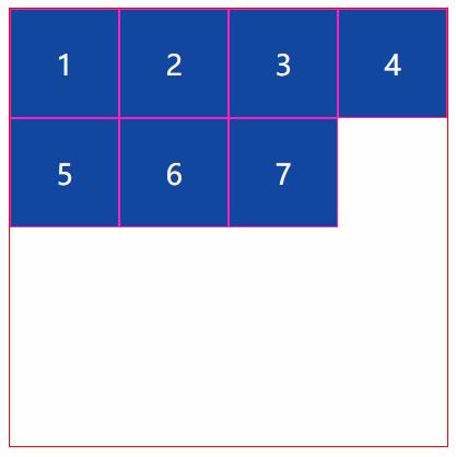
<!DOCTYPE html>
<html lang="en">
<head>
    <meta charset="UTF-8">
    <title>Title</title>
    <link rel="stylesheet" href="style/flex-1.css">
</head>
<body>
    <div class="outer">
        <div class="item div1">1</div>
        <div class="item div2">2</div>
        <div class="item div3">3</div>
        <div class="item div4">4</div>
        <div class="item">5</div>
        <div class="item">6</div>
        <div class="item">7</div>
    </div>
</body>
</html>
*{
    margin: 0;
    padding: 0;
    list-style: none;
}
.outer{
    width: 500px;
    height: 500px;
    border: 1px solid red;
    margin: 30px auto;
    display: flex;
    flex-wrap: wrap;
    align-content:flex-start;
}
.item{
    width: 125px;
    border: 1px solid #ff1bbe;
    background-color: #0D47A1;
    height: 125px;
    box-sizing: border-box;
    font-size: 32px;
    color: white;
    line-height: 125px;
    text-align: center;
    align-content: flex-start;
}
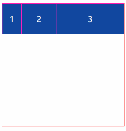
<!DOCTYPE html>
<html lang="en">
<head>
    <meta charset="UTF-8">
    <title>Title</title>
    <style>
        * {
            margin: 0;
            padding: 0;
            list-style: none;
        }
        .outer {
            width: 500px;
            height: 500px;
            border: 1px solid red;
            margin: 30px auto;
            display: flex;
            flex-wrap: wrap;
            align-content: flex-start;
        }
        .item {
            border: 1px solid #ff1bbe;
            background-color: #0D47A1;
            height: 125px;
            box-sizing: border-box;
            font-size: 32px;
            color: white;
            line-height: 125px;
            text-align: center;
        }
        .div1{width: 80px}
        .div2{flex: 1}
        .div3{flex: 2}
    </style>
</head>
<body>
    <div class="outer">
        <div class="item div1">1</div>
        <div class="item div2">2</div>
        <div class="item div3">3</div>

    </div>
</body>
</html>
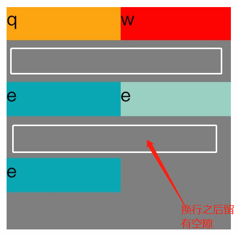
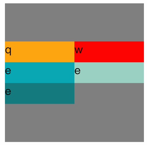
<!DOCTYPE=html>
<html lang="zh-cn">
<head>
<meta charset="UTF-8">
<title>
关于文档元素测试
</title>
<style>

#father{

    width:200px;
    display:flex;
    flex-direction:row;
    flex-wrap:wrap;
    align-content:center;
    height:200px;
    background-color:grey;
}
.son1{

    height:30px;
    width:100px;
    background-color:orange;
}

.son2{

    height:30px;
    width:100px;
    background-color:red;
}

.son3{
    height:30px;
    width:100px;
    background-color:#08a9b5;
}


.son4{
    height:30px;
    width:100px;
    background-color:#9ad1c3;
}

.son5{

    height:30px;
    width:100px;
    background-color:rgb(21,123,126);
}
</style>
</head>
<body>

<div id="father">
    <div class="son1">q</div>
    <div class="son2">w</div>
    <div class="son3">e</div>
    <div class="son4">e</div>
    <div class="son5">e</div>
</div>

</body>
</html>