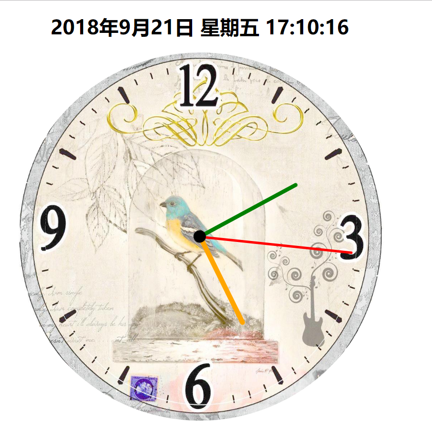
先看一下效果图,背景表盘是一个底图。选一个漂亮的底图,整体钟表效果还是不错的。
下边上代码
<!DOCTYPE html>
<html lang="zh">

	<head>
		<meta charset="UTF-8" />
		<meta name="viewport" content="width=device-width, initial-scale=1.0" />
		<meta http-equiv="X-UA-Compatible" content="ie=edge" />
		<title>钟表</title>
		<style>
			body,
			html {
				margin: 0;
			}

			.location {
				position: relative;
				 600px;
				height: 600px;
				left: calc(50% - 300px);
			}

			.dial {
				 600px;
				height: 600px;
				margin: 0 auto;
				position: absolute;
				border-radius: 50%;
				overflow: hidden;
				background-color: rgba(153, 50, 204, 0.2);
				background-image: url(clock.jpg);
				background-size: 100% 100%;
			}

			.bigdiv {
				 600px;
				height: 600px;
				margin: 0 auto;
				position: absolute;
				border-radius: 50%;
				overflow: hidden;
			}

			.bigdiv>div {
				position: absolute;
				left: 298px;
				border-radius: 100px;
			}

			.bigdiv1 {
				animation: moves 60s steps(60) infinite;
			}

			.bigdiv1 .secondHand {
				 4px;
				height: 250px;
				background-color: red;
				top: 50px;
				left: 298px;
			}

			.bigdiv2 {
				animation: moves 3600s steps(3600) infinite;
			}

			.bigdiv2 .minuteHand {
				 6px;
				height: 180px;
				background-color: green;
				top: 120px;
				left: 297px;
			}

			.bigdiv3 {
				animation: moves 216000s steps(216000) infinite;
			}

			.bigdiv3 .hourHand {
				 8px;
				height: 160px;
				background-color: orange;
				top: 140px;
				left: 296px;
				border-radius: 100px;
			}

			.bigdiv .center {
				top: 290px;
				left: 290px;
				 20px;
				height: 20px;
				background-color: black;
				z-index: 2;
			}

			@keyframes moves {
				from {
					transform: rotateZ(0deg);
				}
				to {
					transform: rotateZ(360deg);
				}
			}

			#dateshow {
				text-align: center;
			}
		</style>
	</head>

	<body>
		<h1 id="dateshow"></h1>
		<div class="location">
			<div class="dial">
			</div>
			<div class="bigdiv bigdiv1" id="secondHand">
				<div class="secondHand"></div>
			</div>
			<div class="bigdiv bigdiv2" id="minuteHand">
				<div class="minuteHand"></div>
			</div>
			<div class="bigdiv bigdiv3" id="hourHand">
				<div class="center"></div>
				<div class="hourHand"></div>
			</div>
		</div>
		<script>
			var dateshow = document.getElementById("dateshow");
			var clock = {
				weeks: ["一", "二", "三", "四", "五", "六", "日"],
				getDate: function() {
					date = new Date();
					year = date.getFullYear();
					month = date.getMonth() + 1;
					day = date.getDate();
					hours = date.getHours();
					minutes = date.getMinutes();
					seconds = date.getSeconds();
					week = date.getDay(); // 星期
					dateText = year + "年" + month + "月" + clock.format(day) + "日 星期" + clock.formatnum(week) + " " +
						clock.format(hours) + ":" + clock.format(minutes) + ":" + clock.format(seconds);
					return dateText;
				},
				format: function(data) {
					if(data.toString().length == 1) {
						data = "0" + data;
					};
					return data;
				},
				formatnum: function(num) {
					return clock.weeks[num - 1];
				},
				showdate: function() {
					dateshow.innerText = clock.getDate();
				},
				go: function() {
					var secondHand = document.getElementById("secondHand");
					var minuteHand = document.getElementById("minuteHand");
					var hourHand = document.getElementById("hourHand");
					date = new Date();
					hours = date.getHours();
					minutes = date.getMinutes();
					seconds = date.getSeconds();
					var secondAngle = seconds;
					var minuteAngle = minutes * 60 + seconds;
					var hourAngle = (60 / 12) * ((hours % 12) * 3600 + minuteAngle);
					hourHand.style.cssText = "animation-delay: -" + hourAngle + "s";
					minuteHand.style.cssText = "animation-delay: -" + minuteAngle + "s";
					secondHand.style.cssText = "animation-delay: -" + secondAngle + "s";
				}

			}
			clock.go();
			clock.showdate();
			setInterval("clock.showdate()", 1000);
		</script>
	</body>

</html>