-
水平居中
- 行内元素:
text-align: center - 块级元素:
margin: 0 auto absolute + transformflex + justify-content: center
- 行内元素:
-
垂直居中
line-height: heightabsolute + transformflex + align-items: centertable
-
水平垂直居中
absolute + transformflex + justify-content + align-items
一 绝对定位与负边距
<!--兼容性不错,缺陷就是必须提前知道被居中块级元素的大小-->
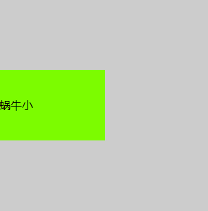
<!DOCTYPE html>
<html>
<head>
    <meta charset="utf-8">
    <title>绝对定位与负边距</title>
    <style>
        .box {
            width: 300px;
            height: 300px;
            background: #ccc;
            position: relative;
        }
        .child {
            width: 150px;
            height: 100px;
            background: lawngreen;
            position: absolute;
            top: 50%;
            margin: -50px 0 0 0;   /*50px为child高度的一半*/
            line-height: 100px;
        }
    </style>
</head>
<body>
    <div class="box">
        <div class="child">蜗牛小</div>
    </div>
</body>
</html>
二 使用绝对定位和transform
<!--不必提前知道被居中元素的尺寸了,translate偏移的百分比就是相对于元素自身的尺寸而言-->
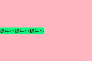
<!DOCTYPE html>
<html>
<head>
    <meta charset="utf-8">
    <title>使用绝对定位和transform</title>
    <style>
        .box {
            width: 300px;
            height: 200px;
            background: lightpink;
            position: relative;
        }
        .child {
            background: springgreen;
            position: absolute;
            top: 50%;
            transform: translate(0, -50%);
        }
    </style>
</head>
<body>
<div class="box">
    <div class="child">
        蜗牛小蜗牛小蜗牛小
    </div>
</div>
</body>
</html>
三 绝对定位结合margin: auto
<!--居中元素的宽高也可以不设置,但不设置的话就必须是图片这种自身就包含尺寸的元素, 否则无法实现-->
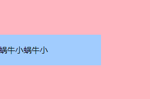
<!DOCTYPE html>
<html>
<head>
    <meta charset="utf-8">
    <title>绝对定位结合margin: auto</title>
    <style>
        .box {
            width: 300px;
            height: 200px;
            background: lightpink;
            position: relative;
        }
        .child {
            width: 200px;
            height: 60px;
            background: #A1CCFE;
            position: absolute;
            top: 0;
            bottom: 0;
            margin: auto;
            line-height: 60px;
        }
    </style>
</head>
<body>
    <div class="box">
        <div class="child">蜗牛小蜗牛小</div>
    </div>
</body>
</html>
四 使用flex布局
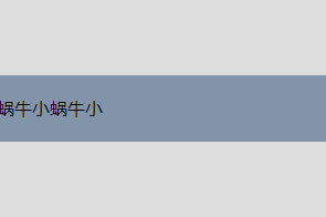
<!DOCTYPE html>
<html>
<head>
    <meta charset="utf-8">
    <title>使用flex布局</title>
    <style>
        .box {
            width: 300px;
            height: 200px;
            background: #ddd;
            display: flex;
            align-items: center;
        }
        .child {
            width: 300px;
            height: 60px;
            background: #8194AA;
            line-height: 60px;
        }
    </style>
</head>
<body>
<div class="box">
    <div class="child">
        蜗牛小蜗牛小
    </div>
</div>
</body>
</html>
五 使用 line-height 和 vertical-align 对图片进行垂直居中
<!DOCTYPE html>
<html>
    <head>
        <meta charset="utf-8">
        <title>使用 line-height 和 vertical-align 对图片进行垂直居中</title>
        <style>
            .box{
                width: 300px;
                height: 200px;
                background: #ddd;
                line-height: 200px;
            }
            .box img {
                vertical-align: middle;
            }
        </style>
    </head>
    <body>
        <div class="box">
            <img src="tip.png" alt="请添加图片">
        </div>
    </body>
</html>