python主流绘图工具:matplotlib ,seaborn,pandas ,openpyxl ,xslwriter
openpyxl :首先说下这个官网的demo,看的有点懵,没有具体说明多个图在一个excel引用不通ws Rererence 只是简单的一个deepcopy 用的一点懵逼,反正我是没看懂,其次多sheet写入也未做拓展,
看了下博客哪些水军一篇粘贴复制毫无新意:
下面以openpyxl 3d bar 柱状图为例:演示效果多sheet 生成柱状图:
官网:https://openpyxl.readthedocs.io/en/latest/charts/bar.html#d-bar-charts
from openpyxl import Workbook
from openpyxl.chart import (
    Reference,
    Series,
    BarChart3D,
)


def bar_3d(configurations: dict):
    """"
    paint 3d bar in the excel ,
    configuration={"data":None,"Title":None,"sheet_name":None,"index":None}
    data:[
    [姓名,column1,column2],
    [value_name,value_col1,value_col2],
    [value_name2,value_column2,value_column2]
    ]
    """
    wb = Workbook()
    for configuration in configurations:
        sheet = configuration["sheet_name"]
        ws = wb.create_sheet(sheet, index=configuration["index"])
        rows = configuration["data"]
        rows.insert(0, configuration["axis_x"])
        for row in rows:
            ws.append(row)
        data = Reference(ws, min_col=2, min_row=1, max_col=3, max_row=7)
        titles = Reference(ws, min_col=1, min_row=2, max_row=7)
        chart = BarChart3D()
        chart.title = configuration["Title"]
        chart.add_data(data=data, titles_from_data=True)
        chart.set_categories(titles)
        chart.height=16
        chart.width=28
        chart.shape="box"

        ws.add_chart(chart, "E5")
    save_path = "test_static.xlsx"
    wb.save(save_path)
解释参数:configurations 是一个存放许多configranition 的列表:每个configration 结构如注释:
configuration={"data":None,"Title":None,"sheet_name":None,"index":None}
    data:[

    [value_name,value_col1,value_col2],
    [value_name2,value_column2,value_column2]
    ]
data就是要写入的数据包含header 和value,data[0]是表头,data[1:]全部是数据,index代表插入excel的sheet的index也就是第几个sheet,Title是绘制柱状图的title:
chart.height是图表的高度,width是宽度,add_chart 是插入chart 方法“E5"指定在excel插入位置,
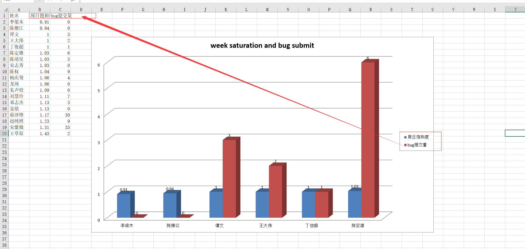
rows.insert(0, configuration["axis_x"]) 这里插入是type分类的名称也就是rows.insert(0,[姓名,column1,column2])
,看个实际效果吧这个type就对应周日饱和,和bug提交量两列
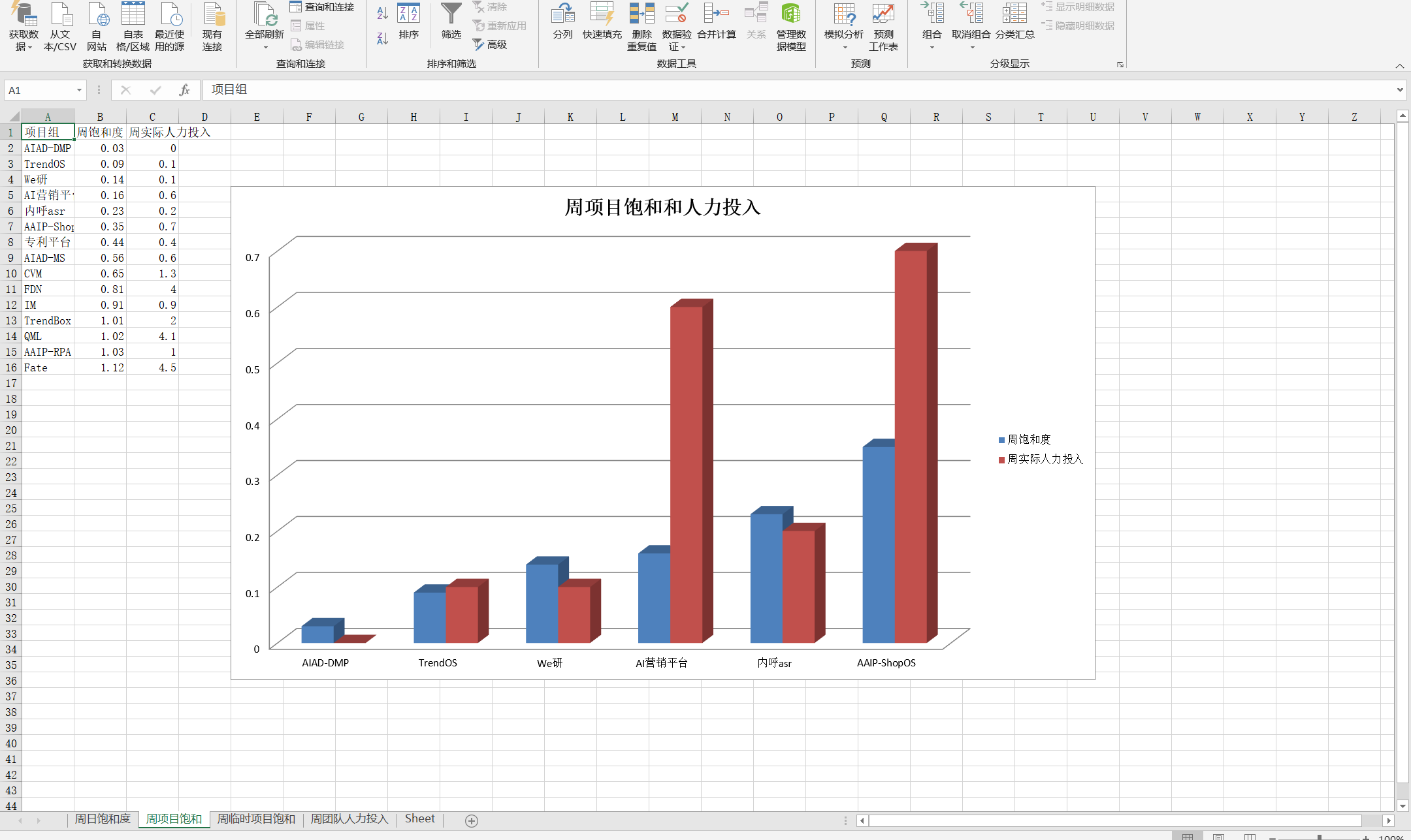
多个sheet查看:
第二部分:使用pandas 绘图结合xslwriter:
官网:https://xlsxwriter.readthedocs.io/example_pandas_chart_columns.html
我就直接上代码了数据自己造了个用pandas:
import pandas as pd


def panda_chart(df_list, cols, title_x, title_y):
    """
    data of narray
    index of data_frame:  [0,1,2,3]
    cols numbers of static columns
    """

    writer = pd.ExcelWriter('pandas_chart_columns2.xlsx', engine='xlsxwriter')
    for i, df in enumerate(df_list):
        # df = pd.DataFrame(data, index=None, columns=["姓名", "饱和度", "人力"])
        sheet_name = f'Sheet{i}'
        df.to_excel(writer, sheet_name=sheet_name,index=False)
        workbook = writer.book
        worksheet = writer.sheets[sheet_name]
        chart = workbook.add_chart({'type': 'column'})
        # set colors for the chart each type .
        colors = ['#E41A1C', '#377EB8']  # , '#4DAF4A', '#984EA3', '#FF7F00']
        # Configure the series of the chart from the dataframe data.
        for col_num in range(1, cols + 1):
            chart.add_series({
                'name':       [f'{sheet_name}', 0, col_num],
                'categories': [f'{sheet_name}', 1, 0, 4, 0],  # axis_x start row ,start col,end row ,end col
                'values':     [f'{sheet_name}', 1, col_num, 4, col_num],  # axis_y value of
                'fill':       {'color':  colors[col_num - 1]},  # each type color choose
                'overlap': -10,
            })

        # Configure the chart axes.
        chart.set_x_axis({'name': f'{title_x}'})
        chart.set_y_axis({'name': f'{title_y}', 'major_gridlines': {'visible': False}})
        chart.set_size({'width': 900, 'height': 400})
        # Insert the chart into the worksheet.
        worksheet.insert_chart('H2', chart)
    writer.save()

if __name__ == '__main__':
    data=[("a",2,4),("b",5,7)]
    df = pd.DataFrame(data, index=None, columns=["姓名", "饱和度", "人力"])
    panda_chart([df],2,"title x","title y")
