1、线性渐变
代码:
<!DOCTYPE html>
<html>
<head>
<meta charset="utf-8">
	<title>gradient -- 线性渐变(单个浏览器)</title>
	<style type="text/css">
		div{
			 400px;
			height: 150px;
			border: 1px solid #666;
			line-height: 150px;
			text-align: center;
			font-size: 30px;
			color: #fff;
			margin: 10px auto;
		}
		.toTop{
			background: -webkit-linear-gradient(to top,red,orange,yellow,green,blue,pink);
			background: linear-gradient(to top,red,orange,yellow,green,blue,pink);
		}
		.toTop-deg{
			background: -webkit-linear-gradient(0deg,orange,green);
			background: linear-gradient(to top,red,orange,yellow,green,blue,pink);
		}
		.toTop-deg2{
			background: -webkit-linear-gradient(90deg,orange,green);
            background: linear-gradient(to top,red,orange,yellow,green,blue,pink);
		}
		.toTop-deg3{
			background: -webkit-linear-gradient(-360deg,orange,green);
            background: linear-gradient(to top,red,orange,yellow,green,blue,pink);
		}
	</style>
</head>
<body>
     <div class="toTop">top</div>
     <div class="toTop-deg">0 deg</div>
     <div class="toTop-deg2">360deg</div>
     <div class="toTop-deg3">-360deg</div>
</body>
</html>
效果:
总结:
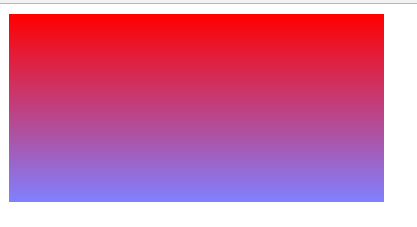
2、渐变兼容
代码:
<!DOCTYPE html>
<html>

<head>
    <title>gradient----线性渐变(兼容多个浏览器)</title>
    <style type="text/css">
    .gradient {
         300px;
        height: 150px;

        filter: alpha(opacity=100 finishopacity=50 style=1 startx=0, starty=0, finishx=0, finishy=150) progid:DXImageTransform.Microsoft.gradient(startcolorstr=red, endcolorstr=blue, gradientType=0);
        -ms-filter: alpha(opacity=100 finishopacity=50 style=1 startx=0, starty=0, finishx=0, finishy=150) progid:DXImageTransform.Microsoft.gradient(startcolorstr=red, endcolorstr=blue, gradientType=0);
        /*IE8*/
        background: red;
        /* 一些不支持背景渐变的浏览器 */
        background: -moz-linear-gradient(top, red, rgba(0, 0, 255, 0.5));
        background: -webkit-gradient(linear, 0 0, 0 bottom, from(#ff0000), to(rgba(0, 0, 255, 0.5)));
        background: -o-linear-gradient(top, red, rgba(0, 0, 255, 0.5));
    }
    </style>
</head>

<body>
    <div class="gradient"></div>
</body>

</html>
效果:
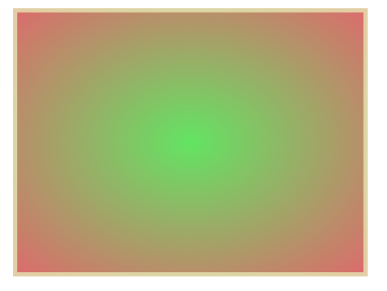
3、径向渐变
代码:
<!DOCTYPE html>
<html>
<head>
<meta charset="utf-8">
	<title>径向渐变</title>
	<style type="text/css">
		div{
			 400px;
			height: 300px;
			margin: 50px auto;
			border: 5px solid hsla(60,50%,80%,0.8);
			background: -webkit-radial-gradient(hsla(120,70%,60%,0.9),hsla(360,60%,60%,0.9));
			background: radial-gradient(hsla(120,70%,60%,0.9),hsla(360,60%,60%,0.9));
		}
	</style>
</head>
<body>
     <div></div>
</body>
</html>
效果: