1.折线面积图加颜色
series =  [
        {
            name:'进项金额',
            type:'line',
            color:'#008DFF',
            itemStyle: {normal: {
                areaStyle: {type: 'default'}
            }},
            data:[120, 132, 101, 134, 90, 230, 210,220, 182, 191, 234, 290],
        },
        {
            name:'进项税额',
            type:'line',
            color:'rgba(0,189,177,1)',
            itemStyle: {normal: {areaStyle: {type: 'default'}}},//把折线图变为折线面积图
            data:[220, 182, 191, 234, 290, 330, 310,120, 132, 101, 134, 90]
        }
    ];
2.折线面积图颜色渐变
series = [
        {
            name:'开票数量',
            type:'line',
            smooth:true, //折线曲线平滑
            color:'#008DFF',
            itemStyle: {normal: {areaStyle: {type: 'default',color: new echarts.graphic.LinearGradient(0, 0, 0, 1, [{

                offset: 0,
                color: 'rgba(0,193,255,0.53)'
            },{
                offset: 1,
                color: 'rgba(0,141,255,0.30)'
            }])
        }}},
            data:[12, 13, 10, 14, 20, 23, 21,22, 18, 19, 23, 29]
        },
    ]
3.圆角的柱状图
itemStyle : { emphasis: {barBorderRadius: 6},normal: {label : {show: true, position: 'top'},barBorderRadius:6}},
label : {show: true, position: 'top'}//每个柱上面展示数据
series = [
        {
            name:'销项金额',
            type:'bar',
            itemStyle : { emphasis: {barBorderRadius: 6},normal: {label : {show: true, position: 'top'},barBorderRadius:6}},
            color:'#008DFF',
            data:[220, 182, 191, 234, 290, 330, 310,120, 132, 101, 134, 90]
        },
        {
            name:'进项金额',
            type:'bar',
            itemStyle : { emphasis: {barBorderRadius: 6},normal: {label : {show: true, position: 'top'},barBorderRadius:6}},
            color:'#F5A623',
            data:[12, 13, 10, 14, 20, 23, 21,22, 18, 19, 23, 29]
        },
        {
            name:'销项税额',
            type:'bar',
            itemStyle : { emphasis: {barBorderRadius:6},normal: {label : {show: true, position: 'top'},barBorderRadius:6}},
            color:'#6ECFF4',
            data:[120, 123, 130, 144, 220, 23, 21,22, 18, 19, 23, 29]
        },
        {
            name:'进项税额',
            type:'bar',
            itemStyle : { emphasis: {barBorderRadius: 6},normal: {label : {show: true, position: 'top'},barBorderRadius:6}},
            color:'#FEDC66 ',
            data:[120, 133, 140, 14, 20, 23, 21,22, 18, 19, 23, 29]
        }
    ]
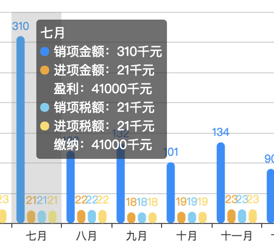
4.自定义鼠标移上提示框
tooltip : {
            trigger: 'axis',
            formatter: function(datas)
              {
                  var res=datas[0].name + '<br/>', val;
                  for(var i = 0, length = datas.length; i < length; i++) {
                    val = (datas[i].value) + '千元';
                      var html = '<span style="display:inline-block;10px;height:10px;border-radius:50%; background:'+barColorFun(datas[i].seriesName)+'"></span> '+datas[i].seriesName + ':' + val + '<br/>';
                      var zj =   '<span style="display:inline-block;10px;height:10px;border-radius:50%; opacity:0;"></span> ';
                      if (i == 1) {
                            valT = (41000)+'千元';
                            res+=html + zj+'盈利:'+valT+'<br/>'
                        }else{
                            if(i == 3){
                                valT = (41000)+'千元';
                                res+=html+zj+'缴纳:'+valT+'<br/>'
                            }else{
                                    res += html;
                                  }
                        }
                    }
                    return res;
               },
            axisPointer : {
                type : 'shadow'
            }
        },
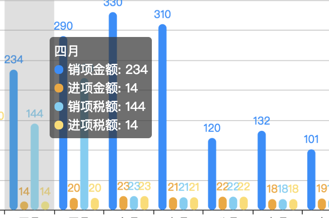
不加formatter时,鼠标移上展示:
自定义formatter后,鼠标移上展示:
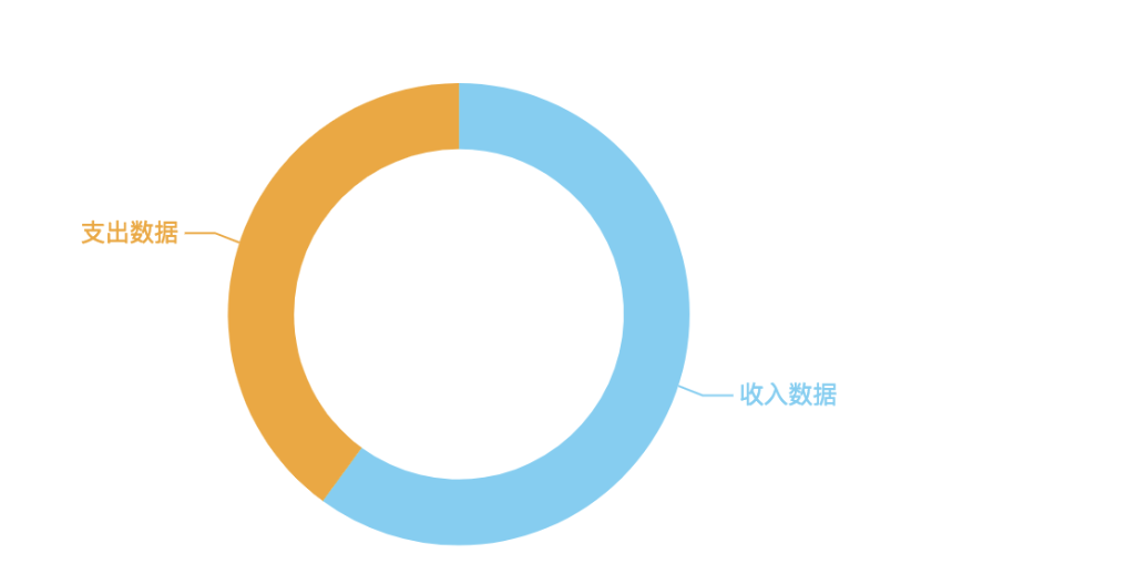
5.改变饼图的连接线长度
series : [
            {
                name:'',
                type:'pie',
                radius : ['50%','70%'],//写两个是环形图
                center: ['46%', '60%'],//饼图的位置
                label: {show: true},
                labelLine: {show:true,length:10},   //改变连接线的长度
                data:piedata
            }
        ]
6.图表的位置
grid:{
            left:'20px',
            right:'30px',
            top:'35px',
            bottom:'50px',
            containLabel: true(若不加这句,则图表距离左边20px,当数值过大时数值会遮挡,加上此句,则y轴始终距离左边20px;
        },