一、垂直导航栏
(1)基础版
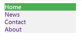


<!DOCTYPE html>
<head>
    <meta charset="utf-8" name="viewport" content="width=device-width,initial-scale=1.0">
    <title>垂直导航栏</title>
    <style>
        * {  box-sizing: border-box; }

        ul{
            list-style-type: none;margin: 0;padding: 0;
            width: 200px;/*3(搭配4用)、设置ul宽度*/
            background-color: #f1f1f1;/*5(搭配6用)、创建背景色为灰色的基础垂直导航栏*/
        }
        li a{
            text-decoration: none;padding: 0 0;
            display: block;/*4、设置a标签显示为块元素->将占据可用的全部宽度,使整个链接区域都可以被单击(而不仅仅是文本)*/
        }
        li a:hover:not(.active){/*9(搭配7用)、设置伪类:not(.active),只对类名非active的元素生效。*/
            background-color: #555;color: white;/*6、在用户将鼠标移到链接上时,改变链接的背景色*/
        }
        li a.active{
            background-color: #4CAF50;color: white;/*7、向当前链接添加 "active" 类,以使用户知道他/她在哪个页面上*/
        }

    </style>
</head>
<body>
    <ul class="topnav">
        <li><a class="active" href="#">Home</a></li><!--8(搭配7用)、添加class="active"-->
        <li><a href="#">News</a></li>
        <li><a href="#">Contact</a></li>
        <li><a href="#">About</a></li>
    </ul>
</body>
(2)居中链接以及添加边框

<!--在垂直导航栏上进行二次修改-->
<!DOCTYPE html>
<head>
    <meta charset="utf-8" name="viewport" content="width=device-width,initial-scale=1.0">
    <title>垂直导航栏:居中链接以及添加边框</title>
    <style>
        * {  box-sizing: border-box; }

        ul{
            list-style: none;margin: 0;padding: 0;
            width:200px;
            background-color: #F1F1F1;
            border: 1px solid #555;/*11、在导航栏周围添加边框*/
        }
        li a{
            text-decoration: none;padding: 0 0;
            display: block;
        }
        li a:hover:not(.active){
            background-color: #5F5F5F;color: white;
        }
        li a.active{
            background-color: #008CBA;color: white;
        }
        li{
            text-align: center;/*10、居中链接*/
            border-bottom: 1px solid #555;/*12(搭配11用)、在导航栏内添加边框*/
        }
        li:last-child{
            border-bottom: none;/*13(搭配12用)、最后一个元素除外*/
        }
    </style>
</head>
<body>
    <ul class="topnav">
        <li><a class="active" href="#">Home</a></li>
        <li><a href="#">News</a></li>
        <li><a href="#">Contact</a></li>
        <li><a href="#">About</a></li>
    </ul>
</body>
(3)全高固定

<!--在垂直导航栏上进行二次修改-->
<!DOCTYPE html>
<head>
    <meta charset="utf-8" name="viewport" content="width=device-width,initial-scale=1.0">
    <title>垂直导航栏:全高固定(创建全高的“粘性”侧面导航:)</title>
    <style>
        * {  box-sizing: border-box; }

        ul{
            list-style-type: none;margin: 0;padding: 0;
            width: 200px;
            background-color: #F1F1F1;
            height: 100%;/*10、全高*/
            position: fixed;/*11(搭配10用,才有全高效果)使它产生粘性,即使在滚动时*/
            overflow: auto;/*12如果导航栏的内容太多,则启用滚动条*/
        }
        li a{
            text-decoration: none;padding: 0 0;
            display: block;
        }
        li a:hover:not(.active){
            background-color: #333333;color: white;
        }
        li a.active{
            background-color: #008CBA;color: white;
        }

        div.content{/*14(搭配13用)*/
            background-color: thistle;
            margin-left: 200px;
        }
    </style>
</head>
<body>
    <ul class="topnav">
        <li><a class="active" href="#">Home</a></li>
        <li><a href="#">News</a></li>
        <li><a href="#">Contact</a></li>
        <li><a href="#">About</a></li>
    </ul>

    <div class="content"><!--13、添加一个div,做测试-->
        <h2>请尝试滚动此区域,并查看 sidenav 如何粘在页面上。</h2>
        <p>请注意,此 div 元素的左外边距为 25%。这是因为侧导航栏被设置为 25% 宽。如果删除这个外边距,则 sidenav 将叠加到该 div 上。</p>
        <p>还要注意,我们已为 sidenav 设置 overflow:auto。如果 sidenav 太长时(例如,如果其中有超过 50 个链接),会添加滚动条。</p>
        <p>Some text..</p>
        <p>Some text..</p>
        <p>Some text..</p>
        <p>Some text..</p>
        <p>Some text..</p>
        <p>Some text..</p>
        <p>Some text..</p>
    </div>
</body>
二、水平导航栏
(1)基础版
<!--在垂直导航栏上进行二次修改得到的水平导航栏-->
<!DOCTYPE html>
<head>
    <meta charset="utf-8" name="viewport" content="width=device-width,initial-scale=1.0">
    <title>水平导航栏</title>
    <!--<style>
        ul{
            list-style-type: none;margin: 0;padding: 0;
            100%;/*13(搭配11用)*/
            background-color: #333333;
        }
        li a{
            text-decoration: none;padding: 0 0;
            /*display: block;*//*12(搭配11用)*/
            color: white;
        }
        li a:hover:not(.active){
            background-color: black;
        }
        li a.active{
            background-color: #008CBA;
        }
        li{
            text-align: center;/*10、居中链接*/
            display: inline;/*11、构建水平导航栏的两个方法之一【行内列表项】:将 <li> 元素的display属性指定为 inline*/
                            /*不推荐【行内列表项】方式实现水平导航栏,因为实际效果会出现每两个列表项之间存在间隙的问题*/
        }
    </style>-->
    <style>
        * {  box-sizing: border-box; }

        ul{
            list-style-type: none;margin: 0;padding: 0;
            width:100%;/*13(搭配14用)*/
            background-color: #333333;
            overflow: hidden;/*15(搭配14用)*/
        }
        li a{
            text-decoration: none;padding: 8px 8px;
            display: block;
            color: white;
        }
        li a:hover:not(.active){
            background-color: black;
        }
        li a.active{
            background-color: #008CBA;
        }
        li{
            float: left;/*14、构建水平导航栏的两个方法之一【浮动列表项】:浮动 <li> 元素*/
        }
    </style>
</head>
<body>
    <ul class="topnav">
        <li><a class="active" href="#">Home</a></li>
        <li><a href="#">News</a></li>
        <li><a href="#">Contact</a></li>
        <li><a href="#">About</a></li>
    </ul>
</body>
(2)边框分隔栏
<!--在水平导航栏上进行二次修改-->
<!DOCTYPE html>
<head>
    <meta charset="utf-8" name="viewport" content="width=device-width,initial-scale=1.0">
    <title>水平导航栏:边框分隔栏</title>
    <style>
        * {  box-sizing: border-box; }

        ul{
            list-style-type: none;margin: 0;padding: 0;
            width: 100%;
            background-color: #333333;
            overflow: hidden;
        }
        li a{
            text-decoration: none;padding: 8px 8px;
            display: block;
            color:white;
        }
        li a:hover:not(.active){
            background-color: black;
        }
        li a.active{
            background-color: #008CBA;
        }
        li{
            float: left;
            border-right: 1px solid #bbb;/*16、为所有列表项添加灰色右边框,以创建链接分隔符*/
        }
        li:last-child{/*17(搭配16用)、最后一项(last-child)除外 */
            border-right: none;
        }
    </style>
</head>
<body>
    <ul class="topnav">
        <li><a class="active" href="#">Home</a></li>
        <li><a href="#">News</a></li>
        <li><a href="#">Contact</a></li>
        <li style="float: right;"><a href="#">About</a></li>
    </ul>
</body>
(3)固定的导航栏

<!--在水平导航栏上进行二次修改-->
<!DOCTYPE html>
<head>
    <meta charset="utf-8" name="viewport" content="width=device-width,initial-scale=1.0">
    <title>水平导航栏:固定的导航栏</title>
    <style>
        * {  box-sizing: border-box; }

        ul{
            list-style-type: none;margin: 0;padding: 0;
            width: 100%;
            background-color: #333333;
            overflow: hidden;
        }
        li a{
            text-decoration: none;padding: 8px 8px;
            display: block;
            color:white;
        }
        li a:hover:not(.active){
            background-color: black;
        }
        li a.active{
            background-color: #008CBA;
        }
        li{
            float: left;
        }
        ul.topnav{
            position: fixed;/*16、使导航栏保持在页面的顶部或底部,即使用户滚动页面也是如此*/
            top:0; /*17(搭配16用)*/
        }
        ul.bottomnav{
            position: fixed;
            bottom: 0;
        }
        body{
            margin: 0;
        }
    </style>
</head>
<body>
    <ul class="topnav">
        <li><a class="active" href="#">Home</a></li>
        <li><a href="#">News</a></li>
        <li><a href="#">Contact</a></li>
        <li><a href="#">About</a></li>
    </ul>
    <ul class="bottomnav">
        <li><a class="active" href="#">Home</a></li>
        <li><a href="#">News</a></li>
        <li><a href="#">Contact</a></li>
        <li><a href="#">About</a></li>
    </ul>

    <div style="padding:20px;margin-top:30px"><!--18、测试用-->
        <h2>请滚动页面以查看效果。</h2>
        <h2>页面滚动时导航栏将位于页面顶部。</h2>

        <p>Some text some text some text some text..</p>
        <p>Some text some text some text some text..</p>
        <p>Some text some text some text some text..</p>
        <p>Some text some text some text some text..</p>
        <p>Some text some text some text some text..</p>
        <p>Some text some text some text some text..</p>
        <p>Some text some text some text some text..</p>
        <p>Some text some text some text some text..</p>
        <p>Some text some text some text some text..</p>
        <p>Some text some text some text some text..</p>
        <p>Some text some text some text some text..</p>
        <p>Some text some text some text some text..</p>
        <p>Some text some text some text some text..</p>
        <p>Some text some text some text some text..</p>
        <p>Some text some text some text some text..</p>
        <p>Some text some text some text some text..</p>
        <p>Some text some text some text some text..</p>
        <p>Some text some text some text some text..</p>
        <p>Some text some text some text some text..</p>
        <p>text text text text text text text text..</p>
    </div>
</body>
(4)右对齐链接
<!--在水平导航栏上进行二次修改-->
<!DOCTYPE html>
<head>
    <meta charset="utf-8" name="viewport" content="width=device-width,initial-scale=1.0">
    <title>水平导航栏:右对齐链接</title>
    <style>
        * {  box-sizing: border-box; }

        ul{
            list-style-type: none;margin: 0;padding: 0;
            width: 100%;
            overflow: hidden;
            background-color: #333333;
        }
        li a{
            text-decoration: none;padding: 8px 8px;
            color: white;
            display: block;
        }
        li a:hover:not(.active){
            background-color: black;
        }
        li a.active{
            background-color: #008CBA;
        }
        li{
            float: left;
        }
    </style>
</head>
<body>
    <ul class="topnav">
        <li><a href="#">Home</a></li>
        <li><a href="#">News</a></li>
        <li><a href="#">Contact</a></li>
        <li style="float:right"><a  class="active" href="#">About</a></li><!--16、列表项向右浮动,来右对齐链接-->
    </ul>
</body>