background背景
background是一个复合属性,
1、background-color背景色
渲染位置:border及以内。
属性值:十六进制,rgb,rgba,颜色名。
简单的导航栏布局↓


<!DOCTYPE html PUBLIC "-//W3C//DTD XHTML 1.0 Transitional//EN" "http://www.w3.org/TR/xhtml1/DTD/xhtml1-transitional.dtd">
<html xmlns="http://www.w3.org/1999/xhtml" xml:lang="en">
<head>
    <meta http-equiv="Content-Type" content="text/html;charset=UTF-8">
    <title>Document</title>
    <style type="text/css">
        *{
            margin: 0;
            padding: 0;
        }
        ul{
            list-style: none;
        }
        .nav{
            width: 960px;
            background: #ccc;
            margin: 50px auto;
            overflow: hidden;
            font-size: 14px;
            font-family: "微软雅黑";
            color: #252525;
            line-height: 30px;
            text-align: center;
        }
        .nav ul{
            overflow: hidden;
        }
        .nav ul li{
            float: left;
            width: 120px;
        }
        .nav ul li a{
            display: block;
            width: 120px;
            height: 30px;
            color: #252525;
            text-decoration: none;
        }
        .nav ul li.current a{
            background: skyblue;
            color: #fff;
            font-weight: bold;
        }
    </style>
</head>
<body>
    <div class="nav">
        <ul>
            <li class="current"><a href="#">首页</a></li>
            <li><a href="#">产品</a></li>
            <li><a href="#">新闻</a></li>
            <li><a href="#">服务</a></li>
            <li><a href="#">合作</a></li>
            <li><a href="#">技术</a></li>
            <li><a href="#">招聘</a></li>
            <li><a href="#">联系我们</a></li>
        </ul>
    </div>
</body>
</html>
效果图↓

另一种玩法↓
<!DOCTYPE html PUBLIC "-//W3C//DTD XHTML 1.0 Transitional//EN" "http://www.w3.org/TR/xhtml1/DTD/xhtml1-transitional.dtd">
<html xmlns="http://www.w3.org/1999/xhtml" xml:lang="en">
<head>
    <meta http-equiv="Content-Type" content="text/html;charset=UTF-8">
    <title>Document</title>
    <style type="text/css">
        *{
            margin: 0;
            padding: 0;
        }
        ul{
            list-style: none;
        }
        .nav{
            width: 960px;
            background: #ccc;
            margin: 50px auto;
            overflow: hidden;
            font-size: 14px;
            font-family: "微软雅黑";
            color: #252525;
            line-height: 30px;
            text-align: center;
        }
        .nav ul{
            overflow: hidden;
        }
        .nav ul li{
            float: left;
            width: 120px;
        }
        .nav ul li a{
            display: block;
            width: 120px;
            height: 30px;
            color: #252525;
            text-decoration: none;
        }
        .nav ul li a:hover{
            background: skyblue;
            color: #fff;
            font-weight: bold;
            text-decoration: underline;
        }
    </style>
</head>
<body>
    <div class="nav">
        <ul>
            <li class="current"><a href="#">首页</a></li>
            <li><a href="#">产品</a></li>
            <li><a href="#">新闻</a></li>
            <li><a href="#">服务</a></li>
            <li><a href="#">合作</a></li>
            <li><a href="#">技术</a></li>
            <li><a href="#">招聘</a></li>
            <li><a href="#">联系我们</a></li>
        </ul>
    </div>
</body>
</html>
效果图↓
鼠标悬停之前→
鼠标悬停任意一个之后→
2、background-image背景图
实际渲染位置:和背景色一样,能看到的其实就是border以内的。
属性值:url(图片路径)。
url:uniform resource locator统一资源定位,实际就是背景图片的来源。
url内部的值可以是相对路径,也可以是绝对路径。
插入图片:<img src="图片来源路径" />
添加的背景图片会铺满整个盒子的背景区域,代码↓
<!DOCTYPE html PUBLIC "-//W3C//DTD XHTML 1.0 Transitional//EN" "http://www.w3.org/TR/xhtml1/DTD/xhtml1-transitional.dtd">
<html xmlns="http://www.w3.org/1999/xhtml" xml:lang="en">
<head>
    <meta http-equiv="Content-Type" content="text/html;charset=UTF-8">
    <title>Document</title>
    <style type="text/css">
        *{
            margin: 0;
            padding: 0;
        }
        .box{
            width: 400px;
            height: 400px;
            border: 1px solid #000;
            background-image: url(file:///C:/Users/dell/Desktop/5e7669f930f081f972285b2923c895e1.png);
            margin: 100px;
        }
    </style>
</head>
<body>
    <div class="box">

    </div>
</body>
</html>
效果图↓
背景图与背景颜色的压盖顺序:image压盖color,代码↓
/*背景图与背景色的压盖顺序↓*/
background: skyblue;
background-image: url(file:///C:/Users/dell/Desktop/5e7669f930f081f972285b2923c895e1.png);
效果图↓

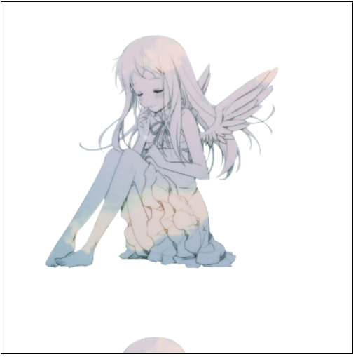
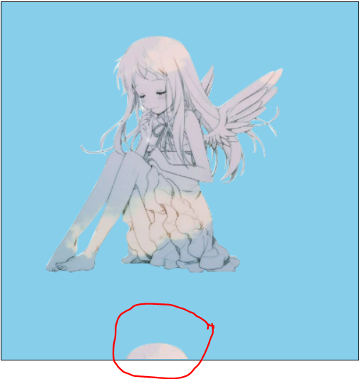
注意:border以内的区域会全部渲染,border以外的区域不会漏出这个盒子,图解↓
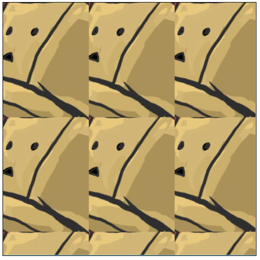
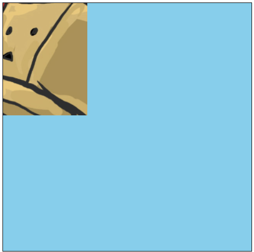
3、background-repeat背景重复
设置背景图片以什么方式进行重复。
属性值:
repeat:默认值,整个背景区域重复。
no-repeat:不重复。
repeat-x:水平方向重复。
repeat-y:垂直方向重复。
整体代码↓
<!DOCTYPE html PUBLIC "-//W3C//DTD XHTML 1.0 Transitional//EN" "http://www.w3.org/TR/xhtml1/DTD/xhtml1-transitional.dtd">
<html xmlns="http://www.w3.org/1999/xhtml" xml:lang="en">
<head>
    <meta http-equiv="Content-Type" content="text/html;charset=UTF-8">
    <title>Document</title>
    <style type="text/css">
        *{
            margin: 0;
            padding: 0;
        }
        .box{
            width: 400px;
            height: 400px;
            border: 1px solid #000;
            background: skyblue;
            background-image: url(file:///C:/Users/dell/Desktop/jjj.PNG);
            /*background-repeat: repeat; */
            /*background-repeat: no-repeat;*/
            /*background-repeat: repeat-x;*/
            background-repeat: repeat-y;
            margin: 100px;
        }
    </style>
</head>
<body>
    <div class="box">
    </div>
</body>
</html>
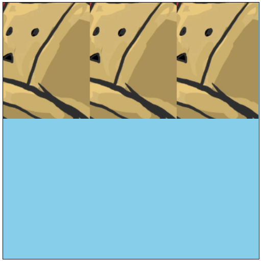
background-repeat:repeat; 效果图↓
background-repeat:no-repeat; 效果图↓
background-repeat:repeat-x; 效果图↓
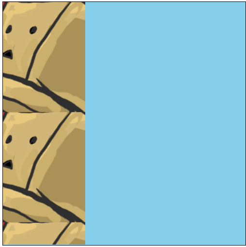
background-repeat:repeat-y; 效果图↓
body背景加载效果:代码↓
<!DOCTYPE html PUBLIC "-//W3C//DTD XHTML 1.0 Transitional//EN" "http://www.w3.org/TR/xhtml1/DTD/xhtml1-transitional.dtd">
<html xmlns="http://www.w3.org/1999/xhtml" xml:lang="en">
<head>
    <meta http-equiv="Content-Type" content="text/html;charset=UTF-8">
    <title>Document</title>
    <style type="text/css">
        *{
            margin: 0;
            padding: 0;
        }
        body{
            background-image: url(file:///F:/%E5%89%8D%E7%AB%AF/photo/321.jpg);
            background-repeat: repeat;
        }
        .box{
            width: 400px;
            height: 400px;
            border: 1px solid #000;
            background: skyblue;
            background-image: url(file:///C:/Users/dell/Desktop/jjj.PNG);
            /*background-repeat: repeat; */
            /*background-repeat: no-repeat;*/
            /*background-repeat: repeat-x;*/
            background-repeat: repeat-y;
            margin: 100px;
        }
    </style>
</head>
<body>
    <div class="box"></div>
    <div class="box"></div>
    <div class="box"></div>
    <div class="box"></div>
    <div class="box"></div>
</body>
</html>
效果图↓
 body的背景图选的不是很好.... :)
repeat-x的妙用:制作一个渐变背景的导航栏↓
给盒子添加一个背景图,水平方向1像素宽,垂直方向正常高度,让背景图水平重复铺开。
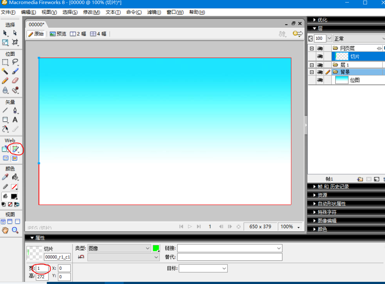
事先用fw切片工具截取两个宽度为1px的不同渐变色条,图解↓
代码↓
<!DOCTYPE html PUBLIC "-//W3C//DTD XHTML 1.0 Transitional//EN" "http://www.w3.org/TR/xhtml1/DTD/xhtml1-transitional.dtd">
<html xmlns="http://www.w3.org/1999/xhtml" xml:lang="en">
<head>
    <meta http-equiv="Content-Type" content="text/html;charset=UTF-8">
    <title>Document</title>
    <style type="text/css">
        *{
            margin: 0;
            padding: 0;
        }
        ul{
            list-style: none;
        }
        .nav{
            width: 960px;
            background: #ccc;
            margin: 50px auto;
            background-image: url(file:///C:/Users/dell/Desktop/%E6%B8%90%E5%8F%98%E6%9D%A104.jpg);
            background-repeat: repeat-x;

            overflow: hidden;
            font-size: 14px;
            font-family: "微软雅黑";
            color: #252525;
            line-height: 30px;
            text-align: center;
        }
        .nav ul{
            overflow: hidden;
        }
        .nav ul li{
            float: left;
            width: 120px;
        }
        .nav ul li a{
            display: block;
            width: 120px;
            height: 30px;
            color: #252525;
            text-decoration: none;
        }
        .nav ul li a:hover{
            font-weight: bold;
            background-image: url(file:///C:/Users/dell/Desktop/%E6%B8%90%E5%8F%98%E8%89%B2%E6%9D%A102.jpg);
            color: #000;
            font-weight: bold;
            text-decoration: underline;
        }
    </style>
</head>
<body>
    <div class="nav">
        <ul>
            <li class="current"><a href="#">首页</a></li>
            <li><a href="#">产品</a></li>
            <li><a href="#">新闻</a></li>
            <li><a href="#">服务</a></li>
            <li><a href="#">合作</a></li>
            <li><a href="#">技术</a></li>
            <li><a href="#">招聘</a></li>
            <li><a href="#">联系我们</a></li>
        </ul>
    </div>
</body>
</html>
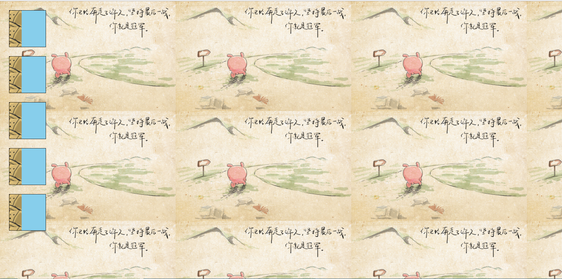
效果图↓
渐变条好像没截好....
4、background-position背景图位置
作用:规定我们插入背景图在盒子中的位置。
属性值:像素表示法、单词表示法、百分比表示法。
①像素表示法:代码↓
<!DOCTYPE html PUBLIC "-//W3C//DTD XHTML 1.0 Transitional//EN" "http://www.w3.org/TR/xhtml1/DTD/xhtml1-transitional.dtd">
<html xmlns="http://www.w3.org/1999/xhtml" xml:lang="en">
<head>
    <meta http-equiv="Content-Type" content="text/html;charset=UTF-8">
    <title>Document</title>
    <style type="text/css">
        *{
            margin: 0;
            padding: 0;
        }
        .box{
            width: 400px;
            height: 400px;
            border: 1px solid #000;
            margin: 100px;
            background-image: url(file:///C:/Users/dell/Desktop/jjj.PNG);
            background-repeat: no-repeat;
            /*150px表示水平向右移动 100px表示向下垂直移动*/
            background-position: 150px 100px;
        }
    </style>
</head>
<body>
    <div class="box"></div>
</body>
</html>
不添加background-position的效果图↓ 注意左上角顶点位置为(0,0)。
添加background-position后效果图↓ 注意水平和垂直的移动方向
注意:属性值为正,如(150px,100px)表示从(0,0)向右、向下移动 ;属性值为负、如(-150px,-100px)表示从(0,0)向左、向上移动。负值是针对有一张大图片超过了盒子的范围,都知道图片的右上角紧贴盒子的右上角,但是想露出超出盒子外的图片内容,那么就要用到负值。
css精灵图技术:很多元素都有背景图,需要有实际存在的图片,需要发送多个http请求下载图片。这个技术就是将很多小的背景图合在一张图片,从始至终就加在这一张图片就行。用法就是给一个合适的盒子大小,然后通过背景图定位找到想用的图片位置。
②单词表示法:图片位置水平和垂直方向用代表方向的单词表示
水平方向,第一个属性值:left,center,right,表示背景在盒子内居左、居中、居右。
垂直方向,第二个属性值:top,center,bottom,表示背景在盒子内居上、居中、居下。
代码↓
<!DOCTYPE html PUBLIC "-//W3C//DTD XHTML 1.0 Transitional//EN" "http://www.w3.org/TR/xhtml1/DTD/xhtml1-transitional.dtd">
<html xmlns="http://www.w3.org/1999/xhtml" xml:lang="en">
<head>
    <meta http-equiv="Content-Type" content="text/html;charset=UTF-8">
    <title>Document</title>
    <style type="text/css">
        *{
            margin: 0;
            padding: 0;
        }
        .box{
            width: 400px;
            height: 400px;
            border: 1px solid #000;
            margin: 100px;
            background-image: url(file:///C:/Users/dell/Desktop/jjj.PNG);
            background-repeat: no-repeat;
            /*像素表示法:150px表示水平向右移动 100px表示向下垂直移动*/
            /*background-position: 150px 100px;*/
            /*单词表示法: 第一个属性值表示居左,第二个属性值表示居中*/
            background-position: left center;
        }
    </style>
</head>
<body>
    <div class="box"></div>
</body>
</html>
效果图↓
单词表示法一般用于给body大背景效果添加水平居中垂直居上的背景图。
background-position: center top;
③百分比表示法:代码↓
<!DOCTYPE html PUBLIC "-//W3C//DTD XHTML 1.0 Transitional//EN" "http://www.w3.org/TR/xhtml1/DTD/xhtml1-transitional.dtd">
<html xmlns="http://www.w3.org/1999/xhtml" xml:lang="en">
<head>
    <meta http-equiv="Content-Type" content="text/html;charset=UTF-8">
    <title>Document</title>
    <style type="text/css">
        *{
            margin: 0;
            padding: 0;
        }
        .box{
            width: 400px;
            height: 400px;
            border: 1px solid #000;
            margin: 100px;
            background-image: url(file:///C:/Users/dell/Desktop/jjj.PNG);
            background-repeat: no-repeat;
            /*像素表示法:150px表示水平向右移动 100px表示向下垂直移动*/
            /*background-position: 150px 100px;*/
            /*单词表示法: 第一个属性值表示居左,第二个属性值表示居中*/
            /*background-position: left center;*/
            /*百分比表示法: 100%向右移动距离=盒子背景宽度-背景图的宽度,50%向下移动距离=(盒子背景高度-背景图高度)*50% */
            background-position: 100% 50%
        }
    </style>
</head>
<body>
    <div class="box"></div>
</body>
</html>
效果图↓
background-position: 100% 50%
百分比表示法: 100%向右移动距离=盒子背景宽度-背景图的宽度,50%向下移动距离=(盒子背景高度-背景图高度)*50%
5、background-attachment背景附着
指的是背景是否随着页面滚动而滚动
属性值:
scroll滚动:背景图会随着页面滚动而滚动。
fixed固定: 背景图不会随着页面滚动而滚动。
代码↓
<!DOCTYPE html PUBLIC "-//W3C//DTD XHTML 1.0 Transitional//EN" "http://www.w3.org/TR/xhtml1/DTD/xhtml1-transitional.dtd">
<html xmlns="http://www.w3.org/1999/xhtml" xml:lang="en">
<head>
    <meta http-equiv="Content-Type" content="text/html;charset=UTF-8">
    <title>Document</title>
    <style type="text/css">
        *{
            margin: 0;
            padding: 0;
        }
        body{
            background-image: url(file:///C:/Users/dell/Desktop/timg.jpg);
            background-repeat: repeat-x;
            background-position: center top;
            background-attachment: fixed;
        }
        div{
            width: 100px;
            height: 100px;
            background-color: skyblue;
            margin-bottom: 50px;
        }
    </style>
</head>
<body>
    <div></div>
    <div></div>
    <div></div>
    <div></div>
    <div></div>
    <div></div>
    <div></div>
    <div></div>
    <div></div>
    <div></div>
    <div></div>
    <div></div>
    <div></div>
    <div></div>
    <div></div>
    <div></div>
    <div></div>
    <div></div>
    <div></div>
    <div></div>
    <div></div>
    <div></div>
    <div></div>
</body>
</html>
效果图↓
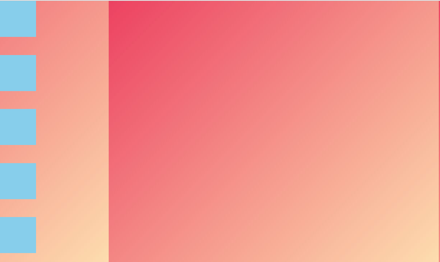
fixed为固定 给body设置的背景图不会随着页面的滚动被滚走,scroll默认值会随着页面滚动而被滚走,可以复制代码自己试一下。
6、background复合属性
代码↓
<!DOCTYPE html PUBLIC "-//W3C//DTD XHTML 1.0 Transitional//EN" "http://www.w3.org/TR/xhtml1/DTD/xhtml1-transitional.dtd">
<html xmlns="http://www.w3.org/1999/xhtml" xml:lang="en">
<head>
    <meta http-equiv="Content-Type" content="text/html;charset=UTF-8">
    <title>Document</title>
    <style type="text/css">
        *{
            margin: 0;
            padding: 0;
        }
        body{
        /*    background-image: url(file:///C:/Users/dell/Desktop/timg.jpg);
            background-repeat: repeat-x;
            background-position: center top;
            background-attachment: fixed;*/
            background: url(file:///C:/Users/dell/Desktop/timg.jpg) no-repeat center top  fixed red;
        }
        div{
            width: 100px;
            height: 100px;
            background-color: skyblue;
            margin-bottom: 50px;
        }
    </style>
</head>
<body>
    <div></div>
    <div></div>
    <div></div>
    <div></div>
    <div></div>
    <div></div>
    <div></div>
    <div></div>
    <div></div>
    <div></div>
    <div></div>
    <div></div>
    <div></div>
    <div></div>
    <div></div>
    <div></div>
    <div></div>
    <div></div>
    <div></div>
    <div></div>
    <div></div>
    <div></div>
    <div></div>
</body>
</html>
效果图↓
注意:这五个属性可以颠倒,谁写在前面都行,但是background-position里的属性值不能颠倒,也就是上面代码里的center top这俩不能颠倒,也不能分开,必须水平在前 垂直在后写在一起!!!