一、文字居中
1、水平方向居中:
text-align: center;
2、垂直方向:
①:单行文本居中,行高等于盒子高↓
line-height: 200px;
完整代码、效果图 ↓


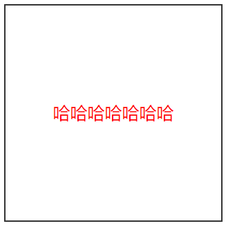
<!DOCTYPE html PUBLIC "-//W3C//DTD XHTML 1.0 Transitional//EN" "http://www.w3.org/TR/xhtml1/DTD/xhtml1-transitional.dtd">
<html xmlns="http://www.w3.org/1999/xhtml" xml:lang="en">
<head>
    <meta http-equiv="Content-Type" content="text/html;charset=UTF-8">
    <title>Document</title>
    <style type="text/css">
        *{
            margin: 0;
            padding: 0;
        }
        .header{
            width: 200px;
            height: 200px;
            border: 1px solid #333;
            margin: 20px auto;
        }
        p{
            text-align: center;
            line-height: 200px;
            color: red;
        }

    </style>
</head>
<body>
    <div class="header">
        <p>哈哈哈哈哈哈哈</p>
    </div>
</body>
</html>
②多行文本垂直居中:不设置盒子高度,用内容撑开高度,内边距上下相等,撑开空白区域。
 200px;
padding: 20px;
完整代码、效果图↓
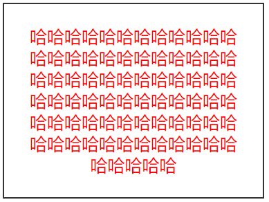
<!DOCTYPE html PUBLIC "-//W3C//DTD XHTML 1.0 Transitional//EN" "http://www.w3.org/TR/xhtml1/DTD/xhtml1-transitional.dtd">
<html xmlns="http://www.w3.org/1999/xhtml" xml:lang="en">
<head>
    <meta http-equiv="Content-Type" content="text/html;charset=UTF-8">
    <title>Document</title>
    <style type="text/css">
        *{
            margin: 0;
            padding: 0;
        }
        .header{
            width: 200px;
            padding: 20px;
            /*height: 200px;*/
            border: 1px solid #333;
            margin: 20px auto;
        }
        p{
            text-align: center;
            line-height: 20px;
            color: red;
        }

    </style>
</head>
<body>
    <div class="header">
        <p>哈哈哈哈哈哈哈哈哈哈哈哈哈哈哈哈哈哈哈哈哈哈哈哈哈哈哈哈哈哈哈哈哈哈哈哈哈哈哈哈哈哈哈哈哈哈哈哈哈哈哈哈哈哈哈哈哈哈哈哈哈哈哈哈哈哈哈哈哈哈哈哈哈哈哈哈哈</p>
    </div>
</body>
</html>
二、盒子居中
1、水平方向居中:
给自身添加宽度,用margin挤出两边相同空白区域。
margin属性值auto,自动撑开最大边距。代码↓
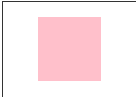
<!DOCTYPE html PUBLIC "-//W3C//DTD XHTML 1.0 Transitional//EN" "http://www.w3.org/TR/xhtml1/DTD/xhtml1-transitional.dtd">
<html xmlns="http://www.w3.org/1999/xhtml" xml:lang="en">
<head>
    <meta http-equiv="Content-Type" content="text/html;charset=UTF-8">
    <title>Document</title>
    <style type="text/css">
        *{
            margin: 0;
            padding: 0;
        }
        .father{
            width: 500px;
            height: 500px;
            border: 1px solid #333;
        }
        .son{
            width: 200px;
            height: 200px;
            background-color: pink;
            margin: 0 auto;

        }
    </style>
</head>
<body>
    <div class="father">
        <div class="son"></div>
    </div>
</body>
</html>
效果图↓
2、垂直方向居中:
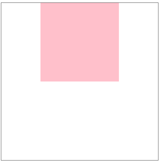
父盒子高度不设置,给父盒子添加上下相同的padding,高度会自己适应子盒子的内容高度。
代码↓
<!DOCTYPE html PUBLIC "-//W3C//DTD XHTML 1.0 Transitional//EN" "http://www.w3.org/TR/xhtml1/DTD/xhtml1-transitional.dtd">
<html xmlns="http://www.w3.org/1999/xhtml" xml:lang="en">
<head>
    <meta http-equiv="Content-Type" content="text/html;charset=UTF-8">
    <title>Document</title>
    <style type="text/css">
        *{
            margin: 0;
            padding: 0;
        }
        .father{
            width: 400px;
            padding: 50px 0;
            border: 1px solid #333;
            margin: 10px auto;
        }
        .son{
            width: 200px;
            height: 200px;
            background-color: pink;
            margin: 0 auto;

        }
    </style>
</head>
<body>
    <div class="father">
        <div class="son"></div>
    </div>
</body>
</html>
效果图↓