Scrollbar
滚动条
The Scrollbar control allows the user to scroll an image or other view that is too large to see completely. Note that the similar Slider control is used for selecting numeric values rather than scrolling. Familiar examples include the vertical Scrollbar at the side of a text editor and the vertical and horizontal pair of bars for viewing a section of a large image or map.
Scrollbar控件让用户可以滚动图片或者其它视图,它们太大了,以至于不能一下子看到全部。注意,类似Slider控件用来选择数字,Scrollbar是用来滚动的。熟悉的例子包括文字编辑器旁边的垂直滚动条和一对垂直、水平滚动条来查看一张大图或者地图的一部分。
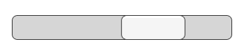
A Scrollbar.
一个滚动条
Properties
属性
| Property: | Function: |
|---|---|
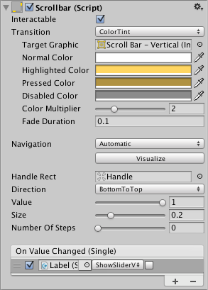
| Interactable | Will this component accept input? See Interactable. |
| Transition |
Properties that determine the way the control responds visually to user actions. See Transition Options. |
| Navigation | Properties that determine the sequence of controls. See Navigation Options. |
| Fill Rect | The graphic used for the background area of the control. |
| Handle Rect | The graphic used for the sliding “handle” part of the control |
| Direction |
The direction in which the Scrollbar’s value will increase when the handle is dragged. The options are Left To Right, Right To Left, Bottom To Top and Top To Bottom. |
| Value | Initial position value of the Scrollbar, in the range 0.0 to 1.0. |
| Size | Fractional size of the handle within the Scrollbar, in the range 0.0 to 1.0. |
| Number Of Steps | The number of distinct scroll positions allowed by the Scrollbar. |
| 属性 | 功能 |
|---|---|
| Interactable | 这个组件是否会接受输入? 请参阅 Interactable. |
| Transition |
确定控件如何对用户操作进行可视化响应的属性。 |
| Navigation | 确定控件导航时对不同方向的响应。请参阅 Navigation Options. |
| Fill Rect | 用于控件的填充区域的图片(Graphic类型) |
| Handle Rect | 用于滑动块的图片(Graphic类型) |
| Direction |
拖动滑块时,填充的图片扩张的方向。 选项是Left To Right, Right To Left, Bottom To Top 和 Top To Bottom |
| Value |
Scrollbar的初始位置值,范围在0.0到1.0之间 |
| Size |
滚动条内的滑块占总长度的比例,在0.0到1.0之间 |
| Number Of Steps |
滚动条所允许的不同滚动位置的数量(可以理解为滑块可以拖动到的几个固定位置。 比如说这个值是5,那么这个滑块只能拖动到(0,1/4,2/4,3/4,1)其它比例都滑不到 |
Events
事件
| Property: | Function: |
|---|---|
| On Value Changed |
A UnityEvent that is invoked when the current value of the Scrollbar changes. The event can send the value as a |
| 属性 | 功能 |
|---|---|
| On Value Changed |
当Slider当前的值发生变化时会调用一个UnityEvent。 这个事件可以将当前值作为一个float类型动态参数发出去。 |
Details
详细
The value of a Scrollbar is determined by the position of the handle along its length with the value being reported as a fraction between the extreme ends. For example, the default left-to-right bar has a value of 0.0 at the left end, 1.0 at the right end and 0.5 indicates the halfway point. A scrollbar can be oriented vertically by choosing Top To Bottom or Bottom To Top for the Direction property.
Scrollbar的值取决于滑块沿着其长度的位置,该值被表示为占最大长度的分数。比如,默认的从左到右的栏的左端为0.0,右端为1.0,中间点为0.5。scrollbar可以通过为“方向”属性选择“顶部到底部”或“底部到顶部”来面向垂直方向
A significant difference between the Scrollbar and the similar Slider control is that the Scrollbar’s handle can change in size to represent the distance of scrolling available; when the view can scroll only a short way, the handle will fill up most of the bar and only allow a slight shift either direction.
Scrollbar和类似的Slider控件之间的显着区别在于Scrollbar的滑块可以改变大小以表示可用的滚动距离; 当视图只能滚动一小段时,滑块将填满大部分栏,只允许轻微向任一方向移动。
The Scrollbar has a single event called On Value Changed that responds as the user drags the handle. The current value is passed to the even function as a float parameter. Typical use cases for a scrollbar include:
Scrollbar有一个事件叫做On Value Changed,当用户拖拽滑块时调用。当前的值作为一个float参数传到事件函数中。Scrollbar典型的用例包括:
- Scrolling a piece of text vertically.
- Scrolling a timeline horizontally.
- Used as a pair, scrolling a large image both horizontally and vertically to view a zoomed section. The size of the handle changes to indicate the degree of zooming and therefore the available distance for scrolling.
- 垂直滚动一段文字
- 水平滚动时间线
- 作为一对使用,在水平和垂直方向上滚动大图以查看放大的部分。 滑块的大小会发生变化表示缩放的程度,从而表示可以滚动的距离。