Transition Options
转换选项
| Transition Options: | Function: |
|---|---|
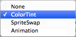
| None | This option is for the button to have no state effects at all. |
| Color Tint |
Changes the colour of the button depending on what state it is in. It is possible to select the colour for each individual state. It is also possible to set the Fade Duration between the different states. The higher the number is, the slower the fade between colors will be. |
| Sprite Swap | Allows different sprites to display depending on what state the button is currently in, the sprites can be customised. |
| Animation |
Allows animations to occur depending on the state of the button, an animator component must exist in order to use animation transition. It’s important to make sure root motion is disabled. To create an animation controller click on generate animation (or create your own) and make sure that an animation controller has been added to the animator component of the button. |
| 转换选项 | 功能 |
|---|---|
| None | 这个选项是让按钮没有任何状态效果 |
| Color Tint |
根据所处的状态更改按钮的颜色。可以为每个单独的状态选择颜色。 也可以在不同状态之间设置淡变持续时间。 数字越高,颜色之间的渐变就越慢 |
| Sprite Swap | 允许显示不同的精灵,取决于按钮当前处于什么状态,精灵可以自定义 |
| Animation |
允许根据按钮的状态播放动画,animator组件必须存在才能使用动画转换。 很重要的一点是要确保root motion处于禁用状态。 要创建动画控制器,请单击生成动画(或创建自己的动画),并确保动画控制器已添加到按钮的动画组件中 |
Each Transition option (except None) provides additional options for controlling the transitions. We’ll go into details with those in each of the sections below.
每个转换选项(None除外)都提供了用于控制转换的附加选项。 我们将在下面阐述每种转换的细节
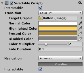
Color Tint
颜色提示
| Property: | Function: |
|---|---|
| Target Graphic | The graphic used for the interaction component. |
| Normal Color | The normal color of the control |
| Highlighted Color | The color of the control when it is highlighted |
| Pressed Color | The color of the control when it is pressed |
| Disabled Color | The color of the control when it is disabled |
| Color Multiplier |
This multiplies the tint color for each transition by its value. With this you can create colors greater than 1 to brighten the colors (or alpha channel) on graphic elements whose base color is less than white (or less then full alpha). |
| Fade Duration | The time taken, in seconds, to fade from one state to another |
| 属性 | 功能 |
|---|---|
| Target Graphic | 用于交互组件的图形 |
| Normal Color | 控件正常状态的颜色 |
| Highlighted Color | 控件突出显示时的颜色 |
| Pressed Color | 控件按下时的颜色 |
| Disabled Color | 控件禁用时的颜色 |
| Color Multiplier | 每个状态的颜色都会乘以它,后面那一坨没必要翻译了,都是废话-。-(注意color的rgba值的取值范围为0~1) |
| Fade Duration |
从一种状态到另一种状态的时间,以秒为单位 |
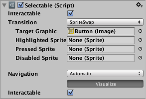
Sprite Swap
精灵交换
| Property: | Function: |
|---|---|
| Target Graphic | The normal sprite to use |
| Highlighted Sprite | Sprite to use when the control is highlighted |
| Pressed Sprite | Sprite to use when the control is pressed |
| Disabled Sprite | Sprite to use when the control is disabled |
| 属性 | 功能 |
|---|---|
| Target Graphic | 正常状态的精灵 |
| Highlighted Sprite | 突出状态的精灵 |
| Pressed Sprite | 按下状态的精灵 |
| Disabled Sprite | 禁用状态的精灵 |
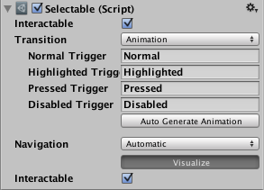
Animation
动画
| Property: | Function: |
|---|---|
| Normal Trigger | The normal animation trigger to use |
| Highlighted Trigger | Trigger to use when the control is highlighted |
| Pressed Trigger | Trigger to use when the control is pressed |
| Disabled Trigger | Trigger to use when the control is disabled |
| 属性 | 功能 |
|---|---|
| Normal Trigger | 动画正常状态的trigger(trigger的定义见Animator) |
| Highlighted Trigger | 动画突出状态的trigger(trigger的定义见Animator) |
| Pressed Trigger | 动画按下状态的trigger(trigger的定义见Animator) |
| Disabled Trigger | 动画禁用状态的trigger(trigger的定义见Animator) |