Ext主要包括11种标准布局方式:Auto(自动布局)、CheckboxGroup(复选框组布局)、Fit(自适应布局)、Column(列布局)、Accordion(折叠布局)、Table(表格布局)、Card(卡片式布局)、Border(边框布局)、Anchor(锚点布局)、Box(盒布局)、Absolute(绝对位置布局)。
一.Auto(自动布局):默认布局方式,使用原始的HTML文档流来布局子元素,并把布局调用传递到子容器。
二.Fit(自适应布局):将使唯一的子元素充满容器,如果在当前容器中存在多个子面板则只有第一个会被显示,代码如下:
     Ext.create('Ext.Panel',{
              title : 'fit布局示例',
              frame : true,
              height : 200,
              width : 300,
              renderTo : Ext.getBody(),
              defaults : { bodyStyle :'backgroundColor:#ffc' },
              layout : 'fit',
             items : [{
                  title : '嵌套面板一',
                  html : '面板一',
                  width : 100
                 },
                 {
                 title : '嵌套面板二',
                 html : '面板二',
                 width : 100
             }]
      });
fit图例:

三.Accordion(折叠布局):手风琴式布局,代码如下:
    Ext.create('Ext.Panel', {
                title : 'Accordion折叠布局',
                width : 300,
                height : 300,
                defaults : {
                    bodyStyle : 'padding:15px'
                },
                layout : {
                    type : 'accordion',
                    animate : true,
                    activeOnTop : true
                    //multi : true    可以同时打开多个面板
                },
                items : [{
                            title : 'Panel 1',
                            html : 'Panel content!'
                        }, {
                            title : 'Panel 2',
                            html : 'Panel content!'
                        }, {
                            title : 'Panel 3',
                            html : 'Panel content!'
                        }],
                renderTo : Ext.getBody()
            });
Accordion图例:

四.Card(卡片式布局):该布局会包含多个子面板,任何时候都只有一个面板处于显示状态,这种布局类经常用来制作向导和标签页。该布局的重点方法是setActiveItem,因为一次只能显示一个子面板,所以切换子面板的唯一途径,就是调用setActiveItem方法。接收一个子面板id或者索引作为参数。Card布局并没有提供一个子面板的导航机制,导航逻辑需要开发人员自己实现。代码如下:
var cardPanel = Ext.create('Ext.Panel',{
              title : 'card布局示例',
              frame :true,
              height : 200,
              width : 300,
              renderTo : Ext.getBody(),
              defaults : {
                 bodyStyle : 'backgroundColor:#ffc'
             },
             layout : 'card',
             items : [{
                      title : '嵌套面板一',
                      html : '面板一',
                      width : 100
                  },{
                      title : '嵌套面板二',
                      html :'面板二',
                      width : 100
                  }],
              buttons : [{
                      text : '上一个',
                      handler : function(){
                          var card = cardPanel.layout;
                          if(card.getPrev())
                              card.setActiveItem(card.getPrev());
                          }
                  },{
                      text : '下一个',
                      handler : function(){
                          var card = cardPanel.layout;
                          if(card.getNext())
                             card.setActiveItem(card.getNext());
                 }
             }]
         });
card图例:

五.Anchor(锚点布局):根据容器大小为其所包含的子面板进行定位的布局,如果容器大小发生变化,所有子面板的位置都会根据规则重新计算,并重新渲染。注意配置项的使用。
*anchorSize(父类提供):用来设置虚拟容器的大小,默认情况下anchor布局是根据容器自身的大小来进行计算定位的,如果提供了anchorSize属性则anchor布局就会根据该尺寸生成一个虚拟容器,然后根据这个虚拟容器的大小来进行计算定位。
*anchor(子容器提供):可以给百分比,也可以是偏移值,还可以是参考边('right','r','bottom','b').
    Ext.create('Ext.Panel', {
             500,
            height: 400,
            title: "AnchorLayout Panel",
            layout: 'anchor',
            renderTo: Ext.getBody(),
            items: [
                {
                    xtype: 'panel',
                    title: '75% Width and 20% Height',
                    anchor: '75% 20%'
                },
                {
                    xtype: 'panel',
                    title: 'Offset -300 Width & -200 Height',
                    anchor: '-300 -200'
                },
                {
                    xtype: 'panel',
                    title: 'Mixed Offset and Percent',
                    anchor: '-250 20%'
                }
            ]
      });
anchor图例:

六.Absolute(绝对位置布局): 根据x、y坐标进行定位。
七.CheckboxGroup(复选框组布局): 实现了按列布局表单组件Ext.form.CheckboxGroup 和 Ext.form.RadioGroup功能,代码如下:
    Ext.create('Ext.Panel',
              { title : 'checkboxgroup布局示例',
              frame : true,
              height : 200,
              width : 300,
              renderTo : Ext.getBody(),
              defaults : {
                  bodyStyle : 'backgroundColor:#ffc',
                  labelWidth : 50,
                  labelAlign :'left'
              },
              items : [
                  {
                      xtype : 'radiogroup',
                      fieldLabel : '性别',
                      columns :2,
                      width : 250,
                      items : [
                          {boxLabel : '男', name : 'sex', inputValue :'male' },
                          {boxLabel : '女', name : 'sex', inputValue : 'female'}
                      ]
                  },{
                      xtype : 'checkboxgroup',
                      fieldLabel : '兴趣',
                      columns : 3,
                      width : 250,
                      items : [
                          { boxLabel: '游泳', name: 'rb', inputValue: '1' },
                          { boxLabel: '阅读', name: 'rb', inputValue: '2', checked: true },
                         { boxLabel: '游戏', name: 'rb', inputValue: '3' },
                           { boxLabel: '电影', name: 'rb', inputValue: '4' },
                        { boxLabel: '散步', name: 'rb',inputValue: '5' },
                           { boxLabel: '登山', name: 'rb', inputValue: '6' } ]
                   }]
          });
CheckboxGroup图例:

八.Column(列布局): 这是一种多列风格的布局样式,每一列的宽度都可以根据百分比或者固定值来进行设置,高度允许根据内容进行变化,它支持一个特殊的属性columnWidth,每一个加入到容器中的子面板都可以通过columnWidth配置项指定百分比或使用width配置,来确定列宽。width配置项是以像素为单位的固定宽度,必须是大于或等于1的数字。columnWidth配置项是以百分比为单位的相对宽度,必须是大于0小于1的小数,例如 ".25".固定值优先于百分比进行计算,也就是说,百分比计算的基础宽度是父容器的宽度减去固定列宽之后剩余的宽度值。代码如下:
    Ext.create('Ext.Panel',{
                  title : 'column布局示例',
                  frame : true,
                  height :150,
                  width : 300,
                  renderTo : Ext.getBody(),
                  defaults : { bodyStyle :'backgroundColor:#ffc', height : 100 },
                  layout : 'column',
                  items : [
                      { title : '嵌套面板一', html : '面板一', width : 100 },
                      { title : '嵌套面板二', html :'面板二', columnWidth : .3 },
                      { title : '嵌套面板三', html : '面板三',columnWidth : .7 }
                  ]
          });
column图例:

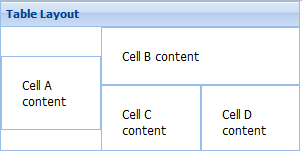
九.Table(表格布局):这种布局允许你非常容易地渲染内容到HTML表格中,可以指定列数、跨行、跨列、可以创建出复杂的表格布局。代码如下:
    Ext.create('Ext.panel.Panel', {
                title : 'Table Layout',
                width : 300,
                height : 150,
                layout : {
                    type : 'table',
                    columns : 3
                },
                defaults : {
                    bodyStyle : 'padding:20px'
                },
                items : [{
                            html : 'Cell A content',
                            rowspan : 2
                        }, {
                            html : 'Cell B content',
                            colspan : 2
                        }, {
                            html : 'Cell C content'
                        }, {
                            html : 'Cell D content'
                        }],
                renderTo : Ext.getBody()
            });
table图例:
10.Border(边框布局):将容器分为5个部分:east,west,north,south,center。通过region进行指定。
    Ext.create('Ext.Panel', {
                        width : 500,
                        height : 300,
                        title : 'Border布局示例',
                        layout : 'border',
                        items : [
                                {
                                    title : 'center',
                                    html : '中部',
                                    region : 'center'
                                },{
                                    title : 'north',
                                    html : '北部',
                                    region : 'north'
                                }, {
                                    title : 'south',
                                    html : '南部',
                                    region : 'south'
                                }, {
                                    title : 'east',
                                    html : '东部',
                                    region : 'east',
                                    width : 100
                                },{
                                    title : 'west',
                                    html : '西部',
                                    region : 'west',
                                    width : 50
                                }],
                        renderTo : Ext.getBody()
                    });
border图例:

11.Box(盒布局):又分为HboxLayout(水平盒布局) 和 VboxLayout(垂直盒布局),通过子元素的flex配置项来划分父容器的空间。代码如下:
    Ext.create('Ext.Panel', {
                     400,
                    height: 200,
                    title: "box盒布局",
                    layout: {
                        type: 'hbox',
                        align: 'stretch'    //子面板高度充满父容器
                    },
                    renderTo: document.body,
                    items: [{
                        xtype: 'panel',
                        title: '占2/4',
                        flex: 2
                    },{
                        xtype: 'panel',
                        title: '占1/4',
                        flex: 1
                    },{
                        xtype: 'panel',
                        title: '占1/4',
                        flex: 1
                    }]
                });
box图例:
