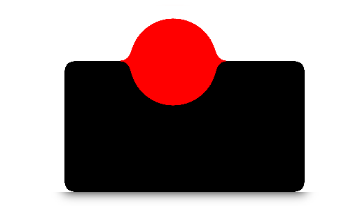
一、效果图:
应用:

二、上代码
<!DOCTYPE html>
<html lang="en">
<head>
    <meta charset="UTF-8">
    <meta name="viewport" content="width=device-width, initial-scale=1.0">
    <title>Document</title>
    <style>
        .effect{
            width: 100%;
            height: 100%;
            padding-top: 50px;

            filter: contrast(10);
            background: #fff;
        }
        .blackball{
            width: 200px;
            height: 100px;
            background: black;
            padding: 10px;
            margin: 0 0 0 240px;

            filter: blur(5px);
        }
        .redball{
            width: 60px;
            height: 60px;
            background: red;

            padding: 10px;
            border-radius: 50%;
            position: absolute;
            top: 11px;
            left: 300px;
            filter: blur(5px);
        }
    </style>
</head>
<body>
    <div class="effect">
        <div class="blackball"></div>
        <div class="redball"></div>
    </div>
</body>
</html>

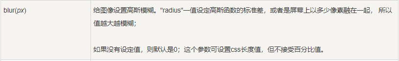
最重要的就是这个blur 高斯滤波的东西,就是把尖的东西变得平缓(也就实现了两个div接触的尖角就会被平缓,达到平缓上凸的效果)