(本文参考---菜鸟教程----实例并做些许改变)----感谢菜鸟教程
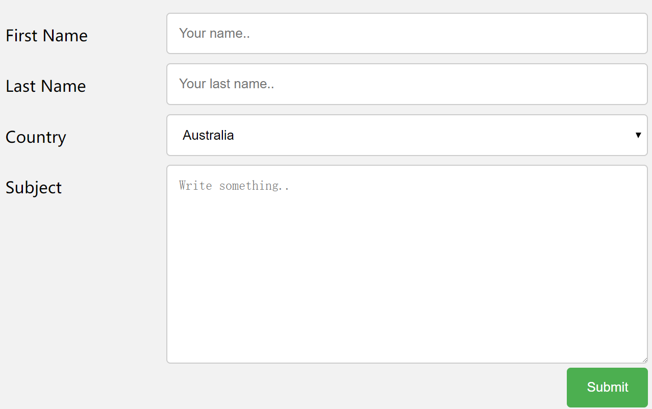
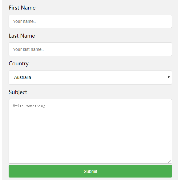
一、效果(这个是在还没缩小的时候,如果是手机或者是放大的话,通过media设计了)
二、知识点
1、可以通过对class命名为 col-25 表示等等要在CSS里面给这个元素定义width为25%
2、把每一个label和input的组合都放进了class=“row”的块中过程了基本块结构
<div class="row">
    <div class="col-25">
      <label for="fname">First Name</label>
    </div>
    <div class="col-75">
      <input type="text" id="fname" name="firstname" placeholder="Your name..">
    </div>
</div>
同理在后面的submit按钮也是放进了这样的一个块中
 <div class="row">
    <input type="submit" value="Submit">
  </div>
之后由于各个块都是希望可以独自的占用一行,互不打扰,由于浮动float的缘故可能导致互相打扰了,所以通过以下代码解决
这里表示在每一个class为row的后面都加一些内容,内容是content也就是空的,然后table也就是块级元素,通过这个空的块级元素,添加
上clear both,就可以在每一个row之间都设置一个隔离膜,防止不同的row之间相互打扰了。
.row:after {
content: "";
display: table;
clear: both;
}
3、之前学过就是,通过resize给textarea定样式的,就是如果resize=none的话就无法改变输入框的大小了,这里是resize:vertical
表示的是可以上下拉伸这个多文本输入框的
4、如果方法或者是在手机等小屏幕中使用的话,就慧把label和input还有submit都设置为独占一行的了
@media screen and (max- 600px) {
  .col-25, .col-75, input[type=submit] {
    width: 100%;
    margin-top: 0;
  }
}
三、完整代码


<!DOCTYPE html>
<html>
<head>
<style>
* {
  box-sizing: border-box;
}

input[type=text], select, textarea {
  width: 100%;
  padding: 12px;
  border: 1px solid #ccc;
  border-radius: 4px;
  resize: vertical;
}

label {
  padding: 12px 12px 12px 0;
  display: inline-block;
}

input[type=submit] {
  background-color: #4CAF50;
  color: white;
  padding: 12px 20px;
  border: none;
  border-radius: 4px;
  cursor: pointer;
  float: right;
}

input[type=submit]:hover {
  background-color: #45a049;
}

.container {
  border-radius: 5px;
  background-color: #f2f2f2;
  padding: 20px;
}

.col-25 {
  float: left;
  width: 25%;
  margin-top: 6px;
}

.col-75 {
  float: left;
  width: 75%;
  margin-top: 6px;
}

/* 清除浮动 */
.row:after {
  content: "";
  display: table;
  clear: both;
}

/* 响应式布局 layout - 在屏幕宽度小于 600px 时, 设置为上下堆叠元素 */
@media screen and (max- 600px) {
  .col-25, .col-75, input[type=submit] {
    width: 100%;
    margin-top: 0;
  }
}
</style>
</head>
<body>

<h2>响应式表单</h2>
<p>响应式表带可以根据浏览器窗口的大小重新布局各个元素,我们可以通过重置浏览器窗口大小来查看效果:</p>

<div class="container">
  <form action="/action_page.php">
  <div class="row">
    <div class="col-25">
      <label for="fname">First Name</label>
    </div>
    <div class="col-75">
      <input type="text" id="fname" name="firstname" placeholder="Your name..">
    </div>
  </div>
  <div class="row">
    <div class="col-25">
      <label for="lname">Last Name</label>
    </div>
    <div class="col-75">
      <input type="text" id="lname" name="lastname" placeholder="Your last name..">
    </div>
  </div>
  <div class="row">
    <div class="col-25">
      <label for="country">Country</label>
    </div>
    <div class="col-75">
      <select id="country" name="country">
        <option value="australia">Australia</option>
        <option value="canada">Canada</option>
        <option value="usa">USA</option>
      </select>
    </div>
  </div>
  <div class="row">
    <div class="col-25">
      <label for="subject">Subject</label>
    </div>
    <div class="col-75">
      <textarea id="subject" name="subject" placeholder="Write something.." style="height:200px"></textarea>
    </div>
  </div>
  <div class="row">
    <input type="submit" value="Submit">
  </div>
  </form>
</div>

</body>
</html>