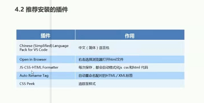
vscode的使用
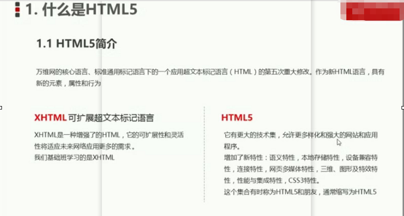
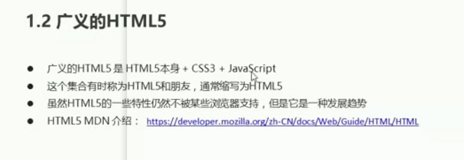
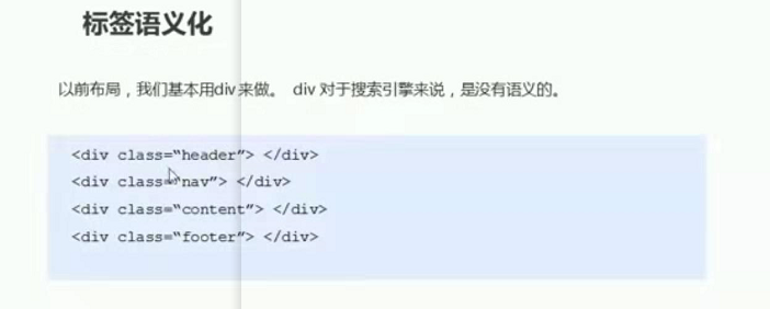
什么是HTML5?
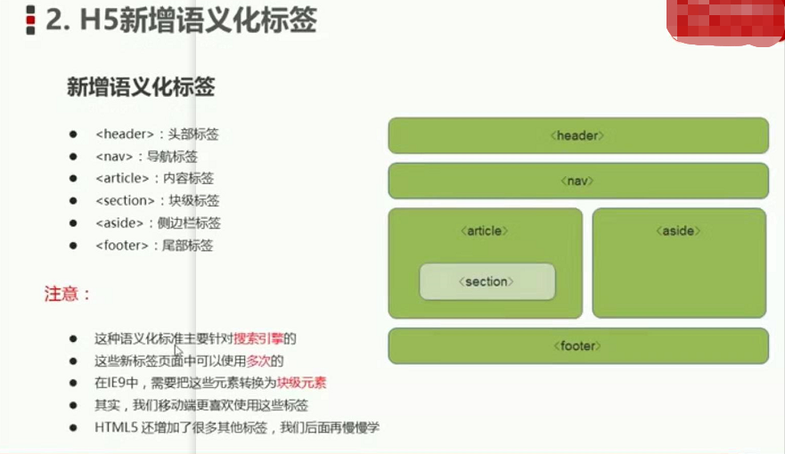
HTML5新增语义化标签
多媒体标签
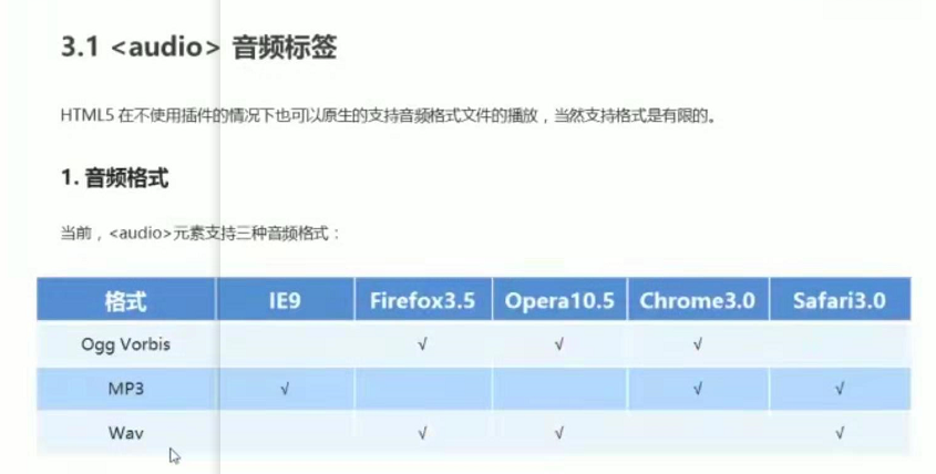
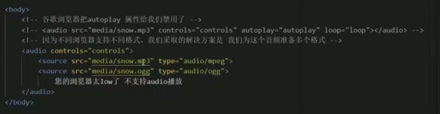
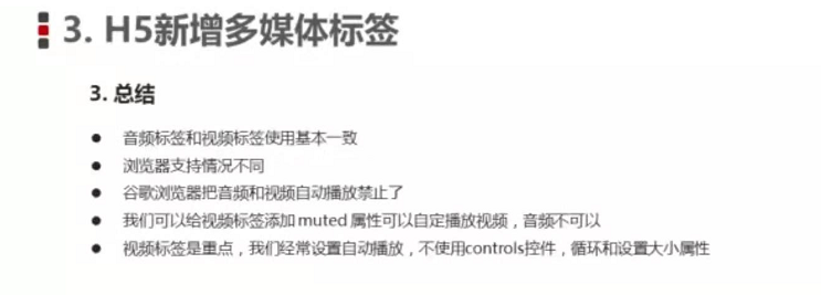
<audio>音频标签
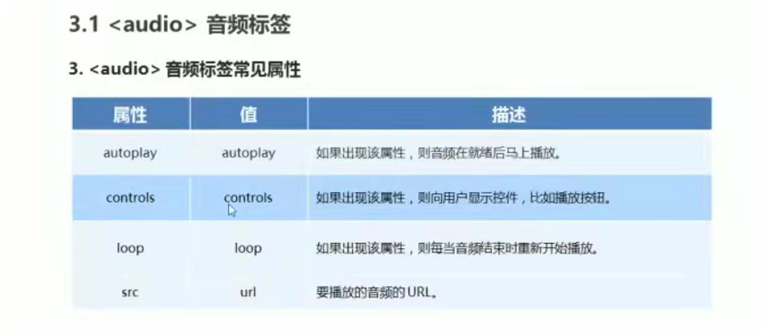
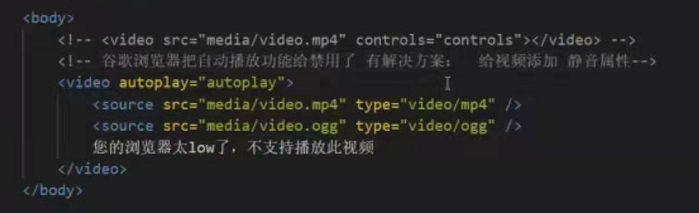
谷歌浏览器 把autoplay属性给我们禁用。
两种音频格式的播放
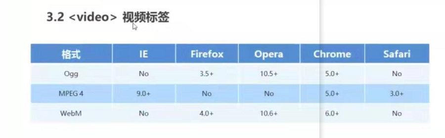
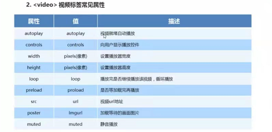
视频标签<video>
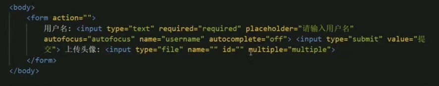
HTML5表单属性
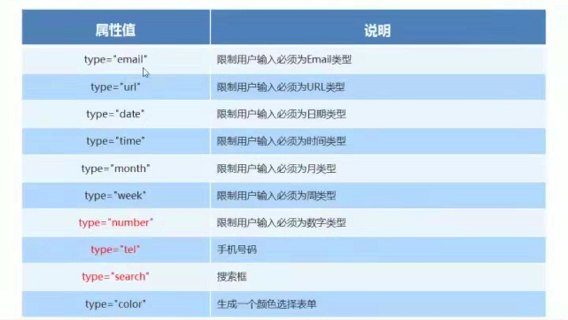
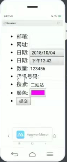
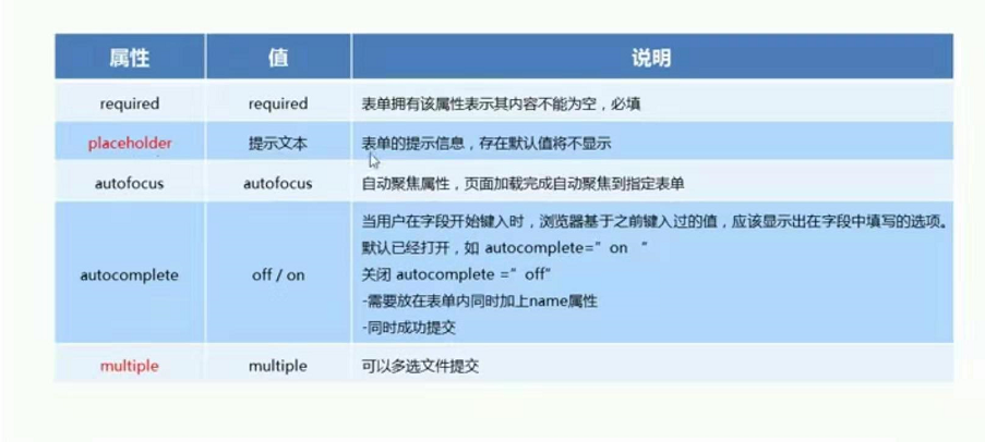
新增表单属性
内容不能为空
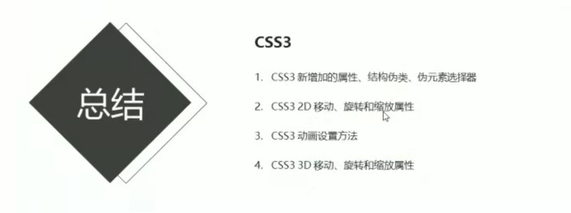
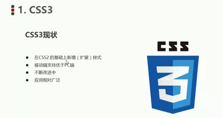
css3
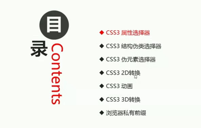
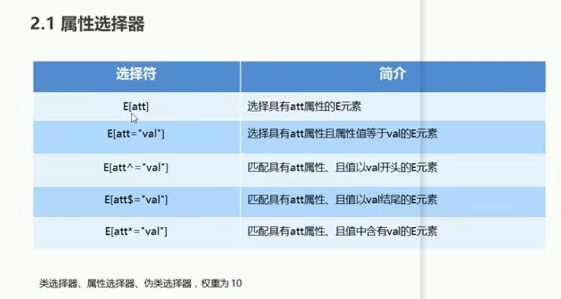
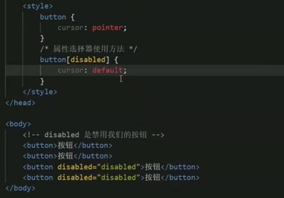
css3属性选择器
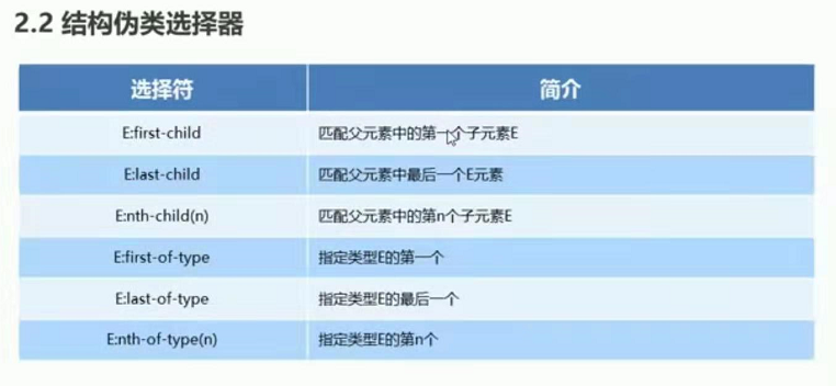
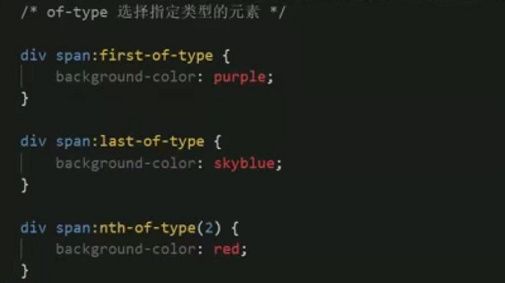
css3结构伪类选择器

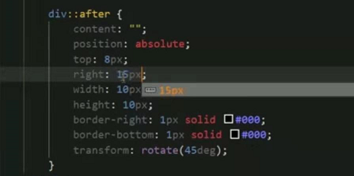
css3伪元素选择器
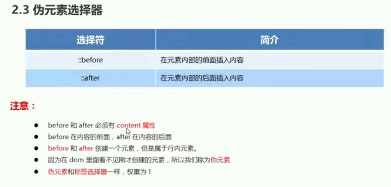
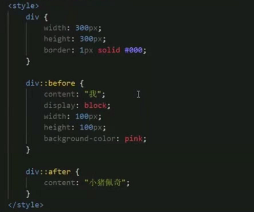
css3伪元素选择器
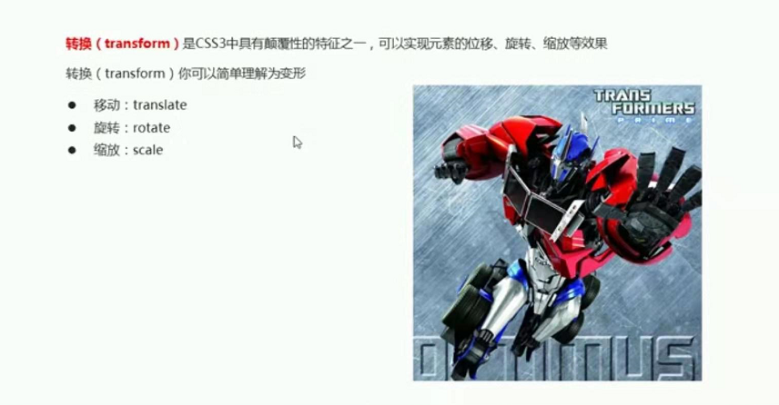
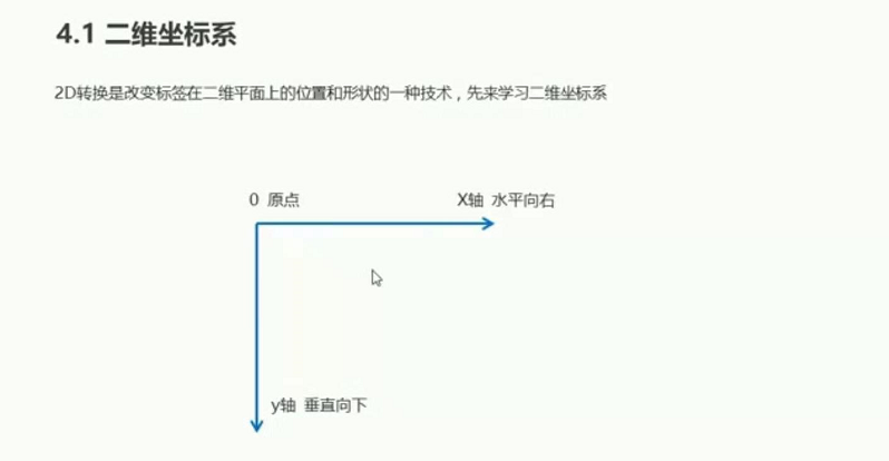
css3 2D转换
二维坐标系
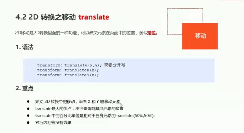
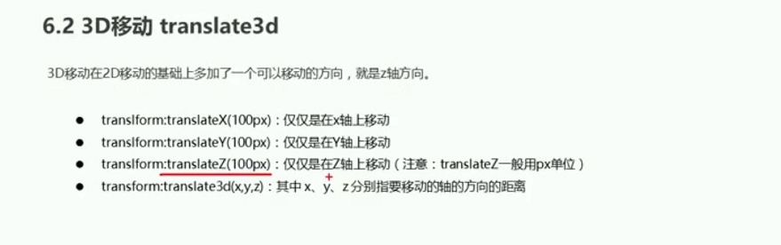
translate 移动
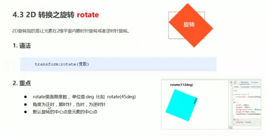
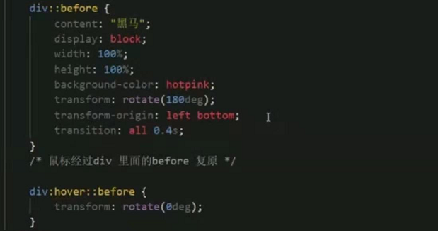
2D 转换之旋转
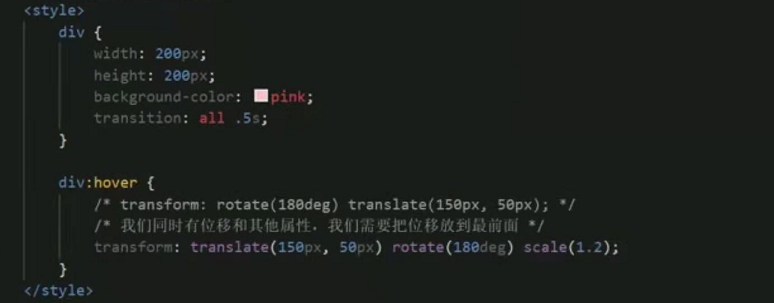
过渡写到本身上,谁做动画给谁加
transform:all 0.3;
案例(三角)
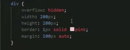
设置转换的中心点

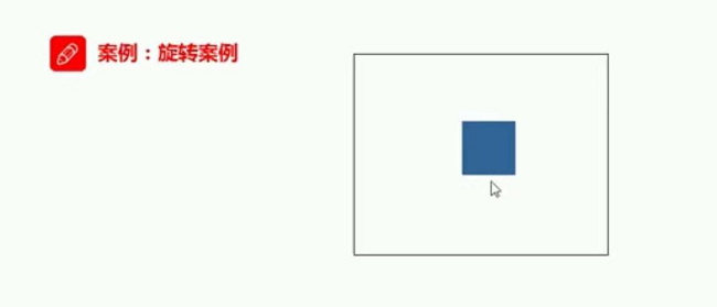
旋转案例
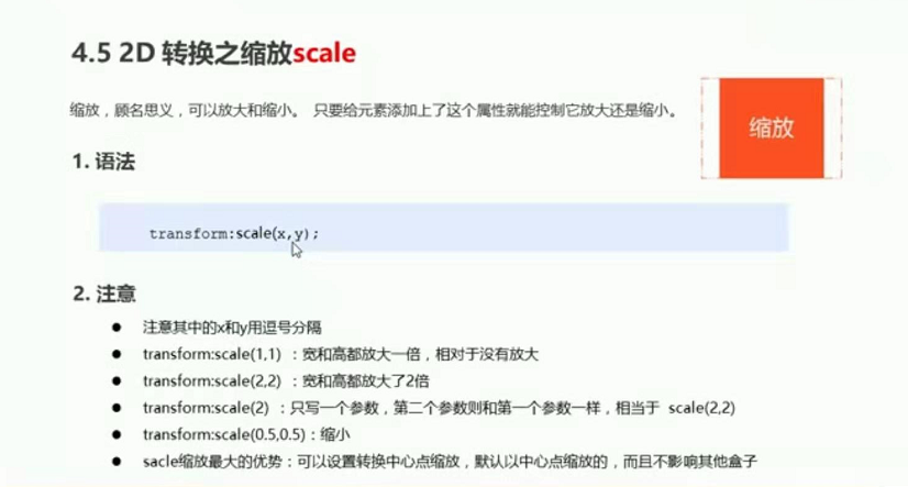
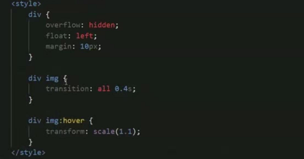
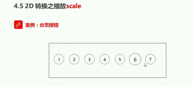
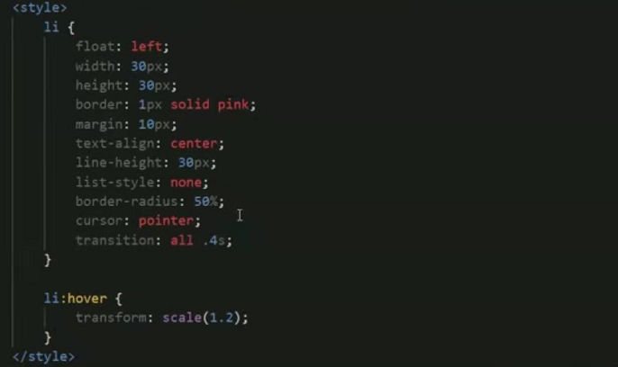
2D转换之缩放scale
案例(图片放大)
案例 分页按钮
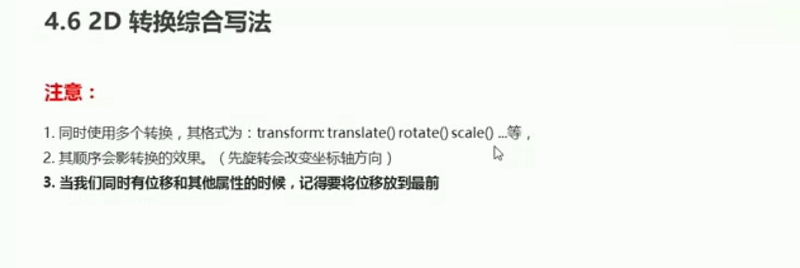
css3 2D转换终和写法
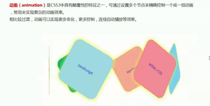
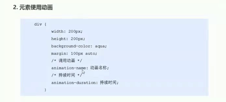
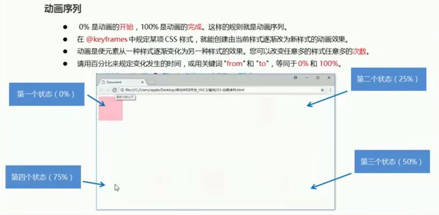
动画
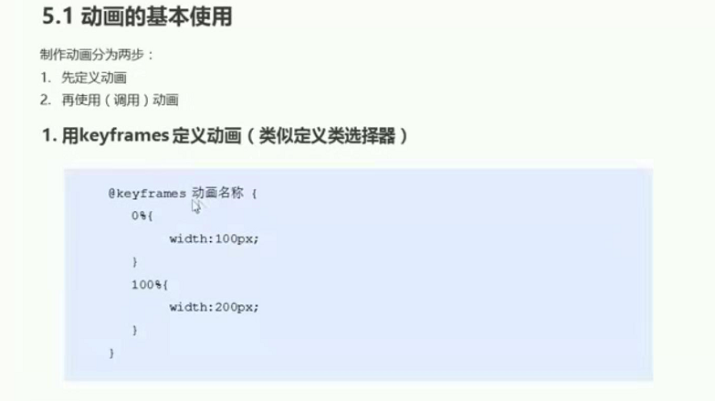
from 和 to 等价与 0% 100%
动画常用属性
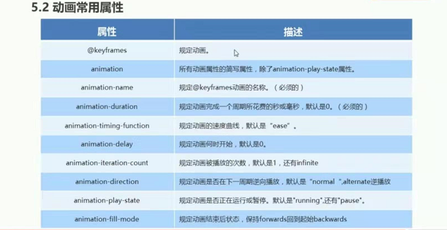
动画简写属性

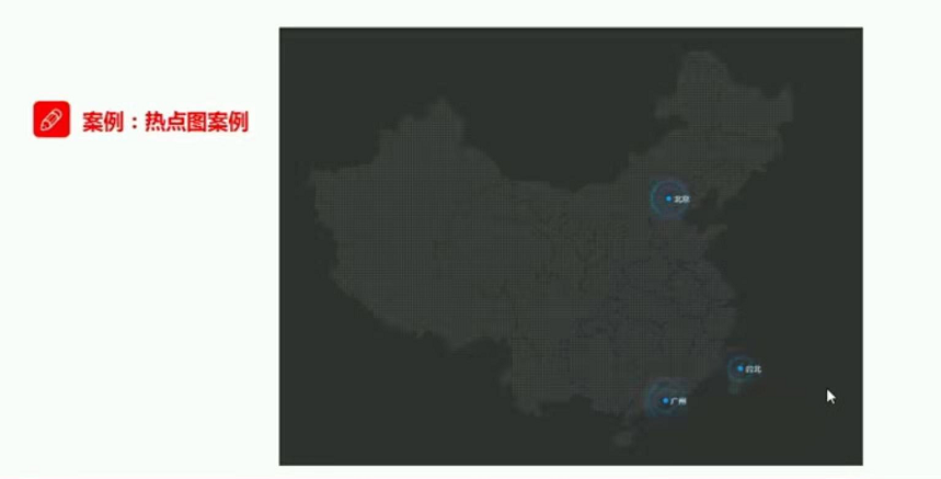
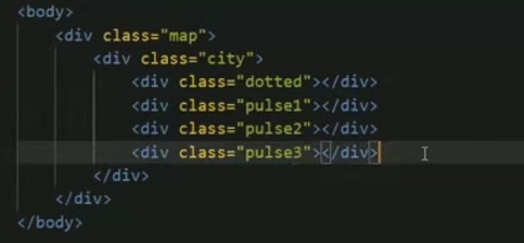
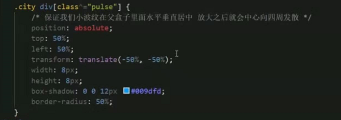
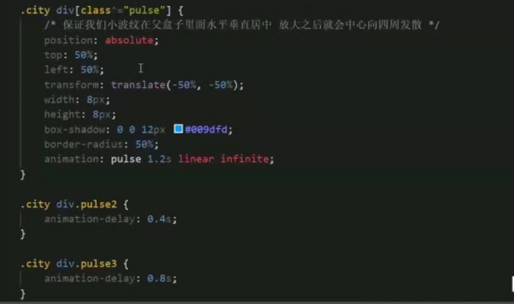
案例 热点图
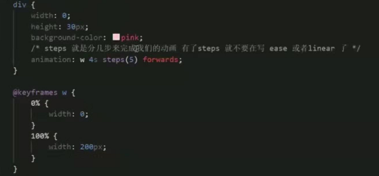
动画速度和曲线步长

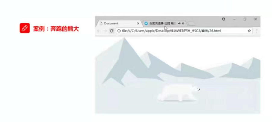
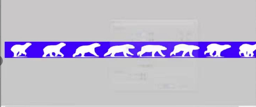
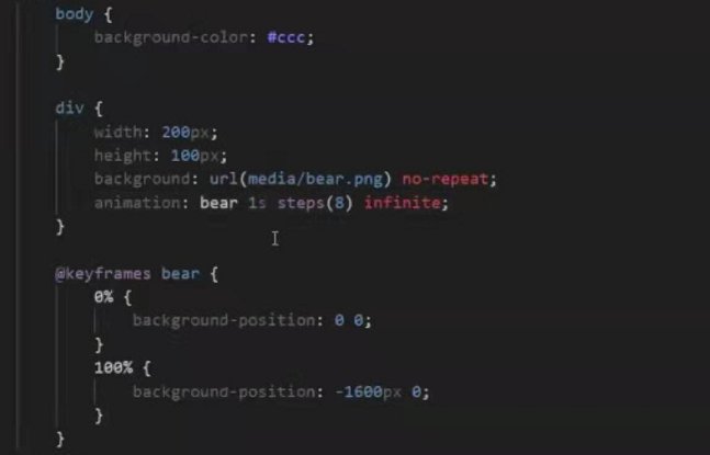
案例2 奔跑的熊大
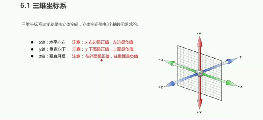
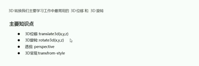
3D转换
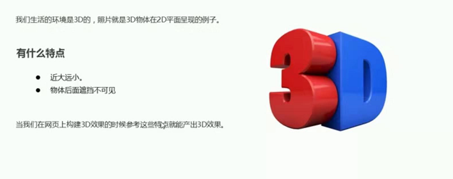
3D转换学习内容

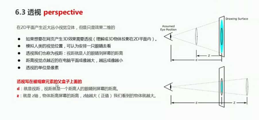
3D透视
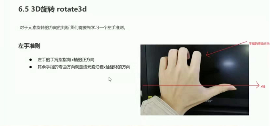
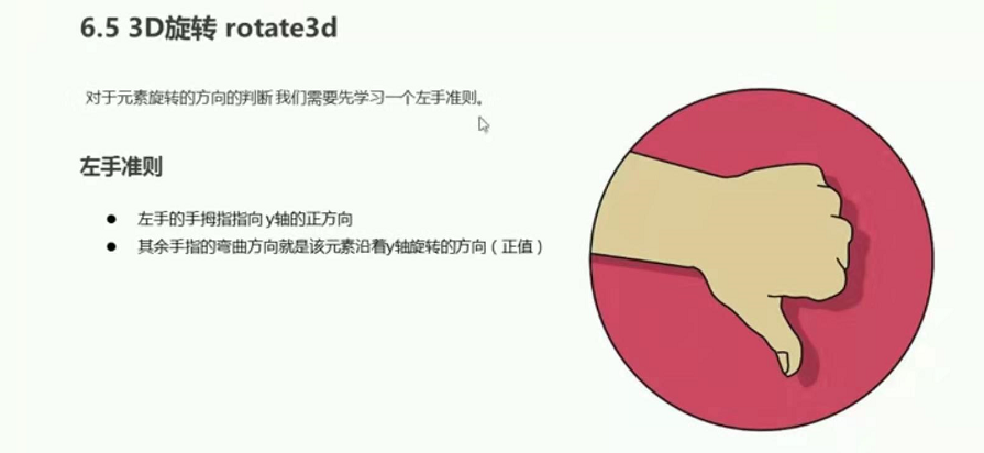
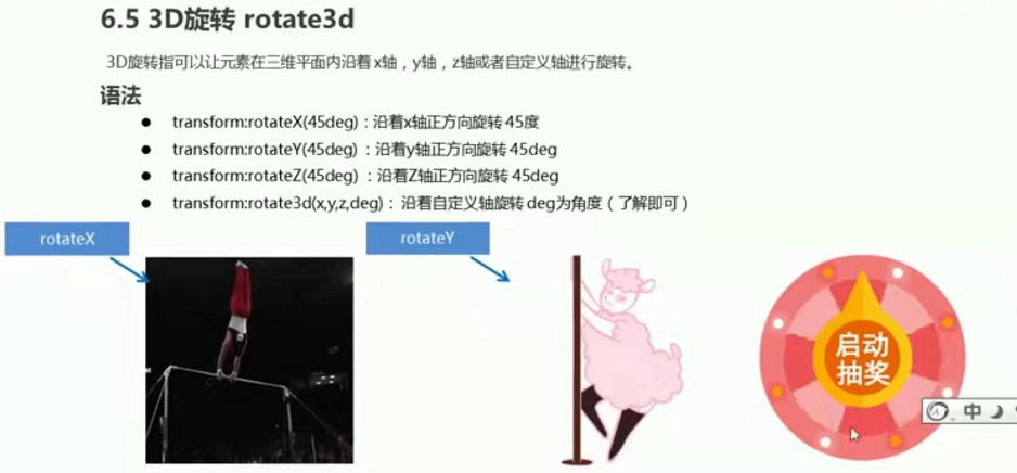
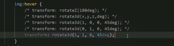
3D旋转rotate3d
X轴
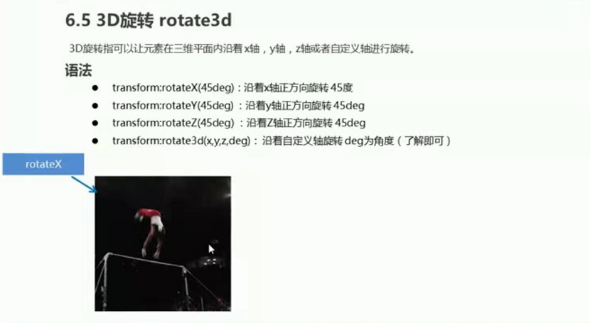
y轴

Z轴
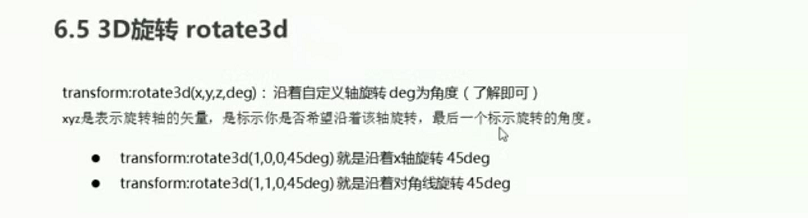
自定义轴旋转
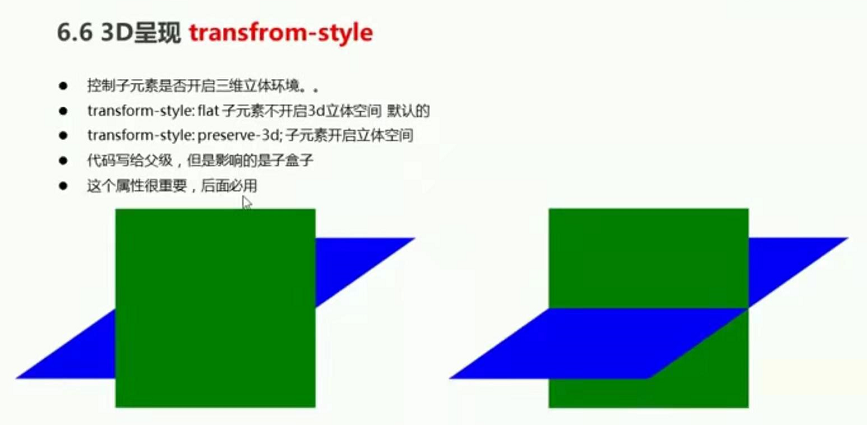
3D呈现

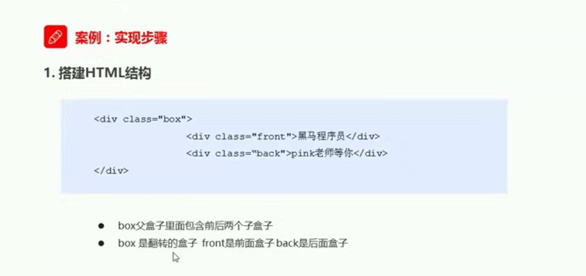
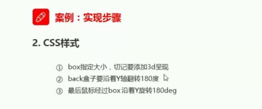
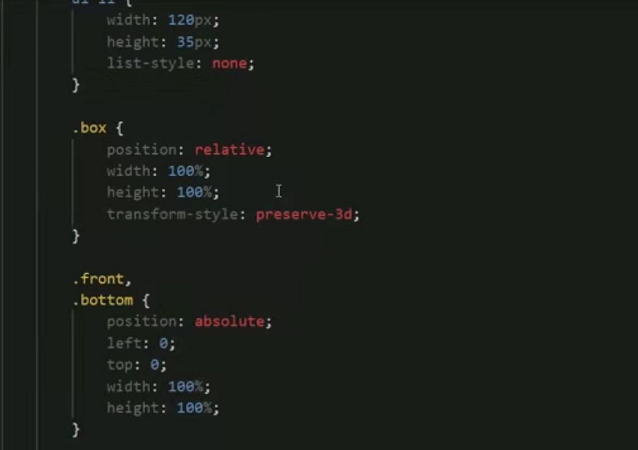
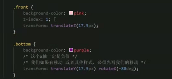
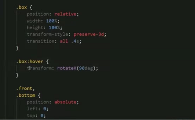
3D转换 2面翻转的盒子

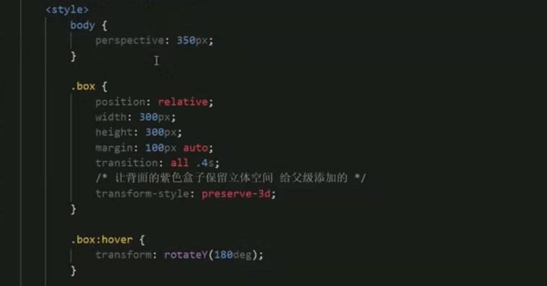
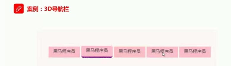
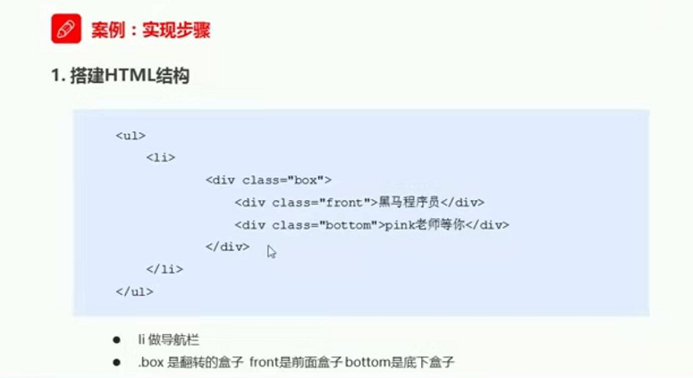
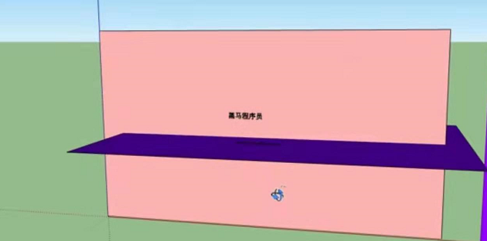
3D导航(案例)
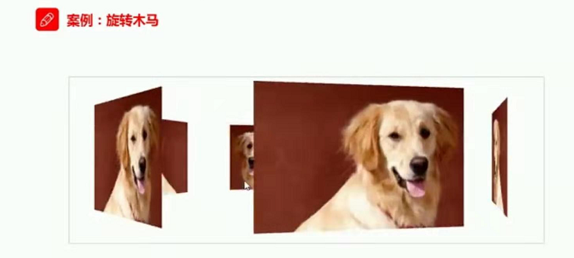
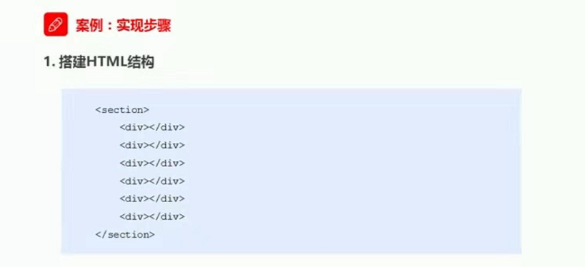
综合案例 旋转木马


<!DOCTYPE html>
<html lang="en">
<head>
    <meta charset="UTF-8">
    <meta name="viewport" content="width=device-width, initial-scale=1.0">
    <meta http-equiv="X-UA-Compatible" content="ie=edge">
    <title>Document</title>
    <style>
        body {
            perspective: 1000px;

        }
        section {
            position: relative;
             300px;
            height: 200px;
            margin: 150px auto;
            /* 开启立体空间 */
            transform-style: preserve-3d;
            /* 添加动画 */
            animation: rotate 10s linear infinite;
            background: url(111.png) no-repeat;

        }

        section:hover {
            /* 鼠标放入停止 */
            animation-play-state: paused ;

        }
        @keyframes rotate {
            0% {
                transform: rotateY(0);
            }
            100% {
                transform: rotateY(360deg);

            }

        }

        section div {
            position: absolute;
             100%;
            height: 100%;
            background: url(111.png) no-repeat;
        }

        section div:nth-child(1) {
            transform: translateZ(300px);

        }
        section div:nth-child(2) {
            /* 先旋转后移动 */
            transform: rotateY(60deg)  translateZ(300px);

        }
        section div:nth-child(3) {
            /* 先旋转后移动 */
            transform: rotateY(120deg)  translateZ(300px);
        }
        section div:nth-child(4) {
            /* 先旋转后移动 */
            transform: rotateY(180deg)  translateZ(300px);
        }
        section div:nth-child(5) {
            /* 先旋转后移动 */
            transform: rotateY(240deg)  translateZ(300px);
        }
        section div:nth-child(6) {
            /* 先旋转后移动 */
            transform: rotateY(300deg)  translateZ(300px);
        }

    </style>
</head>
<body>
    <section>
        <div></div>
        <div></div>
        <div></div>
        <div></div>
        <div></div>
        <div></div>
    </section>
</body>
</html>
浏览器私有前缀