matplotlib几个点画曲线
一、总结
一句话总结:
原理是引入scipy.interpolate的 make_interp_spline函数
在x的最小值和最大值中生成300个点
x_smooth = np.linspace(x.min(),x.max(),300) #300 represents number of points to make between x.min and x.max
y_smooth = make_interp_spline(x, y)(x_smooth)
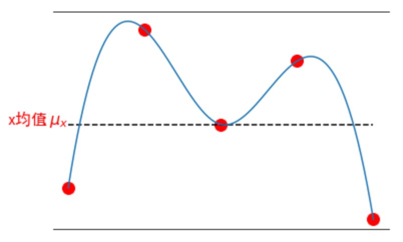
x=np.array([1,2,3,4,5])
y=np.array([4,9,6,8,3])
x_smooth = np.linspace(x.min(),x.max(),300) #300 represents number of points to make between x.min and x.max
y_smooth = make_interp_spline(x, y)(x_smooth)
plt.plot(x_smooth,y_smooth)
二、matplotlib几个点画曲线
博客对应课程的视频位置:
import numpy as np
import matplotlib.pyplot as plt
from scipy.interpolate import make_interp_spline
# 设置matplotlib库字体的非衬线字体为黑体
plt.rcParams["font.sans-serif"]=["SimHei"]
# 设置matplotlib库字体族为非衬线字体
plt.rcParams["font.family"]="sans-serif"

fig, ax = plt.subplots()
# 取消边框
for key, spine in ax.spines.items():
    # 'left', 'right', 'bottom', 'top'
    if key == 'left' or key == 'right':
        spine.set_visible(False)
plt.xticks([])
plt.yticks([])
x=np.array([1,2,3,4,5])
y=np.array([4,9,6,8,3])
y_mean=np.mean(y).repeat(5)
print(y_mean)
#plt.plot(x,y,'ro')
plt.plot(x,y,color='red', marker='o', linestyle='dashed',linewidth=0, markersize=12)
plt.plot(x,y_mean,'k--')
x_smooth = np.linspace(x.min(),x.max(),300) #300 represents number of points to make between T.min and T.max
y_smooth = make_interp_spline(x, y)(x_smooth)
plt.plot(x_smooth,y_smooth)
plt.text(0.2,6,r'x均值', fontdict={'size':16,'color':'r'})
plt.text(0.6,6,r'$:mu_x$', fontdict={'size':16,'color':'r'})
plt.show()