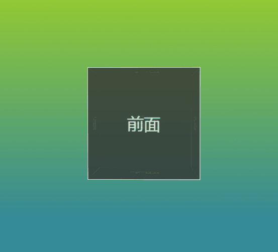
首先看一下效果图
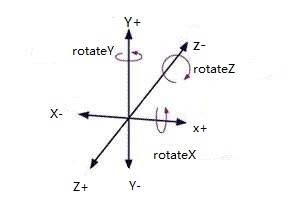
1.坐标系,要在脑海里先建立一个3D坐标系
如下图,看清楚x,y,z轴
2.html代码。
<div class="container">
    <!--包裹六个面的元素-->
    <div class="cube">
        <!--立方体的六个面-->
        <div class="plane-front">前面</div>
        <div class="plane-back">后面</div>
        <div class="plane-left">左面</div>
        <div class="plane-right">右面</div>
        <div class="plane-top">上面</div>
        <div class="plane-bottom">下面</div>
    </div>
</div>
3.css3代码
/*1.首先给html设置一个背景,顺便练习一下渐变*/
html{
background:linear-gradient(#9ed128 0%,#358b98 80%);
opacity: 0.8;
height: 100%;
}
/*2.给。container设置perspective,定义透视效果(元素距离视图的距离),可以改变值尝试。perspective:number/none;(none相当于设置为0,不设置透视效果)。
在这里为了视觉体验更好,设置一下。*/
.container{
margin-top: 200px;
perspective:1000px;
}
/*3.定义最外层包裹六个面的container,并且定义动画。使其旋转,然后再定义那六个面的位置,到时候那六个面也会一同旋转。*/
.cube{
height: 200px;
200px;
position: relative;
margin:auto;
transform-style:preserve-3d;/*定义3d转换*/
animation:rotate 15s infinite;/*animation:动画名字 时长 无限循环 线性速度(匀速)*/
}
/*动画效果,也可以以百分百的方式。默认逆时针的方向旋转。*/
@keyframes rotate{
from{
transfrom:rotateY(0deg) rotateX(0deg);
}
to{
transform: rotateY(360deg) rotateX(360deg);
}
}
/*4.定义每一个面的宽高、行高等内容*/
.cube>div{
height: 100%;
100%;
opacity: 0.9;
position: absolute;
text-align: center;
background: #333;
color:#fff;
line-height: 200px;
font-size: 30px;
border:1px solid #fff;
}
/*5.根据坐标系对每一个面进行定位、旋转得到立方体*/
/* transform:向元素应用3D转换。
translateX/translateY/translateZ:定义3D转换,此函数用来规定指定元素在三维空间中的位移。
rotateX/rotateY/rotateZ:定义旋转。
推荐:http://fangyexu.com/tool-CSS3Inspector.html。
*/
.plane-front{
transform:translateZ(100px);
}
.plane-back{
transform:translateZ(-100px);
}
.plane-left{
transform:rotateY(90deg) translateZ(-100px);
}
.plane-right{
transform:rotateY(90deg) translateZ(100px);
}
.plane-top{
transform:rotateX(90deg) translateZ(100px);
}
.plane-bottom{
transform:rotateX(90deg) translateZ(-100px);
}
/*5.设置鼠标滑过的样式,让每一个面向外走100px*/
.cube:hover .plane-front{
transform:translateZ(200px);
}
.cube:hover .plane-back{
transform:translateZ(-200px);
}
.cube:hover .plane-left{
transform:rotateY(90deg) translateZ(-200px);
}
.cube:hover .plane-right{
transform:rotateY(90deg) translateZ(200px);
}
.cube:hover .plane-top{
transform:rotateX(90deg) translateZ(200px);
}
.cube:hover .plane-bottom{
transform:rotateX(90deg) translateZ(-200px);
}
/*如果要考虑兼容,需要给animation、transform等加前缀。*/
于是一个会动的立方体就大功告成了~