水平垂直居中的布局解决方案有很多,本文仅仅列出三种。
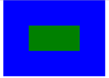
在浏览器里的显示效果:
第一种:利用flex来布局,也是最方便的方式:
.container{
    width: 400px;
    height: 300px;
    background: blue;
    display: flex;
    justify-content: center;
    align-items: center;
}
.center{
    width: 200px;
    height:  100px;
    background: green;
}
第二种:绝对定位加CSS3的2D转换的方式。
.container{
    width: 400px;
    height: 300px;
    background: blue;
    position: relative;
}
.center{
    width: 200px;
    height:  100px;
    background: green;
    position: absolute;
    left: 50%;
    top: 50%;
    transform: translate(-50%,-50%);
}
第三种:绝对定位并使四个方向上均为0加margin:auto;具体代码如下:
.container{
     400px;
    height: 300px;
    background: blue;
    position: relative;
}
.center{
     200px;
    height:  100px;
    background: green;
    position: absolute;
    left: 0;
    right: 0;
    top: 0;
    bottom: 0;
    margin: auto;
}
以上三种方案的HTML部分:
<section class="container">
    <div class="center"></div>
</section>