-----some words------
1.Control:控制 (我们理解成控件)
2.Template:模板
3.Ellipse 椭圆
4.Content 内容
5.Presenter 呈现者, 节目主持人,演播厅,推荐者
6.ContentPresenter 内容呈现者(可能不是太准确)...
------the end ---------
一:Control类
Control类是所有控件的父类,例如Button按钮控件,TextBlock文本框控件等都是继承于Control类。
二:Ellipse类
UWP里画一个圆,没有圆这个类,用的是Ellipse椭圆类,给这个椭圆的长和框设置成一样就好了。
 <Ellipse Width="50"
          Height="50"
          Fill="Blue"></Ellipse>
三:改变Button控件的样式
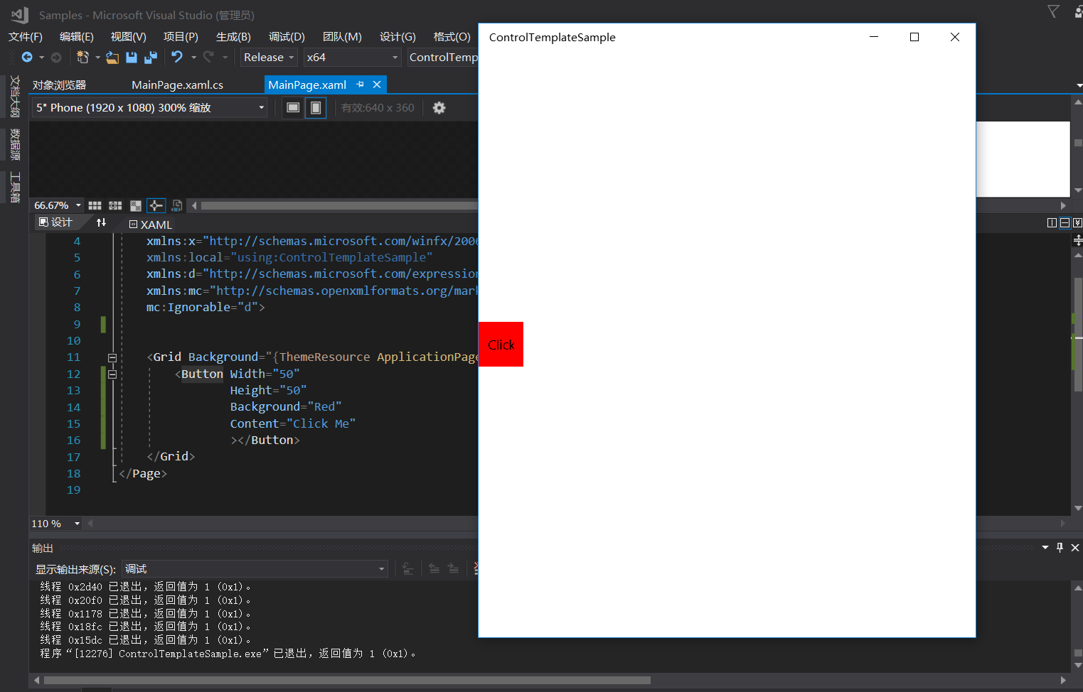
虽然我们可以简单的设置一些控件的样式,但是还是不够。例如下面是一个最简单的Button控件,我们可以改的是Width,Height,但如果你想做一个圆形的按钮,怎么做呢?
在设计器里找到你写的Button控件,右键->编辑模板->编辑副本
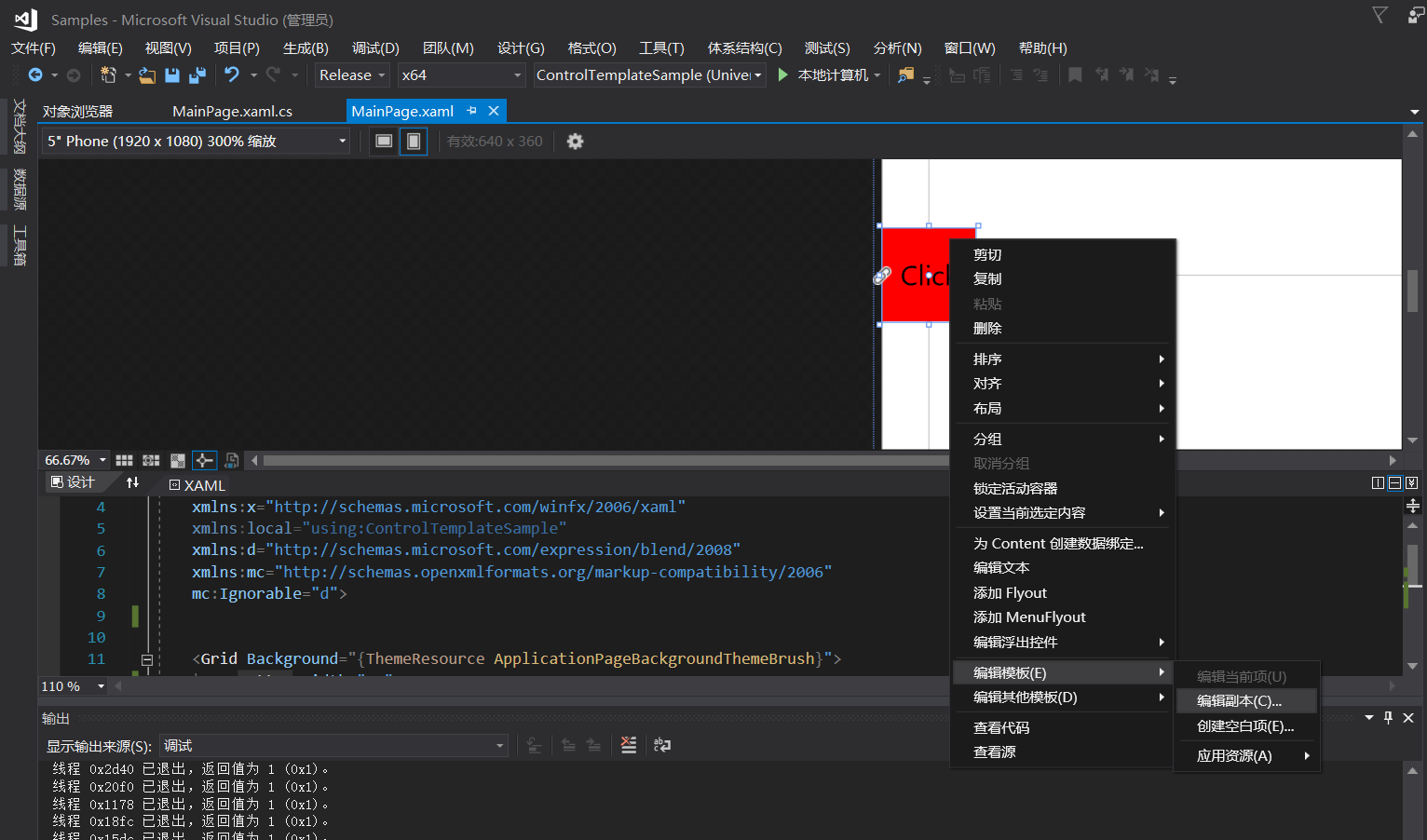
vs会帮你生成一个样式
 <<Page.Resources>
        <Style x:Key="ButtonStyle1" TargetType="Button">
            <Setter Property="Background" Value="{ThemeResource ButtonBackground}"/>
            <Setter Property="Foreground" Value="{ThemeResource ButtonForeground}"/>
            <Setter Property="BorderBrush" Value="{ThemeResource ButtonBorderBrush}"/>
            <Setter Property="BorderThickness" Value="{ThemeResource ButtonBorderThemeThickness}"/>
            <Setter Property="Padding" Value="8,4,8,4"/>
            <Setter Property="HorizontalAlignment" Value="Left"/>
            <Setter Property="VerticalAlignment" Value="Center"/>
            <Setter Property="FontFamily" Value="{ThemeResource ContentControlThemeFontFamily}"/>
            <Setter Property="FontWeight" Value="Normal"/>
            <Setter Property="FontSize" Value="{ThemeResource ControlContentThemeFontSize}"/>
            <Setter Property="UseSystemFocusVisuals" Value="True"/>
            <!--<Setter Property="FocusVisualMargin" Value="-3"/>-->
            <Setter Property="Template">
                <Setter.Value>
                    <ControlTemplate TargetType="Button">
                        <Grid x:Name="RootGrid" Background="{TemplateBinding Background}">
                            <ContentPresenter x:Name="ContentPresenter" AutomationProperties.AccessibilityView="Raw" BorderBrush="{TemplateBinding BorderBrush}" BorderThickness="{TemplateBinding BorderThickness}" ContentTemplate="{TemplateBinding ContentTemplate}" ContentTransitions="{TemplateBinding ContentTransitions}" Content="{TemplateBinding Content}" HorizontalContentAlignment="{TemplateBinding HorizontalContentAlignment}" Padding="{TemplateBinding Padding}" VerticalContentAlignment="{TemplateBinding VerticalContentAlignment}"/>
                        </Grid>
                    </ControlTemplate>
                </Setter.Value>
            </Setter>
        </Style>
    </Page.Resources>
TargetType="Button" 表示这是一个给Button类型设置的样式。
控件有一个Template属性,该属性用来定义控件的模板,为什么你创建一个Button按钮,是方形的而不是圆形的,就是每个控件都有自己的默认模板,当你不去改Template时,他就是默认的,如果我们想让控件变的漂亮一点,就要改控件的模板。
Template模板属性存的是ControlTemplate(控件模板)
里面放的是一个Grid。
说明这个Grid就是该Button的模板。Background="{TemplateBinding Background}" 说明是将我们的在Xaml代码里写的Background绑定到了模板的最外层。简单来理解就是我们设置的样式,要么是通过继承或者绑定到了我们的模板上。
四:ContentPresenter
内容控件Button有一个Content属性,相应的模板里有一个ContentPresenter类用于单独的装内容。
单独装的好处就是不管你的模板的样式怎么改变,我的内容都不会受到影响。
五:做一个圆形Button控件
既然是圆形的按钮,那么我们在模板里加一个圆形。
<Setter Property="Template">
                <Setter.Value>
                    <ControlTemplate TargetType="Button">
                        <Grid x:Name="RootGrid" Background="Transparent">
                            <Ellipse Width="{TemplateBinding Width}"
                                     Height="{TemplateBinding Height}"
                                     Fill="{TemplateBinding Background}"></Ellipse>
                            <ContentPresenter x:Name="ContentPresenter"
                                              AutomationProperties.AccessibilityView="Raw"
                                              BorderBrush="{TemplateBinding BorderBrush}"
                                              BorderThickness="{TemplateBinding BorderThickness}"
                                              ContentTemplate="{TemplateBinding ContentTemplate}"
                                              ContentTransitions="{TemplateBinding ContentTransitions}"
                                              Content="{TemplateBinding Content}"
                                              HorizontalContentAlignment="{TemplateBinding HorizontalContentAlignment}"
                                              Padding="{TemplateBinding Padding}"
                                              VerticalContentAlignment="{TemplateBinding VerticalContentAlignment}"/>
                        </Grid>
                    </ControlTemplate>
                </Setter.Value>
</Setter>
将根Grid的背景改成Transparent透明。在Grid里加上一个圆形,将圆形的背景颜色绑定一下。
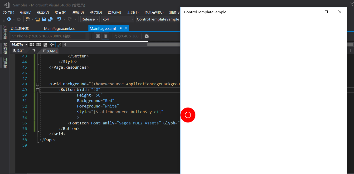
这里的例子是Button的Content是一个FontIcon,该content被装到了模板里的ContentPresenter里。
background被绑定到了模板里的Ellipse的背景里,这样一个简单的按钮的样式就做好了。之后如果还要用这个样式,引用就好了。
当然现在的按钮的其它状态样式比如Pressed,这类的状态样式我这里没写,下篇再见!