matplotlib的安装
pip install matplotlib
matplotlib简单的画图练习
线形图
import matplotlib.pyplot as plt
import numpy as np

x = np.linspace(0, 2 * np.pi, 100) # 随机生成一个 0至100之间的数 间隔是 2*pi
y1, y2 = np.sin(x), np.cos(x)      # 给用 y1 y2 赋值
plt.title('sin & cos')             # 线形图标题 可选  可不写
plt.xlabel('x')                    # 建立数轴x 可选  可不写
plt.ylabel('y')                    # 建立数轴y 可选  可不写
plt.plot(x, y1)                    # 分别画出 x,y1所在的数值
plt.plot(x, y2)                    # 分别画出 x,y2所在的数值
plt.show()
线形 效果图

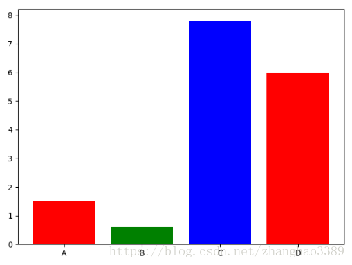
条形图/柱状图
import matplotlib.pyplot as plt

name_list = ['A', 'B', 'C', 'D']
num_list = [1.5, 0.6, 7.8, 6]
# 条形图个数 参数 条形图颜色红绿蓝循环 每个条形的名称
plt.bar(range(len(name_list)), num_list, color='rgb', tick_label=name_list)
plt.show()
条形 效果图
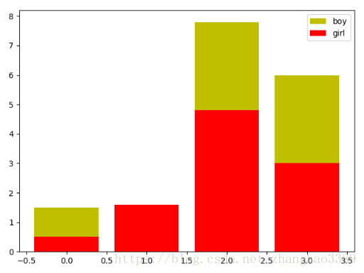
堆叠柱状图 鸡肋
import matplotlib.pyplot as plt

name_list = ['A', 'B', 'C', 'D'] # 数据a
num_list = [1.5, 0.6, 7.8, 6] # 数据a
name_list1 = ['A', 'B', 'C', 'D'] # 数据b
num_list1 = [0.5, 1.6, 4.8, 3] # 数据b
# 条形图个数 参数 表名 可选 颜色黄色
plt.bar(range(len(name_list)), num_list, label='boy', fc='y')
# 条形图个数 参数 表名 可选 颜色黄色
plt.bar(range(len(name_list1)), num_list1, label='girl', fc='r')
plt.legend() # 堆叠
plt.show()
堆叠柱状 效果图 出现了覆盖的情况
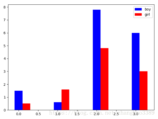
并列柱状图 解决上面的堆叠柱状图的鸡肋情况
import matplotlib.pyplot as plt

name_list = ['A', 'B', 'C', 'D'] # 数据a
num_list = [1.5, 0.6, 7.8, 6] # 数据a
name_list1 = ['A', 'B', 'C', 'D'] # 数据b
num_list1 = [0.5, 1.6, 4.8, 3] # 数据b

x = list(range(len(name_list))) # 将name_list做成列表长度 x
totle_width, n = 0.4, 2 # 每个柱状图的宽度,一共两根柱状图
width = totle_width / n # 柱状图的间距总宽除以二
# x传入有几个柱状图 num_list传入柱状图的数据 width柱状图的宽度 label表名 fc颜色
plt.bar(x, num_list, width=width, label='boy', fc='b')
# 将每个x的值加上柱状图的宽度
for i in range(len(x)):
x[i] = x[i] + width
# 再次传入x的值个柱状图 num_list1传入柱状图数据 width柱状图宽度 label表名 fc颜色
plt.bar(x, num_list1, width=width, label='girl', fc='r')
plt.legend() # 重叠
plt.show()
并列柱状 效果图
饼状图
import matplotlib.pyplot as plt

labels = 'A', 'B', 'C', 'D', 'E' # 传入饼状图的表名
faces = [15, 30, 55, 44.44, 10] # 传入饼状图的值
plt.axes(aspect=1) # 画一个单位圆
explode = [0, 0, 0, 0.2, 0] # 选择需要取出的 那部分
#    传入数据个数   传入表名 以浮点数显示 阴影开 起始角 选择需要取出那块
plt.pie(x=faces, labels=labels, autopct='%3.1f %%', shadow=True, startangle=90, explode=explode)
plt.show()
饼状 效果图