介绍:
这篇文章,并没有完整的实现翻页时钟、日历,只写了如何实现一个可连续翻页的 css 效果。在此基础上实现翻页时钟、日历还不是手到擒来。
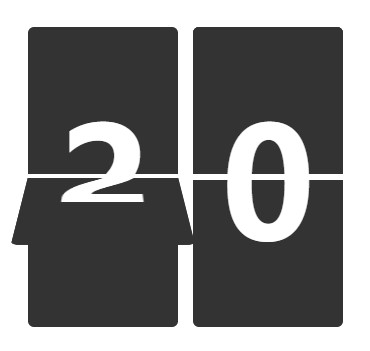
Demo:
上代码:
<!DOCTYPE html>
<html lang="en">

<head>
  <meta charset="UTF-8" />
  <meta http-equiv="X-UA-Compatible" content="IE=edge" />
  <meta name="viewport" content="width=device-width, initial-scale=1.0" />
  <title>Document</title>

  <style>
    *{
      box-sizing: border-box;
      margin: 0;
      padding: 0;
    }
    #app {
      height: 100%;
      font-size: 0;
      display: flex;
      align-items: center;
      justify-content: center;
      flex-flow: wrap-reverse;
    }

    .box {
      position: relative;
      box-sizing: border-box;
      margin: 5px;
    }

    .box .child {
       130px;
      height: 100px;
      overflow: hidden;
    }

    .box>.top {
      background-color: #333;
      line-height: 200px;
      border-bottom: 2px solid #fff;
      border-radius: 4px 4px 0 0;
    }

    .box .flip {
      position: absolute;
      top: 0px;
      z-index: 1;
      transform-origin: bottom;
      border-radius: 4px 4px 0 0;
    }

    .box .flip .flip_face {
      position: absolute;
      background-color: #333;
      line-height: 200px;
      z-index: 1;
      border-bottom: 2px solid #fff;
    }

    .box .flip .flip_back {
      position: absolute;
      background-color: #333;
      line-height: 0px;
      transform: perspective(500px) rotateX(0deg) rotateY(-180deg) rotate(180deg);
      border-top: 2px solid #fff;
    }

    .box .bottom {
      background-color: #333;
      line-height: 0px;
      border-top: 2px solid #fff;
      border-radius: 0 0 4px 4px;
    }

    .text {
      text-align: center;
      font-size: 100px;
      font-weight: 900;
      color: #fff;
    }
  </style>
</head>

<body>
  <div id="app">
    <div class="box" id="box_minute">
      <div class="top child text" id="top">0</div>
      <div class="flip child" id="flip">
        <div class="flip_face child text" id="flip_face">0</div>
        <div class="flip_back child text" id="flip_back">0</div>
      </div>
      <div class="bottom child text" id="bottom">0</div>
    </div>
  </div>

  <script>
    // 获取Dom
    const box_minute = document.querySelector("#box_minute");
    const Top = box_minute.querySelector("#top");
    const flip = box_minute.querySelector("#flip");
    const flipFace = flip.querySelector("#flip_face");
    const flipBack = flip.querySelector("#flip_back");
    const Bottom = box_minute.querySelector("#bottom");
    let timer = null, timerTwo = null;

    const OneCycle = (n, timer) => { // 一次翻页的周期
      let num = 0;
      flipFace.style.zIndex = 1;
      flipBack.style.zIndex = 0;
      flip.style.transform = "perspective(500px) rotateX(0deg)"; // rotateX(0deg) => rotateX(-180deg)
      flipFace.innerHTML = n;
      Bottom.innerHTML = n;

      timer = setInterval(() => {
        num++;
        if (num > 50) {
          clearInterval(timer);
          return;
        };

        if (num === 1) {
          Top.innerHTML = (n + 1) === 60 ? 0 : (n + 1); // 60 和 0 在时间里,其实是一样的
          flipBack.innerHTML = (n + 1) === 60 ? 0 : (n + 1);
        }

        if (num <= 25) {
          flipFace.style.zIndex = 1;
          flipBack.style.zIndex = 0;
        } else {
          flipFace.style.zIndex = 0;
          flipBack.style.zIndex = 1;
        }
        // console.log(num); // 1 ~ 50
        flip.style.transform = `perspective(500px) rotateX(-${180 * num / 50}deg)`
      }, 20); // 将一秒钟分成50份。
    };

    const cycle = () => {
      timerTwo = setInterval(() => {
        let num = new Date().getSeconds();
        OneCycle(num, timer);
      }, 1000);
    };

    cycle();

    // 浏览器页面切换时,定时器setInterval抖动问题
    document.onvisibilitychange = function () {
      if (document.visibilityState === "visible") {
        cycle();
      } else {
        clearInterval(timer);
        clearInterval(timerTwo);
      }
    }

  </script>
</body>

</html>
浏览器页面切换时,定时器 setInterval 抖动问题?
利用 document.onvisibilitychange 来监听页面(可视区)是否变化,只要发生改变就会触发一次,再通过 document.visibilityState 或者 document.hidden 来判断用户是是否在该页面。