效果图如下:
源码:
<!DOCTYPE html public "-//w3c//dtd html 4.01 transitional//en"
"http://www.w3c.org/tr/html4/loose.dtd">
<html>
<head>
<meta charset="utf-8">
<title></title>
<style type="text/css">
p{color: #fff;}
.test{
300px;
padding: 30px 20px;
margin: 60px;
background: #ce5010;
position: relative;
border-radius: 10px;
}
.test span{
0;
height: 0;
font-size: 0;
overflow: hidden;
position: absolute;
}
.test span.bot{
border- 20px;
border-style: solid;
border-color: transparent #ce5010 #ce5010 transparent;
left: -40px;
top: 40px;
}
.test span.top{
border- 10px 20px;
border-style: solid;
border-color: transparent #fff #fff transparent;
left: -40px;
top: 60px;
}
.test .orgBotCor{
color: #333;
font-size: 60px;
position: absolute;
line-height: 60px;
top: -30px;
color: #ce5010;
}
.test.newBG span.bot2{
border- 20px;
border-style: solid dashed dashed; /*这里用dashed是为了解决防止IE6下的bug, 如果是solid,无法显示透明,具体原因不明*/
border-color: #ce5010 transparent transparent;
bottom: -40px;
}
.test.newBG span.top2{
border- 20px;
border-style: solid dashed dashed;
border-color: #fff transparent transparent;
bottom: -33px;
}
.newBG{
background-color: #fff;
border: #ce5010 5px solid;
color: #ce5010;
}
.orangeColor{
color: #ce5010;
}
</style>
</head>
<body>
<div class="test">
<span class="bot"></span>
<span class="top"></span>
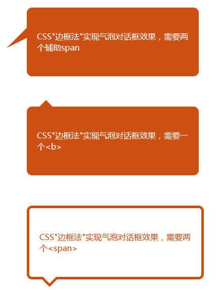
<p>CSS"边框法"实现气泡对话框效果,需要两个辅助span</p>
</div>
<div class="test">
<b class="orgBotCor">◆</b>
<p>CSS"符号法"实现气泡对话框效果,需要一个<b></p>
</div>
<div class="test newBG">
<span class="bot2"></span>
<span class="top2"></span>
<p class="orangeColor">CSS"边框法"实现气泡对话框效果,需要两个<span></p>
</div>
</body>
<html>