昨天面试前端,一面危险通过,面试官建议我看看“圣杯布局”,听起来很玄妙的名字,花了一晚上弄明白怎么回事,惊讶于前端工作的细节和技巧!
我先看几个基础,在后面要用到的:
1.CSS right/left 属性
right/left属性规定元素的右/左边缘。定义了定位元素右/左外边,与其包含块右/左边界之间的偏移。
right:50px:设置元素位置,使其右边缘距离其包含元素的右边缘5。它的右边和包含它的元素的右边之间的距离5px;
    <html>
    <head>
        <style type="text/css"></style>
        <meta charset="UTF-8">
        <style type="text/css">
        .left {
            position:absolute;
            background: red;
            right: 10px;
        }
        </style>
    </head>
    <body>
            <div class="left">
                pppppppppppp<br />
            </div>
        </div>
    </body>
    </html>
元素位于最右侧距离窗口右侧10px处;
2.margin-left:-100% 这种表示中负数什么意思?
先看一个例子:
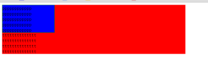
    <html>
    <head>
        <style type="text/css"></style>
        <meta charset="UTF-8">
        <style type="text/css">
        .center {
            float:left;
            width:600px;
            background:red;
        }
        .left {
            float:left;
            width:170px;
            background:blue;
            border:1px solid green;
        }
        </style>
    </head>
    <body>
        <div class="wrap">
            <div class="center">
                <div class="box">
                    tttttttttttttt<br />
                    tttttttttttttt<br />
                    tttttttttttttt<br />
                    tttttttttttttt<br />
                    tttttttttttttt<br />
                    tttttttttttttt<br />
                    tttttttttttttt<br />
                    tttttttttttttt<br />
                    tttttttttttttt<br />
                </div>
            </div>
            <div class="left">
                pppppppppppp<br />
                pppppppppppp<br />
                pppppppppppp<br />
                pppppppppppp<br />
                pppppppppppp<br />
            </div>
        </div>
    </body>
    </html>

我们知道,浮动的元素,只有在位置不够的时候才会被挤到第二行。上面两个div都有足够的位置,所以排在一行没有换行:
使用margin-left:-600px;后是这样:
        <style type="text/css">
        .center {
            float:left;
            width:600px;
            background:red;
        }
        .left {
            float:left;
            width:170px;
            background:blue;
            border:1px solid green;
            margin-left:-600px;
        }
        </style>
margin-left:10px 是左边距10px,效果是content向右移10px,那么-10px就是content,就是蓝色块向左移10px;
这里刚好移动-600px达到红色box的左边!
如果红色块如果宽度设置为100%,蓝色块只浮动,不使用margin左负值,后面的元素是会被挤在第二行的。
        <style type="text/css">
        .center {
            float:left;
            width:100%;
            background:red;
        }
        .left {
            float:left;
            width:170px;
            background:blue;
            border:1px solid green;
        }
        </style>

如果把宽度设为-100%:
        <style type="text/css">
        .center {
            float:left;
            width:100%;
            background:red;
        }
        .left {
            float:left;
            width:170px;
            background:blue;
            border:1px solid green;
            margin-left:-100%;
        }
        </style>

我们可以通过以上方式,让红色box的width=100%,自适应窗口大小,然后让左右两边通过负边距来放置两个box;实现如下:
下面,我们尝试实现“圣杯布局”
利用浮动元素的负边距来定位,代码如下:
<html>
<head>
<meta content="text/html; charset=utf-8" />
<style type="text/css">
    body{
        min-width: 800px;
        text-align: center;
    }
    #head{
        background:green;
        clear:both;
    }
    #footer{
        background:red;
        clear:both;
    }
    #container{
        overflow: auto;
    }
    .column{
        float:left;
        min-height: 300px;
    }
    #center{
        background:blue;
        width: 100%;
    }
    #left{
        background:green;
        width:190px;
        margin-left:-100%;
    }
    #right{
        background:yellow;
        width: 190px;
        margin-left: -190px;
    }
</style>
</head>

<body>
    <div id="head">
        <h1>head</h1>
    </div>
    <div id="container">
        <div id="center" class="column">center</div>
        <div id="left" class="column">left</div>
        <div id="right" class="column">right</div>
    </div>
    <div id="footer">
        <h1>footer</h1>
    </div>
</body>
</html>

现在,通过简单的负边距,已经让left和right定位到正确的位置,剩下的问题是如何让center也定位到正确的位置(现在center是100%铺满的,第一个想法就是在center两侧预留两块位置给left 和 right):
试着给container添加padding:
    #container{
        overflow: auto;
        padding: 0 190px 0 190px;

结果现在center定位正确了,left和right位置不对了!如何修改left和right?
我们尝试在其现有位置上进行偏移,用position: relative!
    #left{
        background:green;
        190px;
        margin-left:-100%;
        position: relative;
        left: -190px;
    }
    #right{
        background:yellow;
         190px;
        margin-left: -190px;
        position: relative;
        right: -190px;
    }
相对其原来位置再进行偏移:

基本上效果出来了!
不过感觉用former也可以达到这个效果!求讨论。