一、开关按钮 ToggleButton
(1)默认的样式比较朴素,可进行修改。
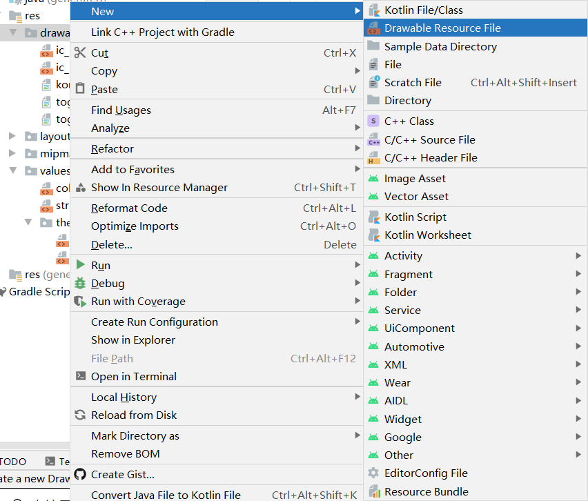
(2)drawable文件夹下新建Drawable Resource File,命名为selector,是一种选择器,我们要在selector.xml中描述“开” “关”的两种状态,两种状态 “开”“关” 可 对应两张不同的图片。
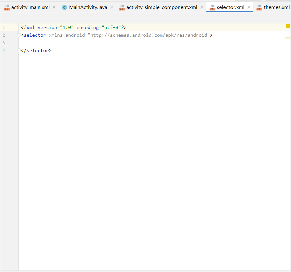
<?xml version="1.0" encoding="utf-8"?>
<selector xmlns:android="http://schemas.android.com/apk/res/android">
    <item android:state_checked="true" android:drawable="@drawable/toggle_on"/>
    <item android:state_checked="false" android:drawable="@drawable/toggle_off"/>
</selector>
(3)完善下ToggleButton
<ToggleButton
        android:id="@+id/tb_switch"
        android:textOn=""
        android:textOff=""
        android:background="@drawable/selector"
        android:checked="true"

        android:layout_width="wrap_content"
        android:layout_height="wrap_content"/>
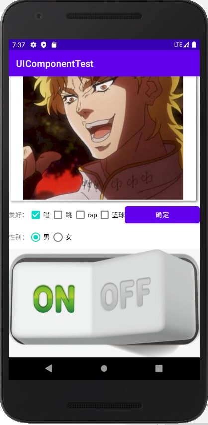
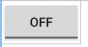
(4)效果如下:
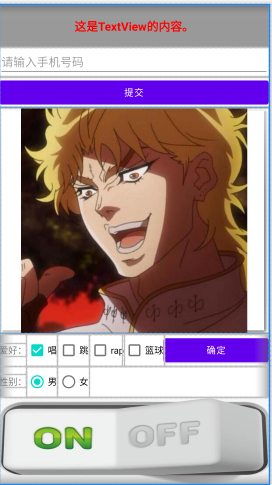
(5)可是,在模拟器中,显示不全,怎么办呢?
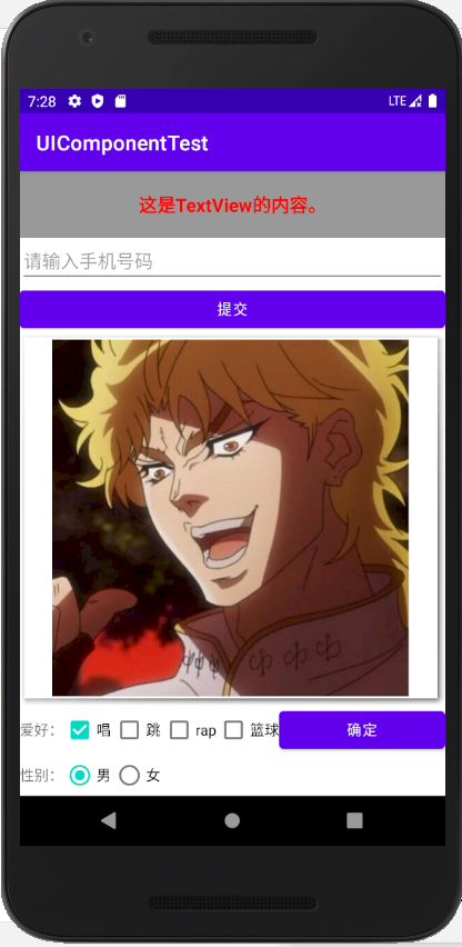
其实很简单,使用ScrollView 把之前写的东西包住即可。
<ScrollView android:layout_height="match_parent"
    android:layout_width="match_parent"
    xmlns:android="http://schemas.android.com/apk/res/android" >

<!--写的东西-->

</ScrollView>