#安装vcd包,数据集在vcd包中
library(vcd)
counts <- table(Arthritis$Improved)
counts
# 垂直
barplot(counts, main = "Simple Bar Plot", xlab = "Improvement",
ylab = "Frequency")
# 改为水平
barplot(counts, main = "Horizontal Bar Plot", xlab = "Frequency",
ylab = "Improvement", horiz = TRUE)
# 两个列
counts <- table(Arthritis$Improved, Arthritis$Treatment)
counts
# 堆砌条形图
barplot(counts, main = "Stacked Bar Plot", xlab = "Treatment",
ylab = "Frequency", col = c("red", "yellow", "green"),
legend = rownames(counts))

#分组条形图
barplot(counts, main = "Grouped Bar Plot", xlab = "Treatment",
ylab = "Frequency", col = c("red", "yellow", "green"),
legend = rownames(counts),
beside = TRUE)

states <- data.frame(state.region, state.x77)
means <- aggregate(states$Illiteracy, by = list(state.region), FUN = mean)
means
means <- means[order(means$x), ]
means
barplot(means$x, names.arg = means$Group.1)
title("Mean Illiteracy Rate")

library(vcd)
attach(Arthritis)
counts <- table(Treatment, Improved)
#棘状图
spine(counts, main = "Spinogram Example")
detach(Arthritis)

#屏幕分成2行2列,可以放4副图
par(mfrow = c(2, 2))
#图1中的数据
slices <- c(10, 12, 4, 16, 8)
#图1中的文字
lbls <- c("US", "UK", "Australia", "Germany", "France")
#饼图1
pie(slices, labels = lbls, main = "Simple Pie Chart")
#图2中的数据,是图1中数据的百分比
pct <- round(slices/sum(slices) * 100)
lbls2 <- paste(lbls, " ", pct, "%", sep = "")
pie(slices, labels = lbls2, col = rainbow(length(lbls)), main = "Pie Chart with Percentages")
#三维饼图
library(plotrix)
pie3D(slices, labels = lbls, explode = 0.1, main = "3D Pie Chart ")
#
mytable <- table(state.region)
lbls <- paste(names(mytable), "
", mytable, sep = "")
pie(mytable, labels = lbls, main = "Pie Chart from a Table
(with sample sizes)")

#扇形图
par(opar)
library(plotrix)
slices <- c(10, 12, 4, 16, 8)
lbls <- c("US", "UK", "Australia", "Germany", "France")
fan.plot(slices, labels = lbls, main = "Fan Plot")

#直方图
#2行2列
par(mfrow = c(2, 2))
#普通的直方图
hist(mtcars$mpg)
#指定12组
hist(mtcars$mpg, breaks = 12, col = "red",xlab = "Miles Per Gallon", main = "Colored histogram with 12 bins")
#freq=FALSE表示密度直方图
hist(mtcars$mpg, freq = FALSE, breaks = 12, col = "red", xlab = "Miles Per Gallon", main = "Histogram, rug plot, density curve")
#jitter是添加一些噪声,rug是在坐标轴上标出元素出现的频数。出现一次,就会画一个小竖杠。从rug的疏密可以看出变量是什么地方出现的次数多,什么地方出现的次数少。
#轴须图是实际数据值的一种一维呈现方式。如果数据中有很多结(相同的值),可以使用如下代码将数据打散布,会向每个数据点添加一个小的随机值,以避免重叠点产生的影响。
rug(jitter(mtcars$mpg))
#画密度线
lines(density(mtcars$mpg), col = "blue", lwd = 2)
# Histogram with Superimposed Normal Curve
x <- mtcars$mpg
h <- hist(x, breaks = 12, col = "red", xlab = "Miles Per Gallon", main = "Histogram with normal curve and box")
xfit <- seq(min(x), max(x), length = 40)
#正态分布
yfit <- dnorm(xfit, mean = mean(x), sd = sd(x))
yfit <- yfit * diff(h$mids[1:2]) * length(x)
lines(xfit, yfit, col = "blue", lwd = 2)
#添加一个框
box()

par(mfrow = c(2, 1))
d <- density(mtcars$mpg)
plot(d)
d <- density(mtcars$mpg)
plot(d, main = "Kernel Density of Miles Per Gallon")
#画多边形
polygon(d, col = "red", border = "blue")
#添加棕色轴须图
rug(mtcars$mpg, col = "brown")

#双倍线宽
par(lwd = 2)
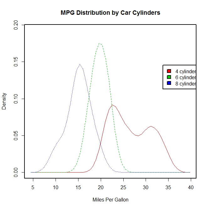
library(sm)
attach(mtcars)
#产生一个因子cyl.f,cyl是mtcars的一个列
cyl.f <- factor(cyl, levels = c(4, 6, 8),labels = c("4 cylinder", "6 cylinder", "8 cylinder"))
sm.density.compare(mpg, cyl, xlab = "Miles Per Gallon")
title(main = "MPG Distribution by Car Cylinders")
#指定颜色值
colfill <- c(2:(2 + length(levels(cyl.f))))
cat("Use mouse to place legend...", "
")
#locator表示在鼠标点击的位置上添加图例
legend(locator(1), levels(cyl.f), fill = colfill)
detach(mtcars)
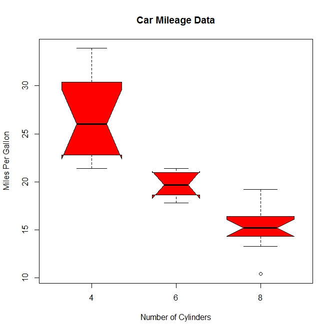
par(lwd = 1)
boxplot(mpg ~ cyl, data = mtcars, main = "Car Milage Data", xlab = "Number of Cylinders", ylab = "Miles Per Gallon")

#notch=TRUE含凹槽的箱线图,有凹槽不重叠,表示中位数有显著差异,如下图,都有明显差异,
boxplot(mpg ~ cyl, data = mtcars, notch = TRUE, varwidth = TRUE, col = "red", main = "Car Mileage Data", xlab = "Number of Cylinders", ylab = "Miles Per Gallon")
mtcars$cyl.f <- factor(mtcars$cyl, levels = c(4, 6, 8), labels = c("4", "6", "8"))
mtcars$am.f <- factor(mtcars$am, levels = c(0, 1), labels = c("auto", "standard"))
boxplot(mpg ~ am.f * cyl.f, data = mtcars, varwidth = TRUE, col = c("gold", "darkgreen"), main = "MPG Distribution by Auto Type", xlab = "Auto Type")
#如下图,再一次清晰显示油耗随着缸数下降而减少,对于四和六缸,标准变速箱的油耗更高。对于八缸车型,油耗似乎没有差别
#也可以从箱线图的宽度看出,四缸标准变速成箱的车型和八缸自动变速箱的车型在数据集中最常见

dotchart(mtcars$mpg, labels = row.names(mtcars), cex = 0.7, main = "Gas Milage for Car Models", xlab = "Miles Per Gallon")

x <- mtcars[order(mtcars$mpg), ]
x$cyl <- factor(x$cyl)
x$color[x$cyl == 4] <- "red"
x$color[x$cyl == 6] <- "blue"
x$color[x$cyl == 8] <- "darkgreen"
dotchart(x$mpg, labels = row.names(x), cex = 0.7,
pch = 19, groups = x$cyl,
gcolor = "black", color = x$color,
main = "Gas Milage for Car Models
grouped by cylinder",
xlab = "Miles Per Gallon")
