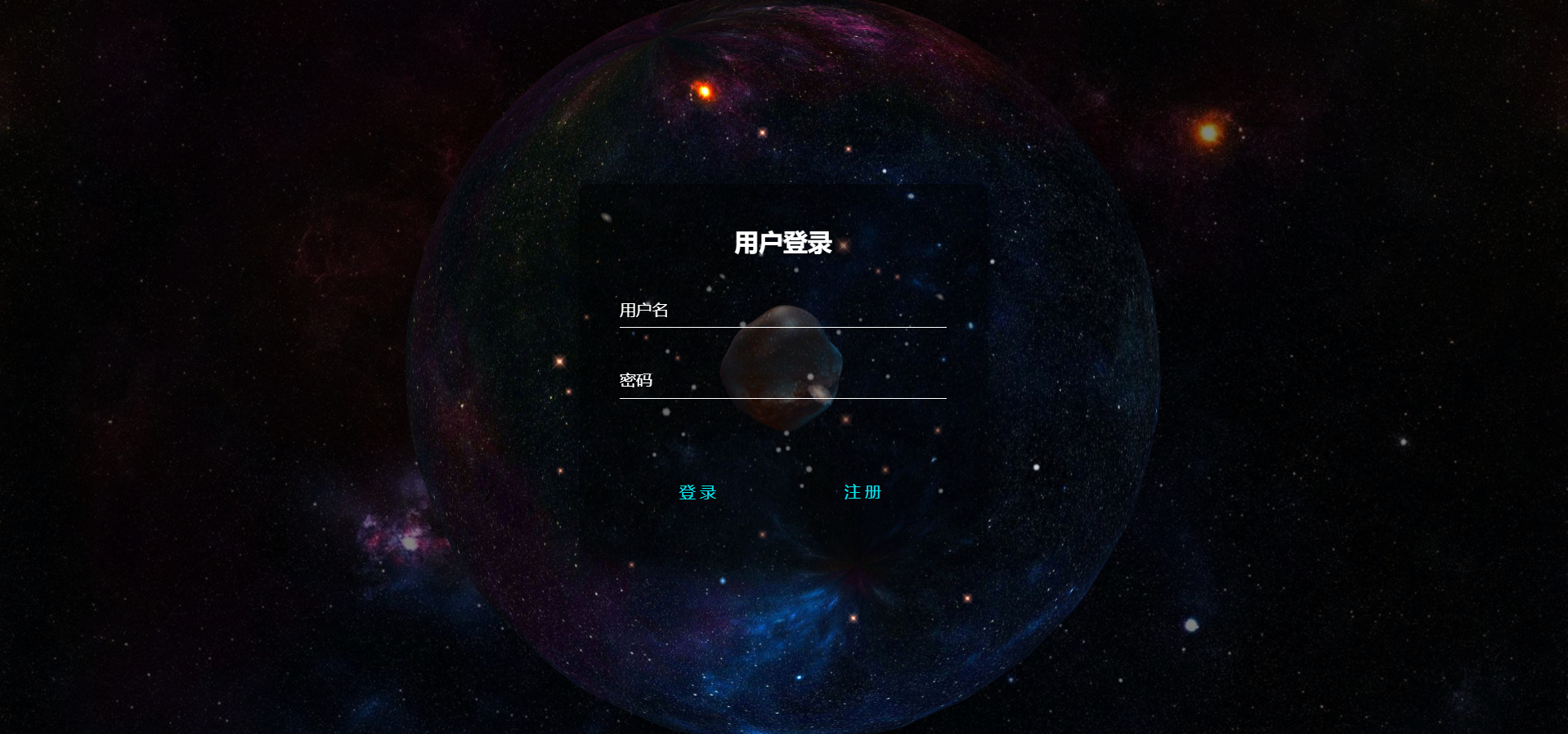
界面展示
HTML
<div id="canvas_container"></div>
<div class="form-box login-box" >
  <h2>用户登录</h2>
  <form class="loginForm">
    <div class="user-box">
      <input type="text" name="userName" required οnfοcus="this.removeAttribute('readonly')" maxlength="11" autocomplete="off">
      <label>用户名</label>
    </div>
    <div class="user-box">
      <input type="password" name="pwd" required οnfοcus="this.removeAttribute('readonly')" maxlength="11" autocomplete="off">
      <label>密码</label>
    </div>
    <input class="sub" type="submit" value="登录"/>
    <input class="sub registerBtn" type="button" value="注册"/>
  </form>
</div>
css
body {
    margin: 0;
    overflow: hidden;
     100vw;
    height: 100vh;
    background-image: url("../img/index/bg0.jpg");
    background-size: cover;
    backdrop-filter:  brightness(50%);
}

canvas {
    display: block;
}

#canvas_container {
     100%;
    height: 100vh;
}

button {
    position: absolute;
    bottom: 5%;
    left: 50%;
    transform: translateX(-50%);
    border: 1px solid white;
    border-radius: 5px;
    font-size: 0.9rem;
    padding: 0.5rem 0.9em;
    background: #000000;
    color: white;
    -webkit-font-smoothing: antialiased;
    font-weight: bold;
    cursor: pointer;
    transition: all .3s;
}

button:hover {
    background: #ffffff;
    color: #000000;
}


html {
  height: 100%;
}
body {
  margin:0;
  padding:0;
  font-family: sans-serif;
/*   background: linear-gradient(#141e30, #243b55); */
}

.form-box {
  position: absolute;
  top: 50%;
  left: 50%;
   400px;
  padding: 40px;
  transform: translate(-50%, -50%);
  background: rgba(0,0,0,.5);
  box-sizing: border-box;
  box-shadow: 0 15px 25px rgba(0,0,0,.6);
  border-radius: 10px;
}

.form-box h2 {
  margin: 0 0 30px;
  padding: 0;
  color: #fff;
  text-align: center;
}

.form-box .user-box {
  position: relative;
}

.form-box .user-box input {
   100%;
  padding: 10px 0;
  font-size: 16px;
  color: #fff;
  margin-bottom: 30px;
  border: none;
  border-bottom: 1px solid #fff;
  outline: none;
  background: transparent;
}
.form-box .user-box label {
  position: absolute;
  top:0;
  left: 0;
  padding: 10px 0;
  font-size: 16px;
  color: #fff;
  pointer-events: none;
  transition: .5s;
}

.form-box .user-box input:focus ~ label,
.form-box .user-box input:valid ~ label {
  top: -20px;
  left: 0;
  color: #03e9f4;
  font-size: 12px;
}

.form-box form .sub {
    position: relative;
    display: inline-block;
    padding: 10px 0px;
    color: #03e9f4;
    font-size: 16px;
    text-decoration: none;
    text-transform: uppercase;
    overflow: hidden;
    transition: .5s;
    margin-top: 40px;
    letter-spacing: 4px;
    text-align:center;
    border:0px;
    background: #fff0;
}

.login-box form .sub{
    49%;
}

.register-box form .sub{
    100%;
}

.form-box .sub:hover {
  background: #03e9f4;
  color: #fff;
  border-radius: 5px;
  box-shadow: 0 0 5px #03e9f4,
              0 0 25px #03e9f4,
              0 0 50px #03e9f4,
              0 0 100px #03e9f4;
}

.form-box .sub span {
  position: absolute;
  display: block;
}

.form-box .sub span:nth-child(1) {
  top: 0;
  left: -100%;
   100%;
  height: 2px;
  background: linear-gradient(90deg, transparent, #03e9f4);
  animation: btn-anim1 1s linear infinite;
}

@keyframes btn-anim1 {
  0% {
    left: -100%;
  }
  50%,100% {
    left: 100%;
  }
}

.form-box .sub span:nth-child(2) {
  top: -100%;
  right: 0;
   2px;
  height: 100%;
  background: linear-gradient(180deg, transparent, #03e9f4);
  animation: btn-anim2 1s linear infinite;
  animation-delay: .25s
}

@keyframes btn-anim2 {
  0% {
    top: -100%;
  }
  50%,100% {
    top: 100%;
  }
}

.form-box .sub span:nth-child(3) {
  bottom: 0;
  right: -100%;
   100%;
  height: 2px;
  background: linear-gradient(270deg, transparent, #03e9f4);
  animation: btn-anim3 1s linear infinite;
  animation-delay: .5s
}

@keyframes btn-anim3 {
  0% {
    right: -100%;
  }
  50%,100% {
    right: 100%;
  }
}

.form-box .sub span:nth-child(4) {
  bottom: -100%;
  left: 0;
   2px;
  height: 100%;
  background: linear-gradient(360deg, transparent, #03e9f4);
  animation: btn-anim4 1s linear infinite;
  animation-delay: .75s
}

@keyframes btn-anim4 {
  0% {
    bottom: -100%;
  }
  50%,100% {
    bottom: 100%;
  }
}
领取方式
扫描下方二维码,回复【宇宙登录界面】领取