参考:https://blog.csdn.net/m0_37362454/article/details/81511427
matplotlib官方文档:https://matplotlib.org/stable/api/_as_gen/matplotlib.pyplot.figure.html
1.figure语法及操作
plt.figure()是新建一个画布。如果有多个图依次可视化的时候,需要使用,否则所有的图都显示在同一个画布中了。
使用plt.figure()的目的是创建一个figure对象。
整个图形被视为图形对象。当我们想调整图形的大小以及在一个图形中添加多个轴对象时,有必要显式地使用plt.figure()。
# in order to modify the size
fig = plt.figure(figsize=(12,8))
# adding multiple Axes objects
fig, ax_lst = plt.subplots(2, 2)  # a figure with a 2x2 grid of Axes
plt.figure()的必要性:
这并不总是必要的,因为在创建scatter绘图时,figure是隐式创建的;但是,在您所示的情况下,图形是使用plt.figure显式创建的,因此图形将是特定大小,而不是默认大小。
# Create scatter plot here
plt.gcf().set_size_inches(10, 8)
另一种选择是在创建scatter图之后使用gcf获取当前图形,并回顾性地设置图形大小:
(1)figure语法说明
figure(num=None, figsize=None, dpi=None, facecolor=None, edgecolor=None, frameon=True)
num:图像编号或名称,数字为编号 ,字符串为名称
figsize:指定figure的宽和高,单位为英寸;
dpi参数指定绘图对象的分辨率,即每英寸多少个像素,缺省值为80 1英寸等于2.5cm,A4纸是 21*30cm的纸张
facecolor:背景颜色
edgecolor:边框颜色
frameon:是否显示边框
(2)例子:
import matplotlib.pyplot as plt
创建自定义图像
fig=plt.figure(figsize=(4,3),facecolor='blue')
plt.show()
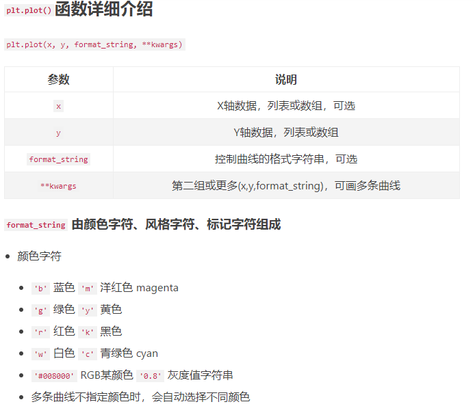
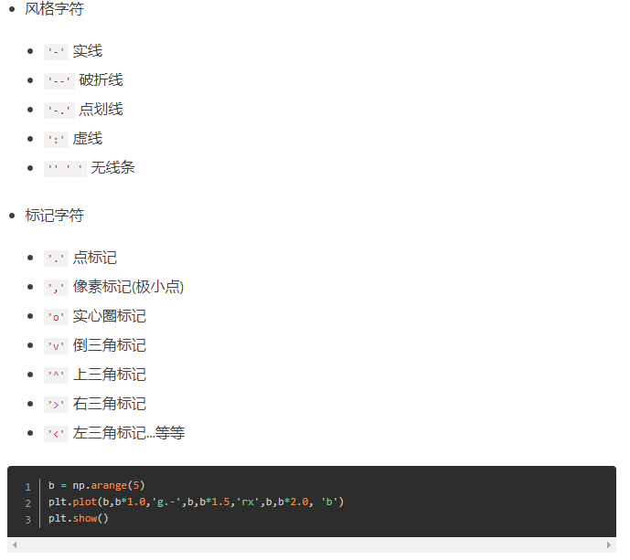
legend(loc  # Location code string, or tuple (see below).
            #  图例所有figure位置。  labels  # 标签名称。
    prop    # the font property.
            #  字体参数
    fontsize  # the font size (used only if prop is not specified).
              #  字号大小。
    markerscale  # the relative size of legend markers vs.
                 # original  图例标记与原始标记的相对大小
    markerfirst  # If True (default), marker is to left of the label.
                 #  如果为True,则图例标记位于图例标签的左侧
    numpoints  # the number of points in the legend for line.
               #  为线条图图例条目创建的标记点数
    scatterpoints  # the number of points in the legend for scatter plot.
                  #  为散点图图例条目创建的标记点数
    scatteryoffsets    # a list of yoffsets for scatter symbols in legend.
                    #  为散点图图例条目创建的标记的垂直偏移量
    frameon    # If True, draw the legend on a patch (frame).
               #  控制是否应在图例周围绘制框架
    fancybox    # If True, draw the frame with a round fancybox.
                #  控制是否应在构成图例背景的FancyBboxPatch周围启用圆边
    shadow    # If True, draw a shadow behind legend.
                #  控制是否在图例后面画一个阴影
    framealpha  # Transparency of the frame.
                #  控制图例框架的 Alpha 透明度
    edgecolor    # Frame edgecolor.
    facecolor    # Frame facecolor.
    ncol    # number of columns.
            #  设置图例分为n列展示
    borderpad    # the fractional whitespace inside the legend border.
                # 图例边框的内边距
    labelspacing    # the vertical space between the legend entries.
                  #  图例条目之间的垂直间距
    handlelength    # the length of the legend handles.
                  #   图例句柄的长度
    handleheight    # the height of the legend handles.
                  #   图例句柄的高度
    handletextpad    # the pad between the legend handle and text.
                    #   图例句柄和文本之间的间距
    borderaxespad    # the pad between the axes and legend border.
                    #  轴与图例边框之间的距离
    columnspacing    # the spacing between columns.
                    #  列间距
    title    # the legend title.
             #  图例标题
    bbox_to_anchor    # the bbox that the legend will be anchored.
                    #  指定图例在轴的位置
    bbox_transform)    # the transform for the bbox.
                    # transAxes if None.
legend()
legend(loc, ncol, **)
可参考:matplotlib 的 legend 官网:https://matplotlib.org/users/legend_guide.html

2.subplot创建单个子图
(1) subplot语法
subplot(nrows,ncols,sharex,sharey,subplot_kw,**fig_kw)
subplot可以规划figure划分为n个子图,但每条subplot命令只会创建一个子图 ,参考下面例子。
(2)例子
import numpy as np
import matplotlib.pyplot as plt
x = np.arange(0, 100)
#作图1
plt.subplot(221)
plt.plot(x, x)
#作图2
plt.subplot(222)
plt.plot(x, -x)
#作图3
plt.subplot(223)
plt.plot(x, x ** 2)
plt.grid(color='r', linestyle='--', linewidth=1,alpha=0.3)
#作图4
plt.subplot(224)
plt.plot(x, np.log(x))
plt.show() 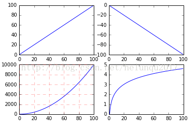
3.subplots创建多个子图
(1)subplots语法
subplots参数与subplots相似
(2)例子
import numpy as np
import matplotlib.pyplot as plt
x = np.arange(0, 100)
#划分子图
fig,axes=plt.subplots(2,2)
ax1=axes[0,0]
ax2=axes[0,1]
ax3=axes[1,0]
ax4=axes[1,1]
#作图1
ax1.plot(x, x)
#作图2
ax2.plot(x, -x)
#作图3
ax3.plot(x, x ** 2)
ax3.grid(color='r', linestyle='--', linewidth=1,alpha=0.3)
#作图4
ax4.plot(x, np.log(x))
plt.show() 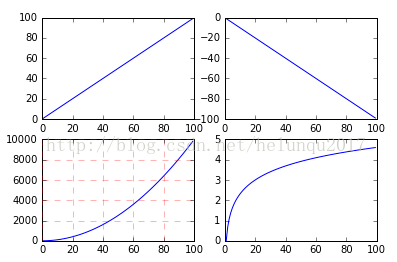
4.面向对象API:add_subplots与add_axes新增子图或区域
add_subplot与add_axes都是面对象figure编程的,pyplot api中没有此命令
(1)add_subplot新增子图
add_subplot的参数与subplots的相似
import numpy as np
import matplotlib.pyplot as plt
x = np.arange(0, 100)
#新建figure对象
fig=plt.figure()
#新建子图1
ax1=fig.add_subplot(2,2,1)
ax1.plot(x, x)
#新建子图3
ax3=fig.add_subplot(2,2,3)
ax3.plot(x, x ** 2)
ax3.grid(color='r', linestyle='--', linewidth=1,alpha=0.3)
#新建子图4
ax4=fig.add_subplot(2,2,4)
ax4.plot(x, np.log(x))
plt.show()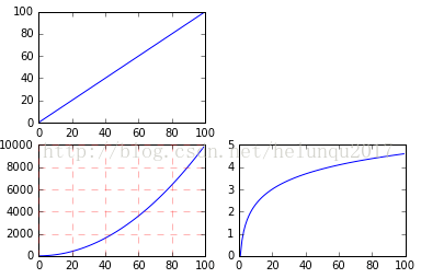
可以用来做一些子图。。。图中图。。。
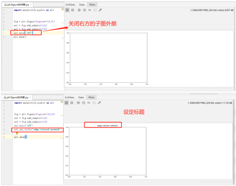
(2)add_axes新增子区域
add_axes为新增子区域,该区域可以座落在figure内任意位置,且该区域可任意设置大小
add_axes参数可参考官方文档:http://matplotlib.org/api/_as_gen/matplotlib.figure.Figure.html#matplotlib.figure.Figure
import numpy as np
import matplotlib.pyplot as plt
#新建figure
fig = plt.figure()
# 定义数据
x = [1, 2, 3, 4, 5, 6, 7]
y = [1, 3, 4, 2, 5, 8, 6]
#新建区域ax1
#figure的百分比,从figure 10%的位置开始绘制, 宽高是figure的80%
left, bottom, width, height = 0.1, 0.1, 0.8, 0.8
# 获得绘制的句柄
ax1 = fig.add_axes([left, bottom, width, height])
ax1.plot(x, y, 'r')
ax1.set_title('area1')

np.random.rand()返回一个或一组服从“0~1”均匀分布的随机样本值。随机样本取值范围是[0,1),不包括1。
np.random.randn()返回一个或一组服从标准正态分布的随机样本值。
plt.legend()函数主要的作用就是给图加上图例,plt.legend([x,y,z])里面的参数使用的是list的的形式将图表的的名称喂给这个函数。
plt.legend()原文链接:https://blog.csdn.net/weixin_41950276/article/details/84259546
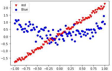
from matplotlib import pyplot as plt
import numpy as np

train_x = np.linspace(-1, 1, 100)
train_y_1 = 2*train_x + np.random.rand(*train_x.shape)*0.3
train_y_2 = train_x**2+np.random.randn(*train_x.shape)*0.3

plt.scatter(train_x, train_y_1, c='red', marker='v' )
plt.scatter(train_x, train_y_2, c='blue', marker='o' )
plt.legend(["red","Blue"])
plt.show()

import tensorflow as tf
from matplotlib import pyplot as plt
import numpy as np

train_x = np.linspace(-1, 1, 100)
train_y_1 = 2*train_x + np.random.rand(*train_x.shape)*0.3
train_y_2 = train_x**2+np.random.randn(*train_x.shape)*0.3

plt.scatter(train_x, train_y_1, c='red', marker='v' )
plt.scatter(train_x, train_y_2, c='blue', marker='o' )
plt.legend(["red","Blue"])
plt.show()