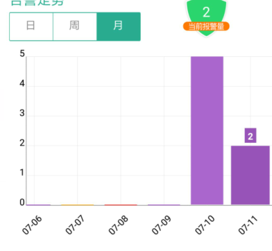
app里有个告警数量的柱状图,有点小问题,y轴竟然不是整数

这个改起来到是简单
Axis yAxis = new Axis().setHasLines(true).setTextColor(Color.BLACK);
yAxis.setMaxLabelChars(6);

maxValue = (maxValue / 10 + 1) * 10;
List<AxisValue> yValues = new ArrayList<AxisValue>();
for (int i = 0; i <= 10; i++) {
    yValues.add(new AxisValue(i));
}
yAxis.setValues(yValues);
只是出来的结果有点不对劲,怎么这个柱形图“顶天立地了”,乍一看,还以为有一部分被挡住了
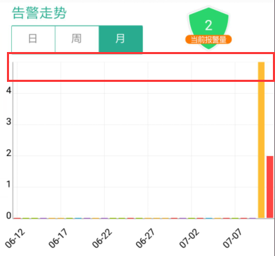
是不是有种戛然而止的感觉
不过这个我调试了半天,是真不晓得怎么搞,想看看源码也找不到源码,就改了下padding的值,变成下面的效果,将就着看吧
<lecho.lib.hellocharts.view.ColumnChartView
    android:id="@+id/chart"
    android:layout_width="match_parent"
    android:layout_height="250dp"
    android:layout_marginTop="10dp"
    android:paddingTop="10dp"
    android:background="#ffffff" />