需求:高度已知为200px,写出三栏布局,左栏和右栏各位200px,中间自适应,如下图所示:

方法一:float浮动布局
原理是:定义三个区块,需要注意的是中间的区块放在右边区块的下面,统一设置高度为200px,然后设置左边栏宽度为200px并且float:left,设置右边栏宽度为200px并且float:right
优点:兼容性比较好
缺点:float会脱离文档流,需要处理float周边的元素比如清除浮动
浮动布局的原理:查看浮动布局详解
<style>
    html *{
        padding: 0;
        margin: 0;
    }
    .layout article div{
        min-height: 200px;
    }
    .left{
        width: 200px;
        float: left;
        background-color: red;
    }
    .right{
        width: 200px;
        float: right;
        background-color: blue;
    }
    .center{
        background-color: green;
    }
</style>
<body>
    <section class="layout float">
        <article class="left-right-center">
            <div class="left"></div>
            <div class="right"></div>
            <div class="center">浮动解决方案</div>
        </article>
    </section>
</body>
效果如下:拉动浏览器窗口的时候,中间宽度自动变化,左右边栏不会变化

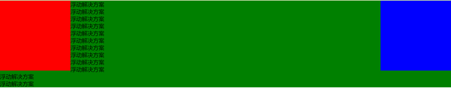
当center这个元素里面的内容超过设置的这个高度,会出现如下这样的问题
解决办法可以在center中添加一个属性:overflow: hidden;后效果如下:

所以当高度不确定的时候,这种布局方式不适用,左右两边的高度不会跟着变动
方法二:绝对定位布局
实现原理:设置三个区块分别左中右,并且统一设置高度为200px和绝对定位,左边栏left:0,右边栏right:0,最重要的是中间的区块,不设置宽度,并且设置left:200px,right:200px,这个定位的数值也就是左边栏和右边栏的宽度大小
优点:快捷,不容易出问题
缺点:定位会脱离文档流,那么后面的元素也都是要脱离文档流的,这个方式的可使用性比较差
<!DOCTYPE html>
<html lang="en">
<head>
    <meta charset="UTF-8">
    <title>Title</title>
</head>
<style>
    html *{
        padding: 0;
        margin: 0;
    }
    .layout article div{
        min-height: 200px;
        position: absolute;
    }
    .left{
        width: 200px;
        left: 0;
        background-color: red;
    }
    .right{
        right: 0;
        width: 200px;
        background-color: blue;
    }
    .center{
        background-color: green;
        left: 200px;
        right: 200px;
    }
</style>
<body>
    <section class="layout absolute">
        <article class="left-right-center">
            <div class="left"></div>
            <div class="center">绝对定位解决方案</div>
            <div class="right"></div>
        </article>
    </section>
</body>
</html>
效果如下:拉动浏览器窗口的时候,中间宽度自动变化,左右边栏不会变化

方法三:flexbox布局方式
实现原理:首先定义三个区块,分别为左中右,并且统一设置高度为200px,然后在这三个区块的父元素中设置display:flex,设置左边栏和右边栏宽度为200px,中间区块设置flex:1
优点:比较完美的一种方式,在移动端基本都是使用这个布局方式,这是css3中的新的布局方式,当设置最小高度后,中间区块内容溢出时高度会自动撑开,左右两边的高度也可以跟着撑开
<!DOCTYPE html>
<html lang="en">
<head>
    <meta charset="UTF-8">
    <title>Title</title>
</head>
<style>
    html *{
        padding: 0;
        margin: 0;
    }
    .layout.flexbox article div{
        min-height: 200px;
    }
    .layout.flexbox .left-right-center{
        display: flex;
    }
    .left{
        width: 200px;
        background-color: red;
    }
    .right{
        width: 200px;
        background-color: blue;
    }
    .center{
        background-color: green;
        flex: 1;
    }
</style>
<body>
    <section class="layout flexbox">
        <article class="left-right-center">
            <div class="left"></div>
            <div class="center">flexbox解决方案</div>
            <div class="right"></div>
        </article>
    </section>
</body>
</html>
效果如下:拉动浏览器窗口的时候,中间宽度自动变化,左右边栏不会变化

方法四:表格布局方式
实现原理:定义三个区块,并且统一设置高度为200px和display:table-cell,然后左边栏和右边栏宽带设置为200px,中间区块不设置宽度,最后需要在这三个区块的父元素上设置100%和display:table
优点:兼容性非常好,在IE8也是可以的,弥补flexbox布局在IE8下的不支持
缺点:当某个区块高度不足的时候(固定高度),其他区块也跟着需要调整高度,但有这种需求就是其他区块不想跟着调整高度,这就是这个布局的缺点
<!DOCTYPE html>
<html lang="en">
<head>
    <meta charset="UTF-8">
    <title>Title</title>
</head>
<style>
    html *{
        padding: 0;
        margin: 0;
    }
    .layout.table article div{
        display: table-cell;
        height: 200px;
    }
    .layout.table .left-right-center{
        display: table;
        width: 100%;
    }
    .left{
        width: 200px;
        background-color: red;
    }
    .right{
        width: 200px;
        background-color: blue;
    }
    .center{
        background-color: green;
    }
</style>
<body>
    <section class="layout table">
        <article class="left-right-center">
            <div class="left"></div>
            <div class="center">表格布局解决方案</div>
            <div class="right"></div>
        </article>
    </section>
</body>
</html>

方法五:网格布局
实现原理:定义三个区块分别为左边栏,中间区块,右边栏,然后再父元素上设置display:grid,grid-template-rows: 200px;(设置格子的高度),grid-template-columns: 200px auto 200px;(这里表示有三列,第一列和第三列的宽度为200px,第二列自动)
<!DOCTYPE html>
<html lang="en">
<head>
    <meta charset="UTF-8">
    <title>Title</title>
</head>
<style>
    html *{
        padding: 0;
        margin: 0;
    }
    .layout.grid .left-right-center{
        width:100%;
        display: grid;
        grid-template-rows: 200px;
        grid-template-columns: 200px auto 200px;
    }
    .left{
        background-color: red;
    }
    .right{
        background-color: blue;
    }
    .center{
        background-color: green;
    }
</style>
<body>
    <section class="layout grid">
        <article class="left-right-center">
            <div class="left"></div>
            <div class="center">网格布局解决方案</div>
            <div class="right"></div>
        </article>
    </section>
</body>
</html>
效果如下:效果如下:拉动浏览器窗口的时候,中间宽度自动变化,左右边栏不会变化

需求:如果高度不确定,那么上述的布局方式哪个还可以适用
flexbox布局和table布局是可以通用的,会自动增加高度(三个区块都会自动增加高度)
网格布局:高度不会自动增加,里面的内容会溢出,但可以不设置grid-template-rows: 200px;这个属性的话,三列都会随着内容而增高,并且可以设置三个区块的最小高度
<style>
    html *{
        padding: 0;
        margin: 0;
    }
    .layout.grid .left-right-center{
        width:100%;
        display: grid;
        min-height: 100px;
        grid-template-columns: 200px auto 200px;
    }
    .left{
        background-color: red;
    }
    .right{
        background-color: blue;
    }
    .center{
        background-color: green;
    }
</style>
<body>
    <section class="layout grid">
        <article class="left-right-center">
            <div class="left"></div>
            <div class="center">
                <p>flexbox解决方案</p>
                <p>flexbox解决方案</p>
                <p>flexbox解决方案</p>
            </div>
            <div class="right"></div>
        </article>
    </section>

</body>
浮动布局:会出现下面这种情况
因为浮动的原理,中间区块的内容被区块1挡住了,当内容超出以后,没有了遮挡物,所以就出现了这种情况,解决这种问题需要使用BFC(查看盒子模型和弹性盒子模型的详解)
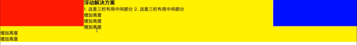
绝对定位:比如讲center里的内容增加,超过高度后这个区块自动增加,但是其他区块是不会自动增加的