方法一:使用css3 transform:translate(-50%; -50%)
思路:子元素绝对定位,距离顶部 50%,左边50%,然后使用css3 transform:translate(-50%; -50%),第一个值是X轴,第二个值是Y轴,表示位移(详情查看transform总结)
优点:高大上,可以在webkit内核的浏览器中使用
缺点:不支持IE9以下不支持transform属性
html标签结构:
    <div class="parent">
        <div class="child">
            <p></p>
        </div>
    </div>
css样式代码:
 1         *{
 2             padding: 0;
 3             margin: 0;
 4         }
 5         html,body{
 6             width: 100%;
 7             height: 100%;
 8         }
 9         body{
10             background-color: azure;
11         }
12         .parent{
13             width: 100%;
14             height: 100%;
15             background-color: orangered;
16             text-align: center;
17         }
18         .child{
19             position: absolute;
20             top: 50%;
21             left: 50%;
22             transform: translate(-50%, -50%);  /* 使用css3的transform来实现 */
23         }
24         .child p{
25             width: 300px;
26             height: 400px;
27             background-color: blue;
28         }
效果如下:
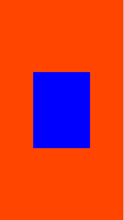
这时候child的宽高与child下的p标签是一样的,这个方法在父级元素们没有设置position为relative的时候,相对于html是水平垂直居中的,但是如果父级元素指定position为relative,并且高度不定的时候(宽高都是auto,并且子元素是以这个父元素定位的),无法实现垂直居中。也就是说当子元素的css为这样时,父元素需要有宽高才能够相对的定位
下面将父元素的样式改一下,将宽高改为自动,并且相对定位,这时候子元素就是根据这个父元素来定位的了
        .parent{
            width: auto;
            height: auto;
            background-color: orangered;
            text-align: center;
            position: relative;
        }
这时候父元素没有了高度,子元素无法与他来定位
效果如下:

方法二:使用css3 flex布局
优点:简单 快捷
缺点:由于是新的布局方式,以前的浏览器兼容性不好
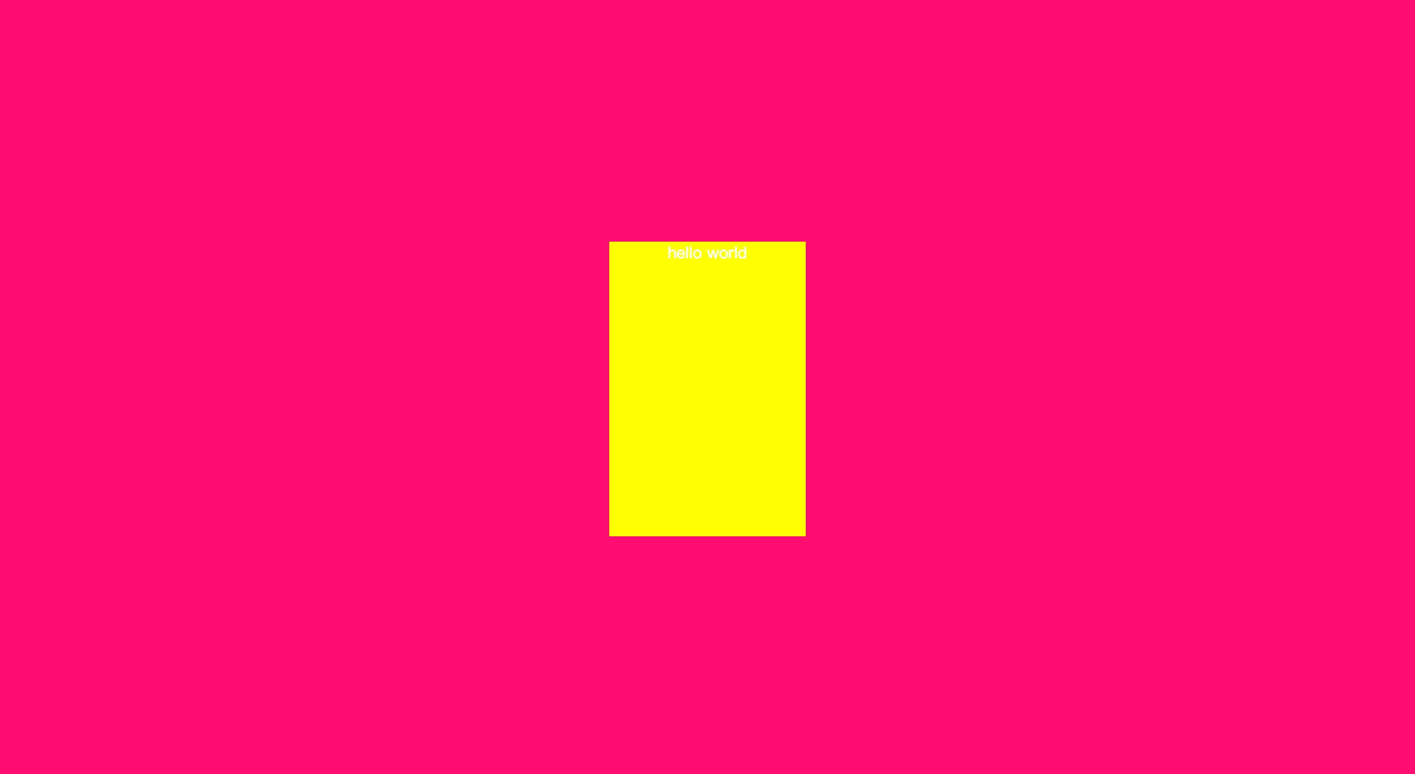
HTML结构:
    <div class="parent">
        <div class="child">hello world</div>
    </div>
CSS样式代码:
*{
        padding: 0;
        margin: 0;
    }
    body,html{
        width: 100%;
        height: 100%;
    }
    .parent{
        display: flex;
        justify-content: center;
        align-items: center;
        width: 100%;
        height:100%;
        background: #FD0C70;
    }
    .parent .child{
        color:#fff;
        width: 200px;
        height: 300px;
        text-align: center;
        background-color: yellow;
    }
最终效果:
当有多个子元素的时候,每个子元素会水平排列并且水平和垂直居中,当高度不够的时候,就是换行,高度自动增加,并且使用相对于父元素垂直居中
<body>
    <div class="parent">
        <div class="child">hello world</div>
        <div class="child">hello world</div>
        <div class="child">hello world</div>
        <div class="child">hello world</div>
        <div class="child">hello world</div>
    </div>
</body>
最终显示效果

方法三:
思路:显示设置父元素为:table,子元素为:cell-table,这样就可以使用vertical-align: center,实现水平居中
优点:父元素(parent)可以动态的改变高度(table元素的特性)
缺点:IE8以下不支持
HTML结构:
<body>
    <div class="parent">
        <div class="child">hello world-1</div>
        <div class="child">hello world-1</div>
        <div class="child">hello world-1</div>
        <div class="child">hello world-1</div>
        <div class="child">hello world-1</div>
        <div class="child">hello world-1</div>
    </div>
</body>
CSS样式代码:
    *{
        padding: 0;
        margin: 0;
    }
    html,body{
        width: 100%;
        height: 100%;
    }
    .parent{
        display: table;
        height:100%;
        width: 100%;
        background-color: #FD0C70;
    }
    .parent .child{
        display: table-cell;
        vertical-align: middle;
        text-align: center;
        color: #fff;
        font-size: 16px;
    }
最终显示的效果:
