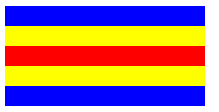
<div class="box1"></div>
<div class="box2"></div>
<div class="box3"></div>
<div class="box4"></div>


//css样式
.box1, .box2, .box3 {
   200px;
  }
.box1{
  margin-bottom: -80px;
  height:100px;
  background: blue;
  }
.box2 {
  margin-bottom:-40px;
  height:60px;
  background: #ffff00;
}
.box3{
  height:20px;
  background: #ff0000;
}
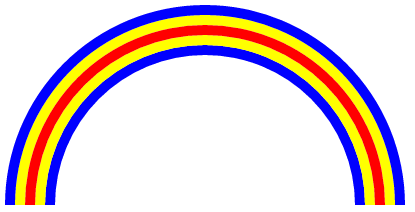
css样式二,也是使用的margin塌陷,不过做出来的是弧形的彩虹:
.box1{
             400px;
            height: 200px;
            overflow: hidden;
        }
        .box1::before{
            float: left;
            display: block;
            height: 400px;
            400px;
            border-radius: 100%;
            border: solid 10px blue;
            box-sizing: border-box;
            content: "";
        }
        .box1::after{
            margin-top: 10px;
            margin-left: 10px;
            display: block;
             380px;
            height: 380px;
            border: solid #ffff00 10px;
            border-radius: 100%;
            box-sizing: border-box;
            content: "";
        }
        .box2{
            float: left;
            margin-top: -180px;
            margin-left: 20px;
             360px;
            height: 180px;
            overflow: hidden;
        }
        .box2::before{
            float: left;
            display: block;
            margin: 0;
             360px;
            height: 360px;
            border-radius: 100%;
            border: solid 10px #ff0000;
            box-sizing: border-box;
            content: "";
        }
        .box2::after{
            display: block;
            margin-top: 10px;
            margin-left: 10px;
             340px;
            height: 340px;
            border-radius: 100%;
            border: solid 10px #ffff00;
            box-sizing: border-box;
            content: "";
        }
        .box3{
            margin-top: -160px;
            margin-left: 40px;
             340px;
            height: 160px;
            overflow: hidden;
        }
        .box3::before{
            float: left;
            display: block;
             320px;
            height: 320px;
            border: solid 10px blue;
            border-radius: 100%;
            box-sizing: border-box;
            content: "";
        }