一、背景介绍
今天在解决一个当点击弹窗之后 整个背景应当是灰色的 界面 但是谷歌和IE浏览器 显示的背景不一致 所以 就有了下文........
解决之后的背景效果:
body.a-active::after{
  content: "";
  background-color: $ciot_black;
  opacity: 0.5;
  position: fixed;
   100%;
  height: 100%;
  top: 0;
}
二、介绍
css3为了区分伪类和伪元素,伪元素采用双冒号写法。
常见伪类——:hover,:link,:active,:target,:not(),:focus。
常见伪元素——::first-letter,::first-line,::before,::after,::selection。
::before和::after下特有的content,用于在css渲染中向元素逻辑上的头部或尾部添加内容。
这些添加不会出现在DOM中,不会改变文档内容,不可复制,仅仅是在css渲染层加入。
所以不要用:before或:after展示有实际意义的内容,尽量使用它们显示修饰性内容,例如图标。
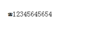
举例:网站有些联系电话,希望在它们前加一个icon☎,就可以使用:before伪元素,如下:
<!DOCTYPE html>
<meta charset="utf-8" />
<style type="text/css">
    .phoneNumber::before {
    content:'260E';
    font-size: 15px;
}
</style>
<p class="phoneNumber">12345645654</p>
如下图所示:
三、content属性
::before和::after必须配合content属性来使用,content用来定义插入的内容,content必须有值,至少是空。默认情况下,伪类元素的display是默认值inline,可以通过设置display:block来改变其显示。
content可取以下值:
1、string
使用引号包一段字符串,将会向元素内容中添加字符串。如:a:after{content:""}
<!DOCTYPE html>
<meta charset="utf-8" />
<style type="text/css">
p::before{
    content: "《";
    color: blue;
}
p::after{
    content: "》";
    color: blue;
}
</style>
<p>平凡的世界</p>
效果如下:

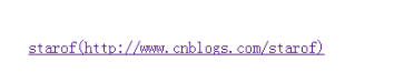
2、attr()
通过attr()调用当前元素的属性,比如将图片alt提示文字或者链接的href地址显示出来。
<style type="text/css">
a::after{
    content: "(" attr(href) ")";
}
</style>
<a href="http://www.cnblogs.com/starof">starof</a>
效果如下:
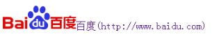
3、url()/uri()
用于引用媒体文件。
举例:“百度”前面给出一张图片,后面给出href属性。
<style>
a::before{
    content: url("https://www.baidu.com/img/baidu_jgylogo3.gif");
}
a::after{
    content:"("attr(href)")";
}
a{
    text-decoration: none;
}
</style>
---------------------------
<body>
<a href="http://www.baidu.com">百度</a>
</body>
效果如下:
4、不使用图片创建小图标
举例:比如一个电话
很巧妙的应用一个div左border加圆角当机身,::before和::after配合圆角当听筒。
<style type="text/css">
    #phone{width:50px;height:50px;border-left:6px solid #EEB422;border-radius:20%;transform:rotate(-30deg);-webkit-transform:rotate(-30deg);margin:20px;margin-right:0px;position:relative;display: inline-block;top: -5px;}
    #phone:before{width:15px;height:15px;background:#EEB422;border-radius: 20%;content: "";position: absolute;left:-2px;top: 1px;}
    #phone:after{width:15px;height:15px;background:#EEB422;border-radius: 20%;content: "";position: absolute;left:-3px;top: 34px;}
</style>
<div id="wraper">
    <div id="phone"></div>
</div>
效果如下:

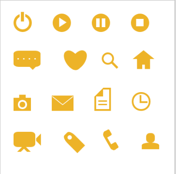
更多的图标:
<!doctype html>
<html>
<head>
    <title>伪类标签使用</title>
</head>
<style type="text/css">
    #wraper{padding:10px;width:380px;height:380px;border:3px solid #ccc;margin:auto;}
    #power{width: 30px;height: 30px;margin:20px;border: 6px solid #EEB422;border-radius: 50%;position: relative;display: inline-block;}
    #power:before{width:7px;height:22px;background:#EEB422;position: absolute;left:8px;top:-13px;content: "";border: 3px solid #fff;}
    #play{width: 30px;height: 30px;margin:20px;border: 6px solid #EEB422;border-radius: 50%;position:relative;display: inline-block;background: #EEB422;}
    #play:before{border:11px solid transparent;border-left:17px solid #fff;content: "";position: absolute;left:9px;top: 3px;}
    #pause{width: 30px;height: 30px;margin:20px;border: 6px solid #EEB422;border-radius: 50%;position:relative;display: inline-block;background: #EEB422;}
    #pause:before{height:20px;width:5px;border:0px solid transparent;border-left:8px solid #fff;border-right:8px solid #fff;content: "";position: absolute;left:4px;top: 5px;}
    #stop{width: 30px;height: 30px;margin:20px;border: 6px solid #EEB422;border-radius: 50%;position:relative;display: inline-block;background: #EEB422;}
    #stop:before{height:17px;width:17px;background:#fff;content: "";position: absolute;left:6px;top: 6px;}
    #comment{width: 50px;height: 25px;margin:20px;border: 6px solid #EEB422;border-radius: 20%;position:relative;display: inline-block;background: #EEB422;}
    #comment:before{border:10px solid transparent;border-top:10px solid #EEB422;content: "";position: absolute;left:28px;top: 28px;}
    #comment:after{content: "....";position: absolute;color: #fff;font-size: 26px;top: -10px;left: 2px;}
    #like{width: 50px;height: 30px;margin:20px;border-radius: 55%;transform:rotate(55deg);-webkit-transform:rotate(55deg);position:relative;display: inline-block;background: #EEB422;}
    #like:before{width:50px;height:30px;border-radius: 55%;transform:rotate(-110deg);-webkit-transform:rotate(-110deg);background:#EEB422;content: "";position: absolute;left:8px;top: -12px;}
    #search{width: 20px;height: 20px;border:4px solid #EEB422;border-radius:50%;margin:20px;position:relative;display: inline-block;top: -5px;left: -5px;}
    #search:before{width:20px;height:5px;background:#EEB422;transform:rotate(45deg);-webkit-transform:rotate(45deg);content: "";position: absolute;left:15px;top: 22px;}
    #home{width: 30px;height: 30px;background:#EEB422;margin:20px;position:relative;display: inline-block;top: 5px;}
    #home:before{width:6px;height:12px;background:#fff;content: "";position: absolute;left:12px;top: 20px;}
    #home:after{border:25px solid transparent;border-bottom:20px solid #EEB422;content: "";position: absolute;top: -38px;left:-10px;}
    #photo{width:40px;height:30px;background:#EEB422;margin:20px;position:relative;display: inline-block;top: 5px;}
    #photo:before{width:13px;height:13px;border:4px solid #fff;border-radius:50%;background:#EEB422;content: "";position: absolute;left:10px;top: 5px;}
    #photo:after{width:15px;height:10px;background:#EEB422;content: "";position: absolute;top: -7px;left:13px;}
    #photo{width:40px;height:30px;background:#EEB422;margin:20px;position:relative;display: inline-block;top: 5px;}
    #email{width:50px;height:35px;background:#EEB422;margin:20px;position:relative;display: inline-block;top: 5px;}
    #email:before{border:25px solid transparent;border-top:20px solid #fff;content: "";position: absolute;left:0px;top: 2px;}
    #email:after{border:25px solid transparent;border-top:20px solid #EEB422;content: "";position: absolute;top:0px;}
    #file{width:30px;height:45px;border:4px solid #EEB422;margin:20px;position:relative;display: inline-block;top: 5px;}
    #file:before{border:10px solid #fff;border-right:10px solid #EEB422;border-bottom:10px solid #EEB422;content: "";position: absolute;left:-4px;top: -4px;}
    #file:after{width:20px;height:5px;border-top:3px solid #EEB422;border-bottom:3px solid #EEB422;content: "";position: absolute;left: 5px;top: 25px;}
    #history{width:35px;height:35px;border:4px solid #EEB422;border-radius: 50%;margin:20px;position:relative;display: inline-block;top: 5px;}
    #history:before{width:14px;height:14px;border-bottom:4px solid #EEB422;border-left:4px solid #EEB422;content: "";position: absolute;left:14px;top: 3px;}
    #video{width:50px;height:35px;background:#EEB422;border-radius: 20%;margin:20px;position:relative;display: inline-block;top: -5px;}
    #video:before{width:6px;height:6px;border:11px solid transparent;border-right:11px solid #EEB422;content: "";position: absolute;left:35px;top: 4px;}
    #video:after{width:10px;height:10px;border:6px solid transparent;border-top:6px solid #EEB422;border-left:6px solid #EEB422;transform:rotate(45deg);-webkit-transform:rotate(45deg);content: "";position: absolute;left:13px;top: 35px;}
    #tags{width:50px;height:25px;background:#EEB422;border-radius: 35% 0% 0% 35%;transform:rotate(45deg);-webkit-transform:rotate(45deg);margin:20px;margin-left:35px;position:relative;display: inline-block;top: -5px;}
    #tags:before{width:10px;height:10px;border-radius:50%;background:#fff;content: "";position: absolute;left:7px;top: 7px;}
    #phone{width:50px;height:50px;border-left:6px solid #EEB422;border-radius:20%;transform:rotate(-30deg);-webkit-transform:rotate(-30deg);margin:20px;margin-right:0px;position:relative;display: inline-block;top: -5px;}
    #phone:before{width:15px;height:15px;background:#EEB422;border-radius: 20%;content: "";position: absolute;left:-2px;top: 1px;}
    #phone:after{width:15px;height:15px;background:#EEB422;border-radius: 20%;content: "";position: absolute;left:-3px;top: 34px;}
    #profile{width: 40px;height:15px;background:#EEB422;border-radius: 45% 45% 0 0;margin:20px;position:relative;display: inline-block;top: 0px;}
    #profile:before{width: 20px;height:22px;background:#EEB422;border-radius:40%;content: "";position: absolute;left: 10px;top: -22px;}
</style>
<body>
    <div id="wraper">
        <div id="power"></div>
        <div id="play"></div>
        <div id="pause"></div>
        <div id="stop"></div>
        <div id="comment"></div>
        <div id="like"></div>
        <div id="search"></div>
        <div id="home"></div>
        <div id="photo"></div>
        <div id="email"></div>
        <div id="file"></div>
        <div id="history"></div>
        <div id="video"></div>
        <div id="tags"></div>
        <div id="phone"></div>
        <div id="profile"></div>
    </div>
</body>
</html>
效果如下:
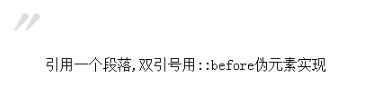
6、给blockquote添加引号
经常用到给blockquote 引用段添加巨大的引号作为背景,可以用 ::before 来代替 background 。好处是即可以给背景留下空间,还可以直接使用文字而非图片:
<meta charset="utf-8"/>
<style type="text/css">
    blockquote::before {
    content: open-quote;
    color: #ddd;
    z-index: -1;
    font-size:80px;
}
</style>
<blockquote>引用一个段落,双引号用::before伪元素实现</blockquote>
效果如下:
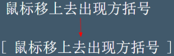
7、超链接特效
举例:配合 CSS定位实现一个鼠标移上去,超链接出现方括号的效果
<meta charset="utf-8" />
<style type="text/css">
body{
    background-color: #425a6c;
}
    a {
    position: relative;
    display: inline-block;
    outline: none;
    color: #fff;
    text-decoration: none;
    font-size: 32px;
    padding: 5px 20px;
}
a:hover::before, a:hover::after { position: absolute; }
a:hover::before { content: "5B"; left: -10px; }
a:hover::after { content: "5D"; right:  -10px; }
</style>
<a>鼠标移上去出现方括号</a>
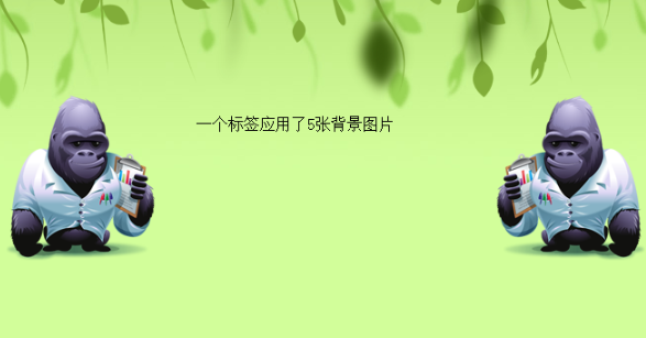
8、::before和::after实现多背景图片
举例:一个标签应用5张背景图
<meta charset="utf-8" />
<style type="text/css">
#silverback {
    position: relative;
    z-index: 1;
    min-width: 200px;
    min-height: 200px;
    padding: 120px 200px 50px;
    background: #d3ff99 url(img/vines-back.png) -10% 0 repeat-x;
}
#silverback:before, #silverback:after {
    position: absolute;
    z-index: -1;
    top: 0;
    left: 0;
    right: 0;
    bottom: 0;
    padding-top: 100px;
}
#silverback:before {
    content: url(img/gorilla-1.png);
    padding-left: 3%;
    text-align: left;
    background: transparent url(img/vines-mid.png) 300% 0 repeat-x;
}
#silverback:after {
    content: url(img/gorilla-2.png);
    padding-right: 3%;
    text-align: right;
    background: transparent url(img/vines-front.png) 70% 0 repeat-x;
}
</style>
<div id="silverback">一个标签应用了5张背景图片</div>
效果如下:
来源于:传送门