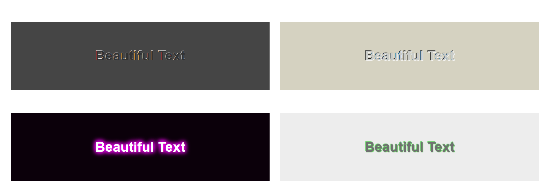
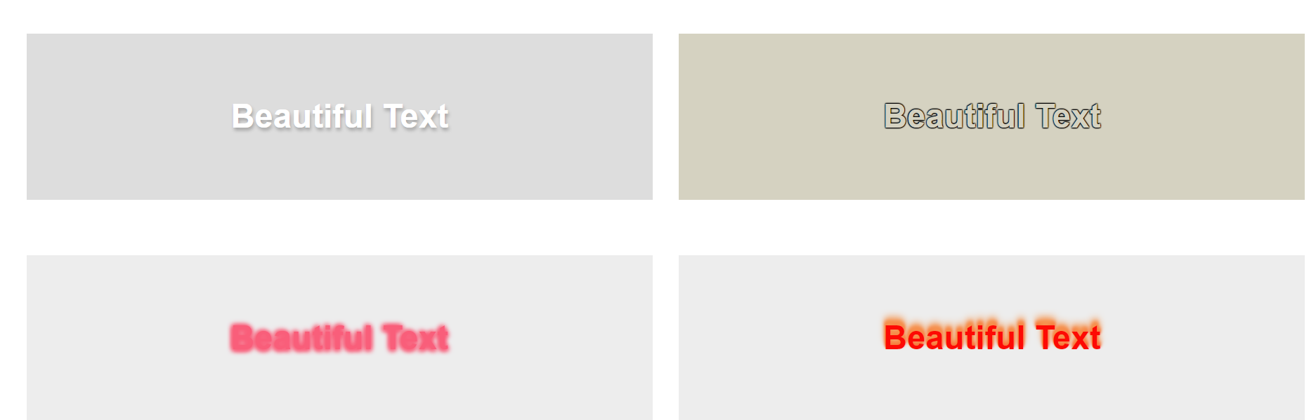
最近有看到一些镂空的或者立体的文字设计图非常好看,然后想了想,应该是使用text-shadow来实现的,这里我贴出我仿的八个demo,分享给大家
首先是HTML代码
 1 <div class="test-all-font">
 2     <p class="test">Love Yourself</p>
 3     <p class="test">Love Yourself</p>
 4     <p class="test">Love Yourself</p>
 5     <p class="test">Love Yourself</p>
 6     <p class="test">Love Yourself</p>
 7     <p class="test">Love Yourself</p>
 8     <p class="test">Love Yourself</p>
 9     <p class="test">Love Yourself</p>
10 </div>
然后是CSS代码
 1 .test-all-font>p {
 2     float: left;
 3     width: 47%;
 4     height: 60px;
 5     margin-left: 2%;
 6     margin-top: 20px;
 7     line-height: 60px;
 8     font-weight: 700;
 9 }
10
11 .test-all-font>p:nth-child(1) {
12     color: #333;
13     text-shadow: -0.2px -0.2px 0.1px #ffffff;
14     background-color: #454545;
15 }
16
17 .test-all-font>p:nth-child(2) {
18     color: #caccc8;
19     text-shadow: -0.3px -0.2px 0.1px #000, 0.4px 0.3px 0.1px #fff;
20     background-color: #d5d2c1;
21 }
22
23 .test-all-font>p:nth-child(3) {
24     color: #fff;
25     text-shadow: -1px -1px 6px #E702E9, 1px 1px 6px #E702E9, -1px 1px 6px #E702E9, 1px -1px 6px #E702E9;
26     background-color: #0B000A;
27 }
28
29 .test-all-font>p:nth-child(4) {
30     color: #6f7070;
31     text-shadow: -0.4px -0.4px 0.4px #5bcd59, 0.4px 0.4px 0.4px #5bcd59;
32     background-color: #EDEDED;
33 }
34
35 .test-all-font>p:nth-child(5) {
36     color: #fff;
37     text-shadow: 0.4px 1px 2px #A5A5A5;
38     background-color: #DDD;
39 }
40
41 .test-all-font>p:nth-child(6) {
42     color: #D5D2C1;
43     text-shadow: 0.2px 0.2px 0.2px #000, -0.2px -0.2px 0.2px #000, 0.2px -0.2px 0.2px #000, -0.2px 0.2px 0.2px #000;
44     background-color: #D5D2C1;
45 }
46
47 .test-all-font>p:nth-child(7) {
48     color: #f95e7a;
49     text-shadow: 0.4px 0.4px 3px #f95e7a, -0.4px -0.4px 3px #f95e7a, -0.4px 0.4px 3px #f95e7a, -0.4px 0.4px 3px #f95e7a;
50     background-color: #EDEDED;
51 }
52
53 .test-all-font>p:nth-child(8) {
54     color: #FD0A04;
55     text-shadow: 0px -3px 4px #F59651,0px -2px 3px #F59651,0px -1.5px 2px #FB6229,0px -1px 1.5px #FB6229,0px -0.5px 1px #FB6229;
56     background-color: #EDEDED;
57 }
注意的点有:1、text-shadow是可以重复的,但是别重新写一个text-shadow,可以在你的样式后面继续跟,中间使用空格隔开就行了,例如:
p{
    text-shadow:1px 1px 1px #DDD,1px 1px 1px #000;
}
2、前两个值是可以为负数的,第一个值代表X轴正方向的偏移量,第二个值代表Y轴的负方向偏移量(大家最好用实践来熟悉它)。
3、大家使用这段代码的时候可能会没有我的示例图出现的效果,是因为浏览器有着默认的margin和padding等,大家要用代码去消除他,最简单的方式是使用样式重置表来消除浏览器默认样式
  1 body, h1, h2, h3, h4, h5, h6, hr, p, blockquote, dl, dt, dd, ul, ol, li, pre, form, fieldset, legend, button, input, textarea, th, td {
  2     margin: 0;
  3     padding: 0
  4 }
  5
  6 html {
  7     color: #000;
  8     overflow-y: scroll;
  9     overflow: -moz-scrollbars-vertical
 10 }
 11
 12 body, button, input, select, textarea {
 13     font-size: 12px;
 14     font-family: arial, 'Hiragino Sans GB', 'Microsoft Yahei', '微软雅黑', '宋体', 5b8b4f53, Tahoma, Arial, Helvetica, STHeiti
 15 }
 16
 17 h1, h2, h3, h4, h5, h6 {
 18     font-size: 100%
 19 }
 20
 21 em {
 22     font-style: normal
 23 }
 24
 25 small {
 26     font-size: 12px
 27 }
 28
 29 ul, ol {
 30     list-style: none
 31 }
 32
 33 a {
 34     text-decoration: none
 35 }
 36
 37 a:hover {
 38     text-decoration: underline
 39 }
 40
 41 legend {
 42     color: #000
 43 }
 44
 45 fieldset, img {
 46     border: 0
 47 }
 48
 49 button, input, select, textarea {
 50     font-size: 100%
 51 }
 52
 53 table {
 54     border-collapse: collapse;
 55     border-spacing: 0
 56 }
 57
 58 img {
 59     -ms-interpolation-mode: bicubic
 60 }
 61
 62 textarea {
 63     resize: vertical
 64 }
 65
 66 .left {
 67     float: left
 68 }
 69
 70 .right {
 71     float: right
 72 }
 73
 74 .overflow {
 75     overflow: hidden
 76 }
 77
 78 .hide {
 79     display: none
 80 }
 81
 82 .block {
 83     display: block
 84 }
 85
 86 .inline {
 87     display: inline
 88 }
 89
 90 label, button {
 91     cursor: pointer
 92 }
 93
 94 .clearfix:after {
 95     content: '20';
 96     display: block;
 97     height: 0;
 98     clear: both
 99 }
100
101 .clearfix {
102     zoom: 1
103 }
104
105 .clear {
106     clear: both;
107     height: 0;
108     line-height: 0;
109     font-size: 0;
110     visibility: hidden;
111     overflow: hidden
112 }
113
114 .wordwrap {
115     word-break: break-all;
116     word-wrap: break-word
117 }
118
119 pre.wordwrap {
120     white-space: pre-wrap
121 }
122
123 body {
124     text-align: center
125 }
126
127 body, form {
128     position: relative
129 }
130
131 td {
132     text-align: left
133 }
134
135 img {
136     border: 0
137 }
也可以自己来设置,这里只是简单给一个建议。如果还有好看的字阴影设计图或是C3动画的设计图大家也可以给我留言,柯基会努力实现的。
加油!!!