浮动的特性
前戏:什么是文档流?
将元素自上而下,从左到右按顺序排列。
1、浮动元素脱标。
脱标:脱离了标准的文档流。
脱标的效果:1、所有的标签一旦设置浮动,能够并排,都不区分行内、块状元素,设置宽高
<!DOCTYPE html>
<html>
    <head>
        <meta charset="UTF-8">
        <title></title>
        <style type="text/css">
            .box{
                float: left;
                width: 50px;
                height: 50px;
                background-color:red ;
            }
            .box2{
                width: 100px;
                height: 100px;
                background: yellow;
            }
            span{
                float:left;
                width:100px;
                height:100px;
                background-color:green;
            }
        </style>
    </head>
    <body>
        <div>
            <div class="box">
                1
            </div>
            <div class="box2">
                2
            </div>

            <span>python</span>
            <span>linux</span>
        </div>
    </body>
</html>

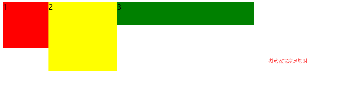
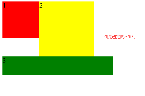
2、浮动元素之间互相贴靠
<!DOCTYPE html>
<html lang="en">
<head>
    <meta charset="UTF-8">
    <title></title>
    <style type="text/css">
        span{
            background-color: red;
            float: left;
        }
        .box1{
            width: 100px;
            height: 100px;
            float: left;
            background-color: red;
        }
        .box2{
            width: 150px;

            height: 150px;
            float: left;
            background-color: yellow;
        }
        .box3{
            width: 300px;
            height: 50px;
            float: left;
            background-color: green;
        }
    </style>
</head>
<body>
    <!-- <span>文字</span>
        <span>文字</span> -->

    <!--
        如果父元素有足够的空间,那么3哥紧靠着2哥,2哥紧靠着1哥,1哥靠着边。
        如果没有足够的空格,那么就会靠着1哥,如果没有足够的空间靠着1哥,自己往边靠
     -->

    <div class="box1">1</div>
    <div class="box2">2</div>
    <div class="box3">3</div>


</body>
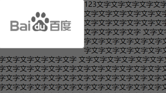
3、字围效果
<!DOCTYPE html>
<html lang="en">
<head>
    <meta charset="UTF-8">
    <title></title>
    <style type="text/css">
        *{
            padding: 0;
            margin: 0;
        }
        div{
            float: left;
        }
        p{
            background-color: #666;
        }
    </style>
</head>
<body>

    <div>
        <img src="./images/企业1.png" alt="">
    </div>
    <p>
        123文字文字文字文字文字文字文字文字文字文字文字文字文字文字文字文字文字文字文字文字文字文字文字文字
        文字文字文字文字文字文字文字文字文字文字文字文字文字文字文字文字文字文字文字文字文字文字
        文字文字文字文字文字文字文字文字文字文字文字文字文字文字文字文字文字文字文字文字文字文字文字文字文字文字文字文字文字文字文字文字文字文字文字文字文字文字文字文字文字文字文字文字文字文字文字文字文字文字文字文字文字文字文字文字文字文字文字文字文字文字文字文字文字文字文字文字文字文字文字文字文字文字文字文字文字文字文字文字文字文字文字文字文字文字文字文字文字文字文字文字文字文字文字文字文字文字文字文字文字文字文字文字文字文字文字文字文字文字文字文字文字文字文字文字文字文字文字文字文字文字文字文字文字文字文字文字文字文字文字文字文字文字文字文字文字文字文字文字文字文字文字文字文字文字文字文字文字文字文字文字文字文字文字文字文字文字文字文字文字文字文字文字文字文字文字文字文字文字文字文字文字文字文字文字文字文字文字文字文字文字文字文字文字文字文字文字文字文字文字文字文字文字文字文字文字文字文字文字文字文字文字文字文字文字文字文字文字文字文字文字文字文字
    </p>

</body>
</html>
4、收缩效果
<!DOCTYPE html>
<html lang="en">
<head>
    <meta charset="UTF-8">
    <title>Document</title>
    <style type="text/css">
        div{
            float: left;
            background-color: red;
        }
    </style>
</head>
<body>

    <!-- 收缩:一个浮动元素。如果没有设置width,那么就自动收缩为文字的宽度(这点跟行内元素很像)
     -->

    <div>
        alex
    </div>

</body>
</html>
清除浮动带来的影响
1、给父盒子设定宽度,不灵活,一般不推荐使用
2、父盒子内增加一个div(内墙法),设置clear:both;结构冗余,也不推荐使用
<!DOCTYPE html>
<html>
    <head>
        <meta charset="UTF-8">
        <title></title>
        <style type="text/css">
            .box li{
                background: red;
                float: left;
                width: 100px;
                list-style: none;
            }
            .clear{
                clear: both;
            }
            .box2{
                width: 100px;
                height: 100px;
                background: yellow;
            }
        </style>
    </head>
    <body>
        <div class="box">
            <ul>
                <li>python</li>
                <li>linux</li>
                <li>javascript</li>
                <div class="clear"></div>
            </ul>
        </div>
        <div class="box2">

        </div>
    </body>
</html>
3、通过伪元素设置claer:both;推荐使用。
<!DOCTYPE html>
<html>
    <head>
        <meta charset="UTF-8">
        <title></title>
        <style type="text/css">
            *{
                margin: 0;
                padding: 0;
            }
            .box li{
                background: red;
                float: left;
                width: 100px;
                list-style: none;
            }
            /*.clearfix:after{
                clear: both;
                display: block;
                content: '';
            }*/

            /*新浪网使用方法*/
            .clearfix:after{
                clear: both;
                content: '.';
                display: block;
                visibility: hidden;
                height: 0;
            }
            .box2{
                width: 100px;
                height: 100px;
                background: yellow;
            }
        </style>
    </head>
    <body>
        <div class="box clearfix">
            <ul>
                <li>python</li>
                <li>linux</li>
                <li>javascript</li>
            </ul>
        </div>
        <div class="box2">

        </div>
    </body>
</html>
4、overflow:hidden
<!DOCTYPE html>
<html lang="en">
<head>
    <meta charset="UTF-8">
    <title>伪元素清除法(常用)</title>
    <style type="text/css">

        *{
            padding: 0;
            margin: 0;
        }
        ul{
            list-style: none;

        }


        .box{
            width: 400px;
            overflow: hidden;
        }


        .box ul li {
            float: left;
            width: 100px;
            height: 40px;
            background-color: red;
        }
        .box2{
            width: 200px;
            height: 100px;
            background-color: yellow;
        }


    </style>
</head>
<body>

    <div class="box">
        <ul>
            <li>Python</li>
            <li>web</li>
            <li>linux</li>

        </ul>

    </div>
    <div class="box2">

    </div>
</body>
</html>