本文采用lattice包帮助文档中的代码,进行参数说明和结果解释。
Let's begin
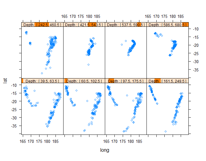
Depth <- equal.count(quakes$depth, number=8, overlap=.1)
xyplot(lat ~ long | Depth, data = quakes)
第一行代码调用函数 equal.count()对连续变量quakes$depth离散化,把该变量转换为因子类型。参数number设置需要的区间个数,参数 overlap 设置两个区间之间的靠近边界的重合(这意味着某些观测值将被分配到相邻的区间中)。每个区间的观测值的个数相等。
第二行代码绘制在不同depth情况下lat和long的散点图(lat为Y轴,long为X轴)
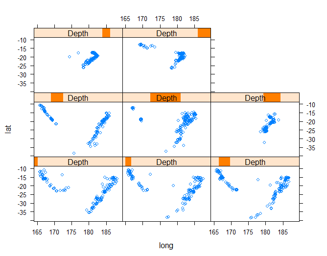
update(trellis.last.object(),
       strip = strip.custom(strip.names = TRUE, strip.levels = TRUE),
       par.strip.text = list(cex = 0.75),
       aspect = "iso")
strip.levels控制显示各个水平Depth:[]
cex控制缺省状态下符号和文字大小的值;
aspect 控制面板的物理高宽比。可以指定为比率或字符串。字符串参数有:
fill(默认值):试图使面板尽可能大以填充可用空间
xy:根据45度银行规则计算宽高比
iso:设备上的物理距离与数据标度中的距离之间的关系被强制为两个轴相同
如果指定了预处理函数并返回组件dx和dy,则这些用于银行计算。 否则,使用默认的预备函数的值。 并非所有的默认预备函数都能产生明智的银行计算。
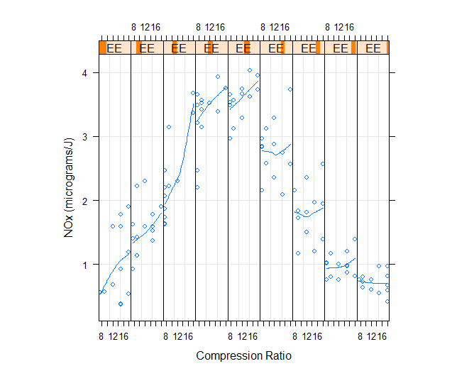
EE <- equal.count(ethanol$E, number=9, overlap=1/4)

## Constructing panel functions on the fly; prepanel
xyplot(NOx ~ C | EE, data = ethanol,
       prepanel = function(x, y) prepanel.loess(x, y, span = 1),
       xlab = "Compression Ratio", ylab = "NOx (micrograms/J)",
       panel = function(x, y) {
           panel.grid(h = -1, v = 2)
           panel.xyplot(x, y)
           panel.loess(x, y, span=1)
       },
       aspect = "xy")
panel函数,指定实际的绘图,里面常用一些panel函数。panel.grid添加水平和竖直网格线,中的h、v指定要添加到图中的水平参考线和垂直参考系的数量。为-1时代表使得网格线与轴标签对齐
panel.rug()在每个面板的x轴和y轴添加轴须线,panel.lmline()添加回归线,panel.xyplot()添加散点图,panel.loess()添加平滑拟合曲线
prepanel预处理函数,使用与panel相同的参数,并返回一个列表,可能包含xlim,ylim,dx,dy等。如果没有,则使用默认值。
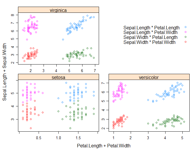
## Extended formula interface

xyplot(Sepal.Length + Sepal.Width ~ Petal.Length + Petal.Width | Species,
       data = iris, scales = "free", layout = c(2, 2),
       auto.key = list(x = .6, y = .7, corner = c(0, 0)))
## user defined panel functions
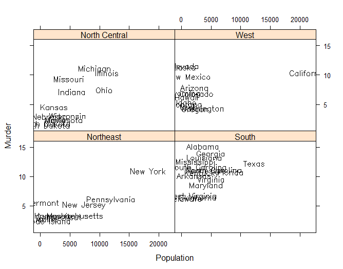
states <- data.frame(state.x77,
state.name = dimnames(state.x77)[[1]],
state.region = state.region)
xyplot(Murder ~ Population | state.region, data = states,
groups = state.name,
panel = function(x, y, subscripts, groups) {
ltext(x = x, y = y, labels = groups[subscripts], cex=1,
fontfamily = "HersheySans")
})
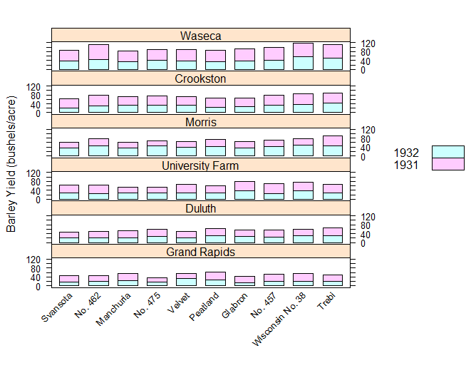
## Stacked bar chart

barchart(yield ~ variety | site, data = barley,
         groups = year, layout = c(1,6), stack = TRUE,
         auto.key = list(space = "right"),
         ylab = "Barley Yield (bushels/acre)",
         scales = list(x = list(rot = 45)))
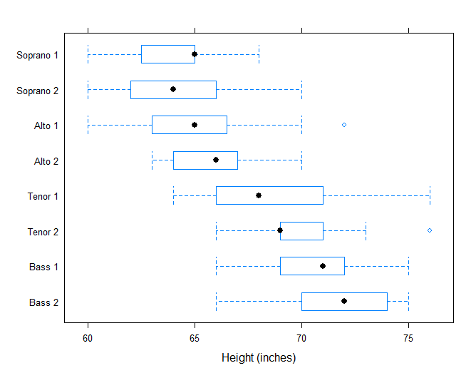
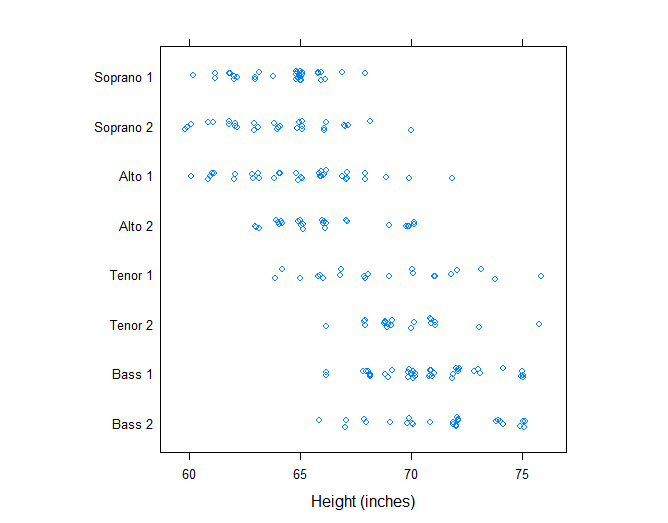
bwplot(voice.part ~ height, data=singer, xlab="Height (inches)")
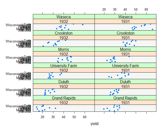
dotplot(variety ~ yield | year * site, data=barley)
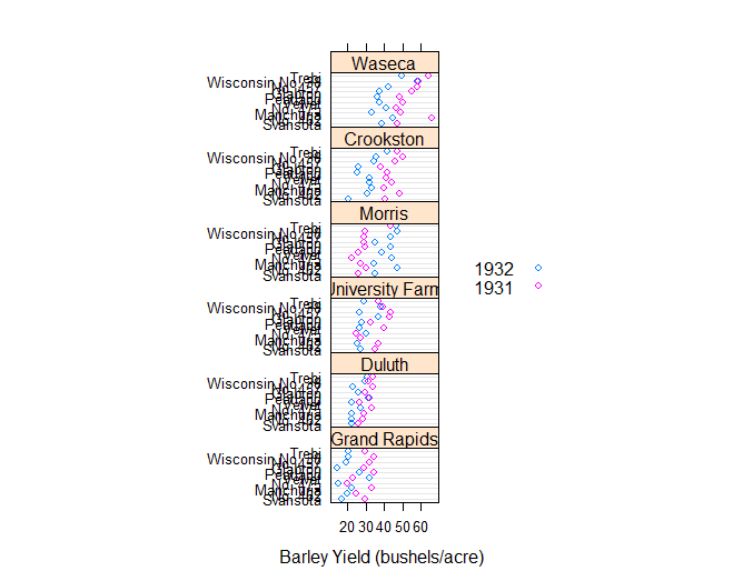
## Grouped dot plot showing anomaly at Morris

dotplot(variety ~ yield | site, data = barley, groups = year,
        key = simpleKey(levels(barley$year), space = "right"),
        xlab = "Barley Yield (bushels/acre) ",
        aspect=0.5, layout = c(1,6), ylab=NULL)
stripplot(voice.part ~ jitter(height), data = singer, aspect = 1,
          jitter.data = TRUE, xlab = "Height (inches)")
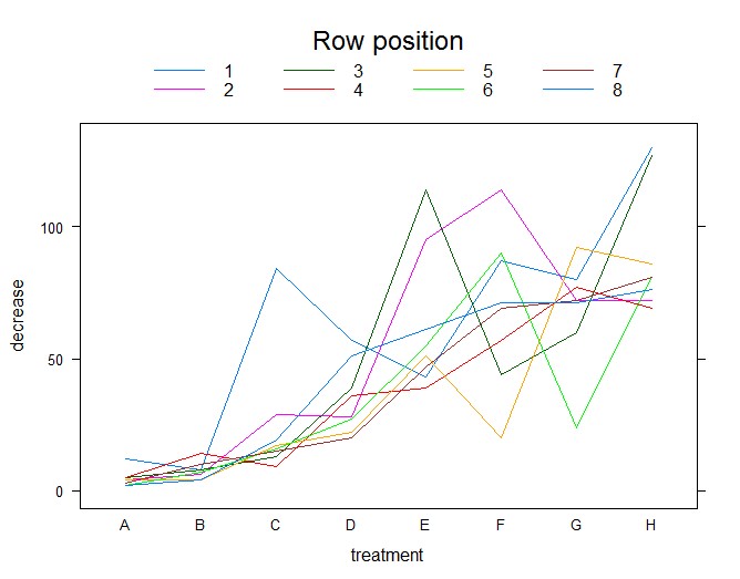
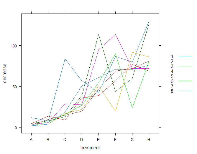
## Interaction Plot

xyplot(decrease ~ treatment, OrchardSprays, groups = rowpos,
       type = "a",
       auto.key =
       list(space = "right", points = FALSE, lines = TRUE))
bwplot(decrease ~ treatment, OrchardSprays, groups = rowpos,
       panel = "panel.superpose",
       panel.groups = "panel.linejoin",
       xlab = "treatment",
       key = list(lines = Rows(trellis.par.get("superpose.line"),
                  c(1:7, 1)),
                  text = list(lab = as.character(unique(OrchardSprays$rowpos))),
                  columns = 4, title = "Row position"))