有时我们不仅需要查看单个变量的分布,同时也需要查看变量之间的联系,这时就需要用到联合分布图。
这里利用Jake Vanderplas所著的《Python数据科学手册》一书中的数据,学习画图。
数据地址:http://raw.githubusercontent.com/jakevdp/marathon-data/master/marathon-data.csv
先来看一下这个数据文件(此处只摘取部分):
       age gender     split     final
0       33      M  01:05:38  02:08:51
1       32      M  01:06:26  02:09:28
2       31      M  01:06:49  02:10:42
3       38      M  01:06:16  02:13:45
4       31      M  01:06:32  02:13:59
5       31      M  01:06:13  02:14:11
6       27      M  01:06:40  02:14:28
7       31      M  01:06:31  02:15:16
8       30      M  01:05:39  02:15:57
9       30      M  01:05:40  02:16:39
10      26      M  01:08:10  02:18:18
   ...    ...       ...       ...
37220   52      M  03:20:00  08:46:04
37221   53      M  03:40:34  08:46:39
37222   60      M  03:39:16  08:46:48
37223   57      M  03:47:08  08:46:58
37224   61      M  03:32:20  08:47:25
37225   41      M  03:43:25  08:49:12
37226   24      M  03:34:01  08:49:36
37227   79      M  03:28:31  08:49:46
37228   24      W  03:35:21  08:50:47
37229   60      W  03:49:33  08:50:58
37230   50      W  03:43:48  08:52:14
这个数据展示的是各年龄和性别的人跑马拉松比赛所用的时间(半程split和全程final)。
让我们来画一个联合分布图,看一下半程和全程时间的分布情况。
联合分布图: sns.jointplot(x,y,data=...,kind=...)
这里需要对数据做的处理工作是把半程和全程的时间转换成秒,因为时间的格式是固定的,因此写了一个用于时间转换的helper function。
代码如下:
import pandas as pd
from matplotlib import pyplot as plt
import seaborn as sns
marathon=pd.read_csv(r"http://raw.githubusercontent.com/jakevdp/marathon-data/master/marathon-data.csv")

marathon["split"]=marathon["split"].astype(str)
marathon["final"]=marathon["final"].astype(str)

def convert_time_to_sec(time):
    """convert hh:mm:ss to seconds"""
    hour=int(time[:2])
    minute=int(time[3:5])
    sec=int(time[6:])
    total_sec=hour*3600+minute*60+sec
    return total_sec

marathon["split_sec"]=[convert_time_to_sec(i) for i in marathon["split"]]
marathon["final_sec"]=[convert_time_to_sec(i) for i in marathon["final"]]

sns.jointplot("split_sec","final_sec",data=marathon)

plt.show()
图像如下:
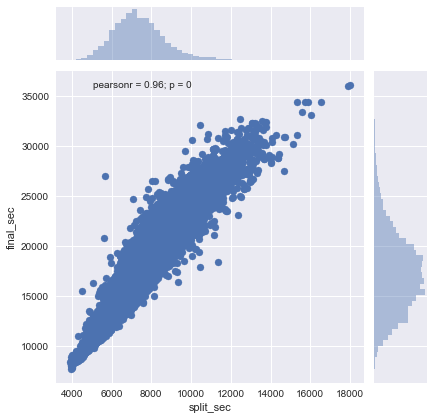
可以看出,如果数据点位于对角线上,说明半程所用的时间正好是全程的一半。但是,大部分数据点都位于对角线上方,这说明大部分人后半程用的时间要比前半程多,也就是越跑越慢。
此外,如果将kind参数设置为reg,图像还会显示拟合线。