flex入门
Flex 是 Flexible Box 的缩写,意为"弹性布局",用来为盒状模型提供最大的灵活性。任何一个容器都可以指定为 Flex 布局。
容器的属性
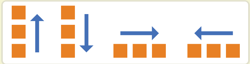
flex-direction
- row(默认值):主轴为水平方向,起点在左端。
- row-reverse:主轴为水平方向,起点在右端。
- column:主轴为垂直方向,起点在上沿。
- column-reverse:主轴为垂直方向,起点在下沿。
html代码
.
	<div class="main">
        <div></div>
        <div></div>
        <div></div>
        <div></div>
        <div></div>
        <div></div>
    </div>
css代码
        .main {
            display: flex;
            flex-direction: row;
            /*| row row-reverse | column | column-reverse; */
        }
	.main div {
            height: 100px;
             20%;
            background: red;
            border-right: 1px solid black;
        }
flex-direction
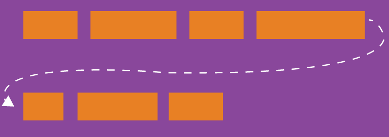
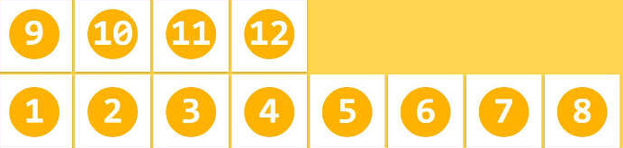
默认情况下,项目都排在一条线(又称"轴线")上。flex-wrap属性定义,如果一条轴线排不下,如何换行。
-
nowrap(默认):不换行。
-
wrap:换行,第一行在上方。
-
wrap-reverse:换行,第一行在下方。
html代码
.
	<div class="main">
        <div></div>
        <div></div>
        <div></div>
        <div></div>
        <div></div>
        <div></div>
    </div>
css代码
	.main {
            display: flex;
            flex-wrap: wrap;
            /*nowrap | wrap | wrap-reverse;*/
        }
	.main div {
            height: 100px;
             20%;
            background: red;
            border-right: 1px solid black;
        }
flex-flow
flex-flow属性是flex-direction属性和flex-wrap属性的简写形式,默认值为row nowrap。
justify-content属性
justify-content属性定义了项目在主轴上的对齐方式。
css代码
	.main {
            justify-content: flex-start | flex-end | center | space-between | space-around;
        }
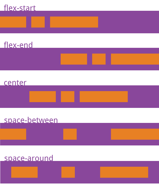
它可能取5个值,具体对齐方式与轴的方向有关。下面假设主轴为从左到右。
- flex-start(默认值):左对齐
- flex-end:右对齐
- center: 居中
- space-between:两端对齐,项目之间的间隔都相等。
- space-around:每个项目两侧的间隔相等。所以,项目之间的间隔比项目与边框的间隔大一倍。
align-items属性
align-items属性定义项目在交叉轴上如何对齐。
css代码
	.main {
          align-items: flex-start | flex-end | center | baseline | stretch;
        }
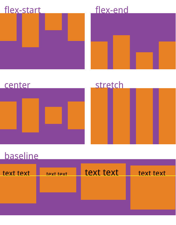
它可能取5个值。具体的对齐方式与交叉轴的方向有关,下面假设交叉轴从上到下。
- flex-start:交叉轴的起点对齐。
- flex-end:交叉轴的终点对齐。
- center:交叉轴的中点对齐。
- baseline: 项目的第一行文字的基线对齐。
- stretch(默认值):如果项目未设置高度或设为auto,将占满整个容器的高度。
align-content属性
align-content属性定义了多根轴线的对齐方式。如果项目只有一根轴线,该属性不起作用。
css代码
	.main {
          align-content: flex-start | flex-end | center | space-between | space-around | stretch;
        }
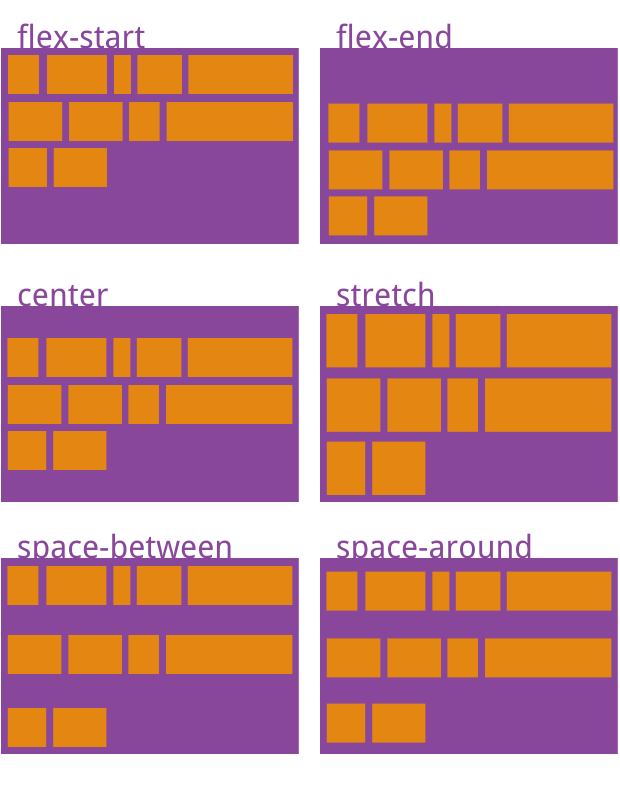
该属性可能取6个值。
- flex-start:与交叉轴的起点对齐。
- flex-end:与交叉轴的终点对齐。
- center:与交叉轴的中点对齐。
- space-between:与交叉轴两端对齐,轴线之间的间隔平均分布。
- space-around:每根轴线两侧的间隔都相等。所以,轴线之间的间隔比轴线与边框的间隔大一倍。
- stretch(默认值):轴线占满整个交叉轴。