ant design的介绍
antd 是基于 Ant Design 设计体系的 React UI 组件库,主要用于研发企业级中后台产品。
特性
- 提炼自企业级中后台产品的交互语言和视觉风格。
- 开箱即用的高质量 React 组件。
- 使用 TypeScript 开发,提供完整的类型定义文件。
- 全链路开发和设计工具体系。
- 数十个国际化语言支持。
- 深入每个细节的主题定制能力。
// 安装antd 3.11.0,antd目前最新版本是4版本以后,目前我们项目还不能进行升级
npm install antd@3.11.0 --save
文档
目前我们项目只能使用ant design3.x.x版本点击这里,现在最新的4版本在我们项目里不能使用
开发页面方式的介绍
初期
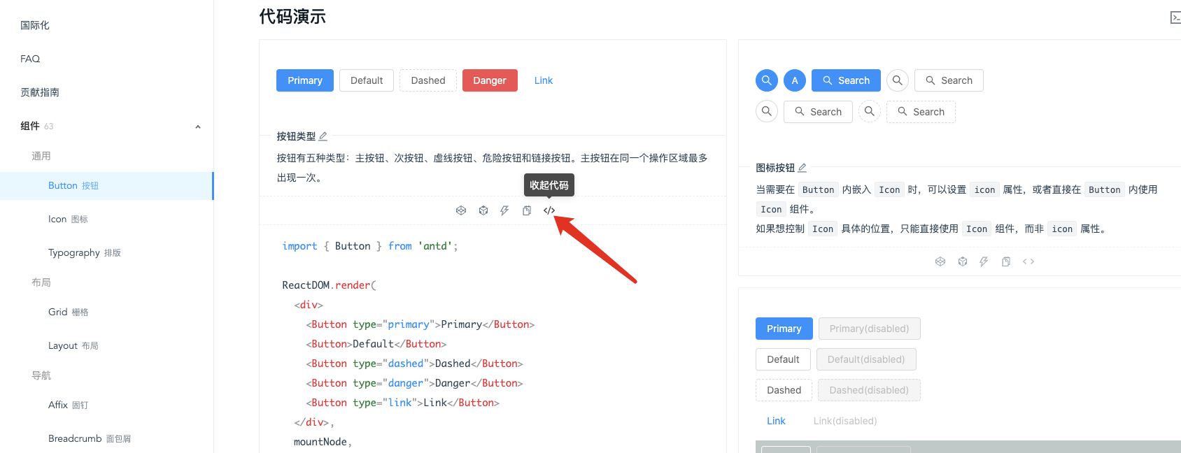
- 第一步:打开antd的官方文档3.x.x版本
- 第二步:查找想要使用的组件
- 第三步:查看代码演示,看哪个代码演示的地方是符合我们原型图需要的组件
- 第四步:查看API(最下面)和使用方式以及复制功能组件的代码,粘贴到项目里,修改数据源以及事件进行开发
后续就进行项目里组件的复制粘贴就可以进行开发
- 引用Button
import { Button } from 'antd';

ReactDOM.render(
  <div>
    <Button type="primary">Primary</Button>
    <Button>Default</Button>
    <Button type="dashed">Dashed</Button>
    <Button type="danger">Danger</Button>
    <Button type="link">Link</Button>
  </div>,
  mountNode,
);
- 引用CheckBox
import { Checkbox, Row, Col } from 'antd';

function onChange(checkedValues) {
  console.log('checked = ', checkedValues);
}

ReactDOM.render(
  <Checkbox.Group style={{  '100%' }} onChange={onChange}>
    <Row>
      <Col span={8}>
        <Checkbox value="A">A</Checkbox>
      </Col>
      <Col span={8}>
        <Checkbox value="B">B</Checkbox>
      </Col>
      <Col span={8}>
        <Checkbox value="C">C</Checkbox>
      </Col>
      <Col span={8}>
        <Checkbox value="D">D</Checkbox>
      </Col>
      <Col span={8}>
        <Checkbox value="E">E</Checkbox>
      </Col>
    </Row>
  </Checkbox.Group>,
  mountNode,
);
- 引用Radio
import { Radio } from 'antd';

class App extends React.Component {
  state = {
    value: 1,
  };

  onChange = e => {
    console.log('radio checked', e.target.value);
    this.setState({
      value: e.target.value,
    });
  };

  render() {
    return (
      <Radio.Group onChange={this.onChange} value={this.state.value}>
        <Radio value={1}>A</Radio>
        <Radio value={2}>B</Radio>
        <Radio value={3}>C</Radio>
        <Radio value={4}>D</Radio>
      </Radio.Group>
    );
  }
}

ReactDOM.render(<App />, mountNode);
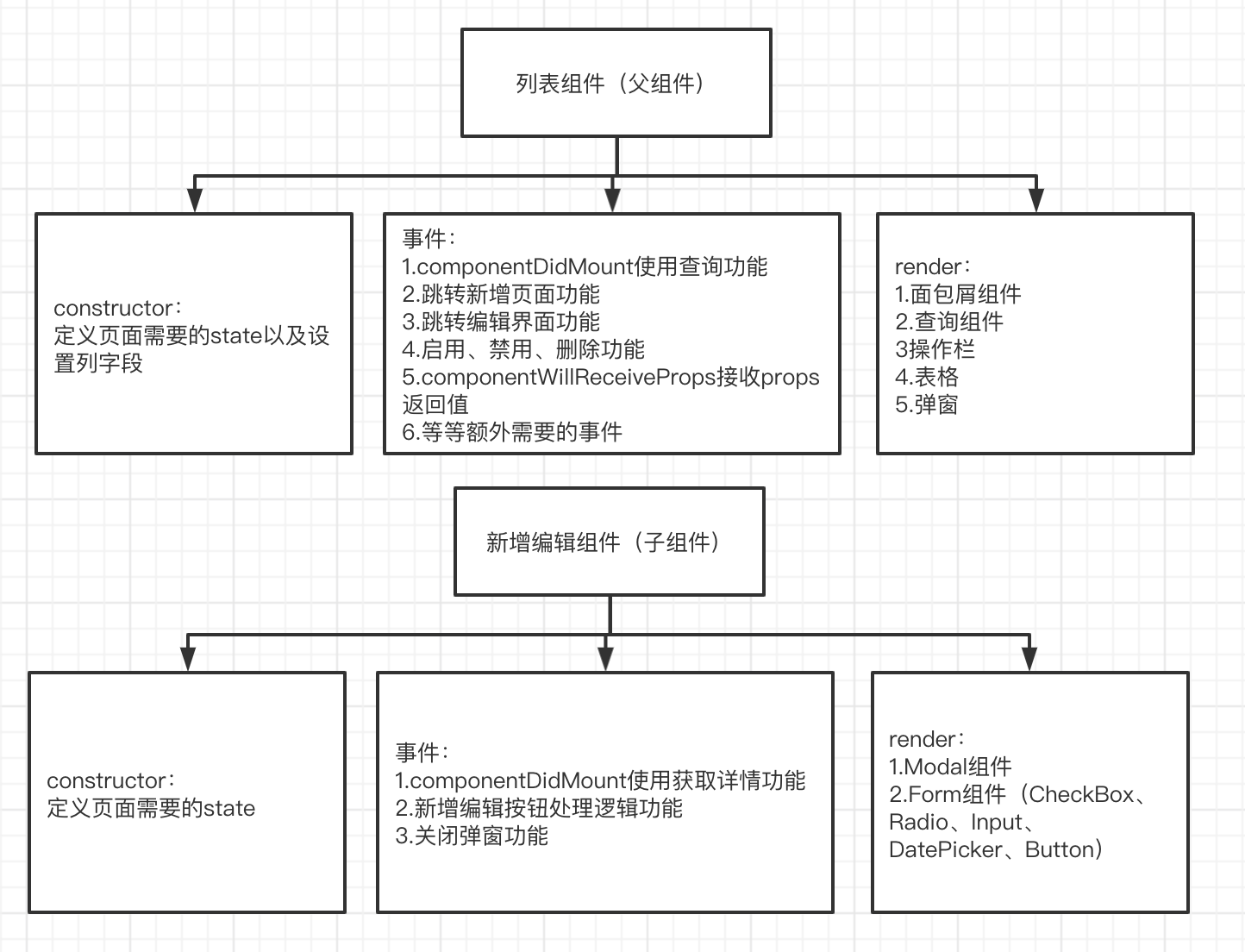
- 流程如图

中期
使用代码片段将可以公用的组件或者代码块提取到我们的代码片段,根据业务逻辑使用快捷命令生成代码片段,不再需要使用antd复制粘贴组件
后期
第一种:
- 1.将页面所有公用功能抽离出一个公共的页面组件
- 2.别的页面继承这个页面,然后在新增自己需要的功能
优点:优点:页面代码量小,公用的地方走同一个文件,如果突然需要调整每个页面的同样组件的功能,会非常简单,修改移除即可
缺点:对代码兼容性要求更高,对组件开发实力以及规划能力有较高要求
第二种:
- 使用vscode插件或者npm库一键生成我们页面需要的基础公用代码,写入到项目里,我们再在这个基础上进行修改
- 配合我们成型的代码片段,快速开发
优点:每个页面就是一个纯新的页面,只是帮助你快速生成了公用代码,开发者想如何进行开发修改都可以,你想怎么改都可以,灵活性很强
缺点:调整公用地方就会相对麻烦,和平常开发页面没有区别
组件开发方式
- 第一步:在component文件夹新建一个页面组件,除了组件其余命名统一小驼峰,里面包括组件js(大驼峰)、less、imgs、入口文件index.js(方便使用)
- 第二步:查看原型图,复制类似页面代码到当前页面js,或者通过代码片段生成、vscode插件生成相应代码
- 第三步:修修改改开发
组件开发步骤
1.定义组件
// 定义
class GetList extends React.Component {
     render() {
         return ()
     }
};
// 导出
export default GetList;
2.添加construcor
- 接收props
- 定义state或者接收props
- 可以定义事件名称
 constructor(props) {
      super(props);
      this.state = {
         // 查询组件配置项
         searchConfig: [{
            label: '订单编号',
            type: 'Input',
            name: 'OrderId',
            placeholder: '请输入订单编号',
         },
         ],
         // 提交参数
         postData: {
            pageIndex: 1,
            pageSize: 10,
         },
         // 弹窗是否展示
         showModal: false
      }
   }
3.添加生命周期
- 页面加载调用接口
- 接口返回数据更新页面
// 调用接口
componentDidMount() {
   this.getData();
}
// 根据返回值进行页面的更新
componentWillReceiveProps(nextProps) {
   const { getListListResult } = nextProps.getList;
   if (getListListResult !== this.props.getList.getListListResult) {
      const { code, data } = getListListResult;
      if (code === '0') {
         return this.setState({
            tableData: data.list,
            total: data.total
         });
      }
      message.error(getListListResult.message);
   }
}
4.添加事件
- 按钮操作
- 公用方法
//查询列表
search = (err, value) => {
   const { postData } = this.state;
   postData.pageIndex = 1;
   this.setState({
      postData: { ...postData, ...value }
   }, () => {
      this.getData();
   })
}
5.编写render里面的代码
- 面包屑组件
- 查询组件
- 操作栏
- 表格
- 弹窗
// 代码示例
<div>
   {/*面包屑*/}
   <TopNav />
   {/*loading*/}
   <Spin spinning={!!this.props.loading.models.getList}>
      {/*样式common-page-content用来给当前页面间距*/}
      <div className='common-page-content'>
         {/*查询组件*/}
         <SearchForm
            onRef={r => this.child = r}
            searchConfig={searchConfig}
            search={this.search}
            key={1}
            toggleSearchForm={this.showmorecallback}
         />
         {/*操作栏*/}
         {btnArr.find(v => v.enCode === 'lr-add') && <div className='table-control-bar'>
            <Button onClick={() => this.addGetList('showModal', true)} type='primary' >新增消息模板</Button>
         </div>}
         {/*表格*/}
         <Table className='bannertable'
            rowSelection={rowSelection}
            pagination={pagination} rowKey='id'
            columns={tableColums}
            dataSource={tableData} />
      </div>
   </Spin>
   {/*弹窗*/}
   {showModal && <ShowModal hideFildModel={this.addGetList} />}
</div>
新增编辑页
- 新增编辑的Form表单
// 使用form组件
<Form>
    <FormItem {...formItemLayout2} label='活动名称'>
        {getFieldDecorator('quota0', {
            initialValue: '', // 默认值
            rules: [ // 验证规则
                { required: true, message: '请输入活动名称', },
            ]
        })(
            <Input maxLength={10} style={{  '100%' }} placeholder='字数限制10个字符' />
        )}
    </FormItem>
     <FormItem {...formTailLayout} >
         {getFieldDecorator('control', {
             // 验证规则(必填、正则)
             rules: [
             ],
             // 初始化的值
             initialValue: ''
         })(
             <Fragment>
                 <Button className='mar-right-width' type='primary' onClick={this.btnOk}>保存</Button>
                 <Button onClick={this.handleCancel}>取消</Button>

             </Fragment>
         )}
     </FormItem>
</Form>
弹框组件Modal
- 1.新增编辑的Form表单
- 2.新增编辑的table表格
<Modal
    width={500}
    title={rowInfo.Id ? '编辑' : '新增'}
    visible
    maskClosable={false}
    onCancel={this.handleClose}
    onOk={this.sureAdd}
>
    <Form>
        <FormItem {...formItemLayout2} label='field1'>
            {getFieldDecorator('field1', {
                initialValue: rowInfo.field1,

            })(
                <Input style={{  '100%' }} placeholder='请输入Field1' maxLength={10000} />
            )}
        </FormItem>
    </Form>
</Modal>
组件功能图
常用的antd组件
通用
- Button按钮
- Icon图标
布局
Grid组件
- Row行组件
- Col列组件
导航
- Steps进度条
数据录入
- CheckBox多选框
- DatePicker日期选择框
- Form表单
- InputNumber数字输入框
- Radio单选框
- Switch开关
- Select选择器
- TimePicker时间选择框
- Upload上传
数据展示
- Popover气泡卡片
- Tooltip文字提示
- Tabs标签页
- Table表格
- Modal对话框
- Message全局提示
- Popconfirm气泡确认框
- Spin加载中
其他
- Divider分割线
案例
实现内容:列表的增删查改
- 第一步:查看ant文档并添加Form组件
// 第一步:页面组件的新增以及完成基础的代码
// 第二步:使用antd组件的Form组件,并使用高级搜索功能

class childCom extends React.Component {
   constructor(props) {
       super(props);
       this.state = {
         ...
       };
   }
   getFields() {
        const count = this.state.expand ? 10 : 6;
        const { getFieldDecorator } = this.props.form;
        const children = [];
        for (let i = 1; i < 4; i++) {
            children.push(
                <Col span={8} key={i} style={{ display: i < count ? 'block' : 'none' }}>
                    <Form.Item label={`Field ${i}`}>
                        {getFieldDecorator(`field${i}`, {
                        })(<Input placeholder="placeholder" />)}
                    </Form.Item>
                </Col>,
            );
        }
        return children;
    }

    handleSearch = e => {
        this.props.form.validateFields((err, values) => {
            const { dataSource } = this.state;
            let field1 = values.field1;
            let field2 = values.field2;
            let field3 = values.field3;
            let searchDataSource = dataSource.filter(item => (!field1 || item.field1 == field1)
                && (!field2 || item.field2 == field2) && (!field3 || item.field3 == field3));
            this.setState({
                searchDataSource
            })
        });
    }
   render() {
       return (
           <Form className="ant-advanced-search-form">
               <Row gutter={24}>{this.getFields()}</Row>
               <Row>
                   <Col span={24} style={{ textAlign: 'right' }}>
                         <Button type="primary" onClick={this.handleSearch}>
                           Search
             </Button>
                       <Button style={{ marginLeft: 8 }} onClick={this.handleReset}>
                           Clear
             </Button>
                       <a style={{ marginLeft: 8, fontSize: 12 }} onClick={this.toggle}>
                           Collapse <Icon type={this.state.expand ? 'up' : 'down'} />
                       </a>
                   </Col>
               </Row>
           </Form>
       );
   }
}
export default Form.create()(childCom)
- 第二步:查看ant文档并添加table组件
// 定义state,以及表格的列数据

   constructor(props) {
       super(props);
       this.state = {
         dataSource: []
       };
       this.columns=[];
   }

// 添加Table组件,至少需要两个属性,1.列属性,2.数据源属性
<Table columns={this.columns} dataSource={data} />
- 第三步:添加中间区域的Button组件用于新增
<Button type="primary" onClick={() => this.showModal('showModal', true)}>新增</Button>
- 第四步:父组件添加新增组件弹窗ShowModal
// 引入子组件ShowModal
import ShowModal from './ShowModal';
// 父组件定义state
this.state = {
    ...
    showModal: false
};
// 控制弹窗的开启关闭
showModal = (field, flag) => {
    this.setState({ [field]: flag })
}
// 修改render
render(){
    const { dataSource, showModal } = this.state;
    return (
        ...
        {showModal && <ShowModal showModal={this.showModal} />}
    )
}
- 第五步:添加子组件ShowModal
<Modal
    width={500}
    title={'添加'}
    visible
    maskClosable={false}
    onCancel={this.handleClose}
    onOk={this.sureAdd}
>
    <Form>
         <FormItem {...formItemLayout2} label='Field1'>
             {getFieldDecorator('Field1', {
                 initialValue: '',

             })(
                 <InputNumber style={{  '100%' }} placeholder='请输入Field1' maxLength={10000} />
             )}
         </FormItem>
    </Form>
</Modal>
- 第六步:实现新增功能
// 父组件添加新增函数并传递到子组件
addInfo = (obj) => {
      const { dataSource } = this.state;
      dataSource.push(obj);
      this.setState({
          dataSource
      })
}

{showModal && <ShowModal showModal={this.showModal} addInfo={this.addInfo} />}

// 子组件的弹窗组件获取页面的值并调用父组件新增功能
sureAdd = () => {
    this.props.form.validateFields((err, values) => {
        if (!err) {
            this.props.addInfo(values);
            this.handleClose();
        }
    });
}
- 第七步:实现删除功能
// 父组件删除按钮添加确认删除功能
<Popconfirm title={'确认删除吗'} onConfirm={() => this.deleteInfo(record)} okText="Yes" cancelText="No">
    <a >删除</a>
</Popconfirm>

// 父组件添加删除函数

deleteInfo = record => {
    const { dataSource } = this.state;
    // 根据Id找到要删除的索引
    let deleteIndex = dataSource.findIndex(item => item.Id === record.Id)
    dataSource.splice(deleteIndex, 1);
    this.setState({ dataSource });
};
- 第八步:实现修改功能
// 父组件的修改按钮传递当前数据内容到子组件
<a onClick={() => this.showModal('showModal', true, record)}>修改</a>

// 父组件showModal修改,传递当前修改的元素
showModal = (field, flag, rowInfo) => {
   this.setState({ [field]: flag, rowInfo })
}

// 父组件添加修改函数
editInfo = (obj) => {
    const { dataSource } = this.state;
    let index = dataSource.findIndex((item) => item.Id === obj.Id);
    dataSource[index] = obj;
    this.setState({
        dataSource
    })
}

// 父组件的子组件添加rowInfo属性和传递editInfo函数
{showModal && <ShowModal showModal={this.showModal} addInfo={this.addInfo} rowInfo={rowInfo} editInfo={this.editInfo} />}


// 子组件接收父组件的rowInfo的值并给到state
constructor(props) {
    super(props);
    this.state = {
        rowInfo: props.rowInfo || {}
    };
}
// 子组件修改添加和修改的逻辑
sureAdd = () => {
    this.props.form.validateFields((err, values) => {
        if (!err) {
            const { rowInfo } = this.state;
            // 如果有值说明是编辑
            if (rowInfo.Id) {
                values.Id = rowInfo.Id;
                this.props.editInfo(values);
            }
            // 否则是新增
            else {
                values.Id = Math.random();
                this.props.addInfo(values);
            }
            this.handleClose();
        }
    });
}
// render接收父组件的值,并修改FormItem组件的initialValue
render() {
    const { rowInfo } = this.state;
    return(
        ...
        <FormItem {...formItemLayout2} label='field1'>
            {getFieldDecorator('field1', {
                initialValue: rowInfo.field1,

            })(
                <Input style={{  '100%' }} placeholder='请输入Field1' maxLength={10000} />
            )}
       </FormItem>
    )
}
- 第九步:实现查询功能
// 父组件添加searchDataSource,用于查询后的searchDataSource
this.state = {
    dataSource: [
        {
            Id: '123123',
            field1: '1',
            field2: 'John Brown',
            field3: 32,

        },
    ],
    searchDataSource: [
        {
            Id: '123123',
            field1: '1',
            field2: 'John Brown',
            field3: 32,

        },
    ],
    rowInfo: {},
    showModal: false
};
// 父组件修改table的数据源
<Table columns={this.columns} dataSource={searchDataSource} />
// 修改查询函数
handleSearch = e => {
    this.props.form.validateFields((err, values) => {
        const { dataSource } = this.state;
        let field1 = values.field1;
        let field2 = values.field2;
        let field3 = values.field3;
        let searchDataSource = dataSource.filter(item => (!field1 || item.field1 == field1)
            && (!field2 || item.field2 == field2) && (!field3 || item.field3 == field3));
        this.setState({
            searchDataSource
        })
    });
}